Showing posts with label self expression. Show all posts

Saturday, 23 November 2013

Cuban Fashion: Tight, Bright and Sometimes Blindingly White


This month's travelling took me to Cuba, for a week of sunshine, museum visits and surprisingly nice beer. Whilst not everything was plain sailing, particularly as I was robbed on my first day in Havana, I did have plenty of time to check out Cuban style and try to define the looks that locals tend to go for. Here are the Havana fashion notes I came up with.

Havana portrait of old man selling food by a market 
A street seller sporting a denim shirt.

  • Showing how totally unaffected they are by the heat, locals wear loads of denim and quite often will be seen in warm hoodies or cardigans. Meanwhile you'll be struggling to cool yourself down in skimpy layers and looking for the nearest bar with air con - all part of the experience! 
  • Despite the unrelenting heat, lycra and polyester make frequent appearances in the wardrobes of Cuban women. They favour skin-tight clothing and are not ashamed to show off their figures, whether they're a size 6 with a glaring thigh gap or size 20 with a little more to love. You're most likely to find leggings in candy pink or turquoise teamed with stretchy vest tops and boob tubes - think Jane Norman and Primark in the UK.
  • In markets you'll see plenty of leather bags, sandals and belts, not just in tan but in a wide range of colours. If you've got money to burn then they make great souvenirs (or presents for yourself).

Young man in sleeveless top beside the water in Havana 
A striped headscarf makes an appearance.

  • Headscarves are worn by both men and women and they tend to be very colourful and patterned. Hats are popular too, but headscarves are a better choice for surviving the often strong tropical winds that blow through the city and avoiding a ruined hairdo.
  • Sweat doesn't seem to be a problem here - however synthetic the uniforms of officials, you're lucky to spot one moistened brow, let alone an emergency requiring copious amounts of Right Guard. However, if you're from the UK, you'll be the one doing enough sweating for everyone, so it's essential to invest in mattifying moisturiser, lightweight layers of clothing in cotton and linen, a decent deodorant and plenty of sun cream, which should be applied regularly.
  • Unlike my visit to Thailand, where locals proudly showed off designer labels and recognisable brand names emblazoned on their t-shirts, from Jack Daniel's to Prada, Cuba is clearly less exposed to designer culture. Clothing may have slogans or intricate designs, but it won't necessarily have a brand attached; many items are plain or carry a simple pattern. As a visitor, you should be mindful of the animosity between Cuba and the USA and try to avoid packing items covered in blatant US slogans or logos, such as the US flag (plus you don't want to draw attention to your tourist status!). 

Hair scrunchies in bright colours

[Image via Coolhunting.com]. 
The scrunchie makes a comeback here...
  •   Women wearing uniforms add a touch of personality through their tights, which can be anything from lace print to fishnet or leopard print; the only rule is that the tights have to be black. Another area of self-expression is their nails, where crazy colour combinations and patterns reign supreme, and their hair, which can be adorned with 90s-era accessories like flower-shaped clips and scrunchies in bold hues.
  • Some ladies ditch the skin-tight bright outfits in favour of a blinding all-white ensemble in cotton, with tiered maxi dresses or wide skirts and lacy white vest tops, finished off with white pumps or sandals and a co-ordinating parasol. This type of clothing is widely available on market stalls and in the small shops lining Obispo.
  • Wearing white for fashion is not to be confused with a national protest movement known as the Ladies in White (Damas de Blanco), campaigning for the release of 75 political prisoners held by the government after voicing their views about human rights. The women wear white to Mass each Sunday and walk through the streets to promote their cause.

So, that's pretty much Havana style in a nutshell. If you've ever been to Cuba and you want to add anything to the list, let me know by leaving a comment below. I'd love to hear your tips!

Tuesday, 12 February 2013

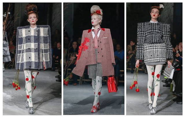
Thom Browne A/W13: Alice in Wonderland, set in the 80s

I've had my eye on Thom Browne's quirky designs for a while now, but this collection made me stop in my tracks. It's as if he made up a recipe with equal ratios of Lewis Carroll, Gwen Stefani, Russian dolls, 1980s power dressing and an angry Miss Havisham, then added an extra sprinkling of rose petals for good measure. My favourite parts of the concoction, including one of the best girl-with-attitude pouts yet:


Thom Browne Fall 2013 Red Roses and Pintucks
 [All images via Style.com, except where credited]
Excess All Areas

Browne's love of full volume design is always at the forefront of what he does - there's rarely any subtlety involved. That means an entire outfit in red, a pintuck-upon-pintuck dress with a corseted waist or a rose-strewn tulle gown with co-ordinating headpiece.

The typical Browne girl, if there is such a thing and she can be pinned down to a mere stereotype, is someone who refuses to be a wallflower. She probably loves cupcakes and Tim Burton films and wanted to be a horse when she grew up.

Thom Browne Fall 2013 Red Lips and Roses
 Roses Are Red

It's all about the 1980s bouffant, even down to the frizz. Backcombed to seemingly impossible heights, it then has corsages pinned carefully into place, teamed with groomed brows, a pinch of blusher and a geisha-style lip in vibrant red. The overall effect is that of a Russian doll who's been listening to power ballads and works in an office. Makes perfect sense to me...

Thom Browne Fall 2013 Grey
 The Lady is a Vamp

These shoulders are markedly different from the Henry VIII shoulders rocked at Burberry last season; they're more elegant and often angular rather than solidly inflated in appearance. If you've seen Browne's work before, you'll know he loves to exaggerate the silhouette like this, with American footballer shapes for men. 

These images also remind me of the micro-trend on street photography websites, for fashion editors and celebs to wear their jackets balanced on their shoulders, rather than putting their arms through the sleeves - the shapes here look very similar. Perhaps this is a case of the street influencing the catwalk?

Thom Browne Fall 2013 Red Embroidery and Embellishment
 The Gathering 

Hitch up, look sharp, as Dizzy Rascal didn't quite ever say. Gathered layers of fabric were heavily embellished or accessorised with everything from fur trims (though I hope they're not real) to Edwardian ruffles. The nipped in waist is a great antidote to the effect of wide skirts and fussy sleeves.

Thom Browne Fall 2013 Geisha Pout
 A Pout To Rival McKyla Maroney's Meme

This is a look that says, "I don't care if you hate what I'm wearing, because I bloody love it." Topped off by power brows, obvs. 

McKayla is Not Impressed at Fashion Week
Sorry, McKayla.
[Image via Memecrunch.com]

Thom Browne A/W 2013 Grids and Tweed
Squaring Up

Again, these are not Henry VIII or American footballer shoulders, but they're something else. In this case, more of a masculine shape, but made to seem all the more square and grid-like thanks to the choice of geometric tweed fabrics. There's also a sort of Alan Titchmarsh twist (yes, really - I haven't gone totally mad, but it is a tenuous link) in that the square patterns work really well with the climbing roses. Sort of like a trellis - see? Just me? Oh well. Maybe I've spent too long analysing this one. 

Still, Thom Browne's Autumn/Winter outlook is rosy as far as I'm concerned. Just get me some 80s tunes, a can of hairspray and some roses and I'll be desperately recreating the look in no time, though maybe not without the set designer's additions of men tied to hospital beds.

Thursday, 19 July 2012

Going for Gold - Illustration

Gold Eye Make-up Illustration
Goldeneye.

Here's a little illustration I produced last month which has been waiting for the right time to pop up on the blog. There's nothing like a dramatic eye to get you noticed... 
Block colours have been hitting the catwalk left, right and centre, but this was also inspired by the influx of Art Deco-style accessories available at the moment (which will continue into next season and probably peak with the film adaptation of The Great Gatsby) and the gold lust of Team GB pre-Olympics. Get ready to see a lot more gold in the media frenzy, kids.

[Illustration my own. Please ask before reproducing].

Wednesday, 15 February 2012

Fashion Raindrops - Fashion Quotes from Novels - #1

'I was determined that, for once, for just once in my life, when I went to those readings, I would be wearing the 'right' thing... To my chagrin, I found all my clothes stubbornly resisting this desired neutrality, splitting themselves resolutely up into three categories: Tyrolean Peasant, Bar Girl, and Dreaded Librarian.'

Sally Jay Gorce in Elaine Dundy's The Dud Avocado, 1958.

Wednesday, 8 February 2012

Magazine Snippet: Natural Beauty from Viola Davis for the LA Times


[Cover image from the LA Times Magazine, February edition]
I may be one of the only people in the world who hasn't read The Help, or seen the film (sorry, I've been too busy with books on anatomy, and raving about the amazing cinema experience that is The Artist), but I do know the star of its big screen adaptation and she looks amazing here. Instead of wearing an expensive weave or wig, as she does for films and premieres, Viola Davis is shown with her natural hair. It's great to see her not conforming to the Hollywood ideal of manageable straight (preferably blonde) hair that's been tweaked to within an inch of its life; her own short style looks great, and it really frames her face. Meanwhile that dress is brilliantly quirky -  not one for the 9 to 5, but it's perfect for creating an edge on this shoot.


[Image from the LA Times online]
Aside from the empowering hair, this shoot is also about equally powerful clothing.The ruff collar on the left is so overtly theatrical and over the top, yet Viola manages to wear it, rather than letting it wear her. As for the outfit on the right, it's the kind of ensemble that wouldn't look out of place at Fashion Week. With the petticoat peeking out and the killer Hollywood sunglasses, this is a woman who deserves to be noticed.


[Original image from the LA Times online, customised by me]
The playful use of structural clothing and a monochromatic colour palette have really made this shoot for me. It could have easily been an exercise in showing the latest spring florals or kooky prints, but then it would have detracted from the strong poses and Viola's natural look, which seems anything but manufactured. This is a brilliant example of how to let your cover star do all the talking, and not just use her as a clothes horse, but to choose pieces that really suit her Oscar nominee status.

Saturday, 19 November 2011

Vintage Style Gets Mobile: London to Brighton


[All images my own].
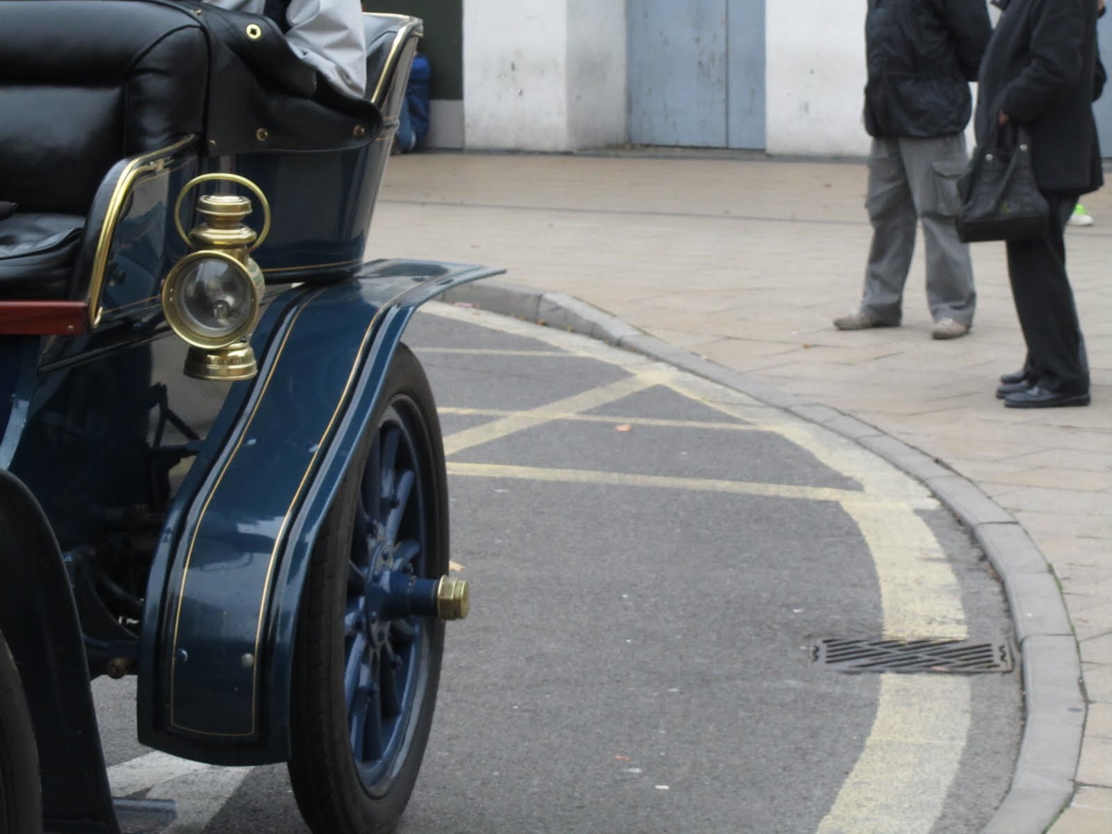
The other week (before my home internet died and I was forced to resort to blogging in my lunch hour) I went to see the annual London to Brighton vintage car and bike rally. Basically if you own a vintage vehicle, you can register to take part, though usually some of the really old and knackered ones don't make it the whole way - this year there were 5o who didn't make the finishing line. It's always a fun event and I couldn't resist fashion-spotting at the same time. Here's my first candidate, appropriately dressed for the dodgy weather in a wax jacket and matching hat.


This car gets extra points for effort as they have retro luggage on the roof. You might notice that a lot of the participants wore hats, and I don't know how the bare-headed ones did it, as it was freezing.


Here's a look at one of the cars up close. It's been kept really well and restored to its former glory, with leather upholstery.


Another vehicle shot, this time looking very much like Cruella DeVil's four wheels in 101 Dalmatians. The driver wisely decided not to go for any fur, but instead went for all black to match the exterior.


It's the blokes that make the real effort at this event, as you can see above. Several cars had co-ordinating drivers and passengers, which looked great and added to the flamboyance of the day. It felt so different from a normal Sunday outing. These two even have goggles to complete the look.


Best costume has to go to the moustachioed pair in sheepskin jackets. In order to keep their scarves flying backwards permanently, they had small strips of wire (yes, really), and I even though they were wearing wings at first. The facial fuzz was the icing on the cake.


Retro vs. modern transport - the old cars clearly look much sharper and more interesting, even if they go at half the speed of our chunky buses.


The ultimate accessory for a vintage rally participant has to be a wicker basket, as seen here. Useful for storing your lunch in, and it's classy too.

I loved seeing how much effort people had gone to when preparing for the London to Brighton run, and it was really entertaining to watch. Next year I'm going to try and get in touch with one of the drivers (some of them were solo and looked a bit lonely in the cold) and hitch a lift. 1940s tea dress and victory rolls in my hair would be obligatory, obvs.

Sunday, 25 September 2011

LFW: Frontline Style Inspiration


[All photographs my own. Please ask before reproducing].
Here are just a few of the people that caught my eye during LFW. Some of them are exhibitionists but others just genuinely seem to love expressing themselves through clothing and accessories. Firstly, I love this man's bag - it's practical, hard-wearing and very vintage-looking with its boxy shape.


The subtle gold heel on these knee-high boots is smart and eye-catching without being too trend-led. There's a lot of block heel detail coming in for this season and it's also a really clever way of making old footwear look like new. You can buy coloured coverings for your heels or soles on the internet (usually about £15 for a set) and do a bit of upcycling on some shoes you no longer wear.

Three style spots here: her bag, their bags and his suit. The woman's choice is quite rustic-looking and worn, with the shoulder straps being chunkier than fashion-led rucksacks. The leather should wear over time to create a really well-loved bag. As for the men? Their shoppers, in black and pink, are symptomatic of the wider trend for men to carry simple bags out of choice rather than necessity. Shoppers for men are going to be gradually introduced on the high street this season - I'm not sure how well they'll be received, but then cardigans were slow to be worn at first and now they're everywhere. The burgundy suit that our middle figure is showing off has also got a lot of style mileage; it's clean-cut, a nice retro shade, and it's slim. Good choice.


For a more outlandish take on fashion, this man has really established his own identity through clothes and styling. Even his beard is artistic and not a traditional cut for someone of his age. Picking flowing, loose pieces to wear alongside it, he clearly has an eye for shape, but he might take himself a little too seriously.


All-out darkness and tailored perfection in this ensemble. I do get the feeling that it might not work as well if you were popping to the shops for a pint of milk, but for a creative industry this is a great example of good dressing.


Simple deep red desert boots with grey suit trousers: this colour combination is really well thought out and it's so much nicer to see casual shoes mixed with formal wear, rather than the typical fashion-boy loafers (usually mock-croc).


The Japanese always seem to have an impeccable sense of style and these boys are no exception. In particular, the sea green mac is enough of a statement to stand out by itself.


Here's an example of the typical London IT-girl look, probably fresh from Hoxton or Shoreditch. I'm pretty tired of the 'I just woke up looking like this' vibe and the skinny schoolgirl figures, usually clutching a cigarette and an iPhone, but they were pretty hard to avoid at Fashion Week. I do like her hair, as I had my own pretty similar do last year and five years previously, but this all feels a bit too cleverly orchestrated to be real.


This is a much more natural look - clashing colours and fabrics, topped off with gorgeous blue velvet boots. The 7/8 length of the mustard trousers is going to be continuing as a trend for AW/11-12, so we'd better get used to those ankle-bashers.


In the courtyard of Somerset House, this girl was rocking her Yoko Ono glasses. I don't think she could actually see out of them, as she was peering over the top of the lenses, so we can safely put this in the 'fashion over function' category.


For a woman wearing such decadent shoes, she stopped at one of the exhibitions more conservative stands, which was a bit surprising. The heels on these sparklers have got to be 5 inches and upwards. I like how she paired them with cream knitted socks and she isn't afraid to let you see them. Maybe the key to wearing heels all day is a decent piece of hosiery?

There's always a photographer with a massive camera lurking nearby (I don't count, as mine is digital and therefore quite compact). This bloke took the biscuit as he clearly wasn't phased by fashion himself, but had an eye for spotting it on other people. Maybe we should call him a conscientious objector?


At this point I nearly started hyperventilating. Donna Wallace, Accessories Editor of Elle UK, was visiting the exhibition stands at Fashion Week (where I was interning with my boss). I recognised her immediately as she's always dressed innovatively whenever Elle does a feature on what its team likes to wear. This time she had what looked like Prada shoes, with a neon green Cambridge Satchel Company bag (just out of shot). I spoke to her later on and she was lovely. It was amazing to meet one of my fashion idols.


Lastly, what did I wear? Here's one of my outfits from my time at LFW. The dress is vintage, from the YMCA in Canterbury a few years ago (they had a brilliant vintage section but are sadly no longer running). The bag is a vintage vanity case, the buckle boots are River Island and the hat is Urban Outfitters USA. As you can see, I was quite shattered as this was taken when I got home on the last day, but I had a brilliant time meeting people, working hard to generate buyer and journalist interest, and absorbing the atmosphere.

Thursday, 30 June 2011

All Things Blonde and Beautiful - the Slogan T-shirt


After a mid-bleaching ginger/yellow moment, I have finally achieved platinum blonde again. Last year this was a salon-based tranformation, but this time I created the look at home, with gaps of at least a week (if not two) between colour changes, to aid hair recovery. [Image my own].


This is on my wishlist for new items. It's cheeky as a slogan but also the actual colourscheme is really nice - I love the mustard yellow against the dark marl grey. There's a brilliant red seam running from both armpits, which will make blonde hair stand out that little bit more.
T-shirt, £14.99, River Island [Image taken from their website and enhanced by me].

It's time for a confidence-boost, and I've found the perfect solution with this t-shirt. Sometimes you need to go back to basics with dressing, and remember that not every outfit has to be a smart one. For those more relaxing days, a slogan tee strikes the perfect balance between fun and functional, plus it allows you a lot of flexibility regarding your bottom half. Of course you can go for jeans, but equally a plain midi-skirt or shorts would work here. The great thing about an inoffensive slogan such as this means that it can be worn for babysitting, spending time with relatives or meeting new people, without the risk of causing offence (put away your 'Barbie is a Slut' version for those occasions).

Trust me: I'm a blonde.

Thursday, 23 June 2011

D.I.Y. wedding accessory

This is the finished article! My much sought-after netting finally arrived and was the finishing touch to this fascinator. I was determined to make it myself, and I did!

Fascinator in blue (above) and burgundy (below) settings. My hair is platinum blonde at the moment, so the base of the piece will blend in, with any luck.


[Images my own. Please ask before reproducing].

So, my crafting project for Operation Wedding has come to fruition and here are some images to give you an idea of how it all went. I opted for a straw fascinator base, although you can get fabric-covered versions, but I was drawn to the straw because it has more of that vintage feel. I wanted feathers, but found that a lot of the high street hairpieces were completely covered or were full of these fussy, pokey things that stuck out a mile away. My fascinator needed to be fashion-led (it's an LCF alumnus getting married), classy (it's not a night clubbing) and a bit eclectic (it's me who's wearing it). Hopefully I've achieved that with the addition of flat peacock feathers, turquoise feathers, black fabric bands and black birdcage netting.

Method for 1 wedding fascinator:

  • Take your base (which can be bought easily online, or from craft shops such as C&H Fabrics, where I found this straw number for £2.79) and decide how you want to arrange the decorations on top.
  • Sew some black fabric bands onto your chosen base, to emphasise the direction of the feathers and add a bit of a background, effectively meaning you can add colour between those lines. I created a 'V' shape with two black strips arranged across the circular base.
  • Attach the netting onto the back of the base using a simple running stitch or even some PVA glue, remembering to try it on your head to see how much or how little netting you want to use. It's nice to try and shade one eye slightly with the coverage, giving a retro feel.
  • On the back of the base, attach a bridal/crafting comb (again, from internet suppliers or C&H Fabrics), which has a loop on each 'finger' of the comb that you can sew into. By catching those loops in your running stitch, you keep the comb close to the base and it should feel fairly solid. Remember that the direction of the comb dictates how you can fix it to your hair - the top of the comb should adhere to the top part of the design on the other side!
  • Sew, glue or clip on feathers and other appropriate decorations. You might want to add bridal hair pieces such as pearls on wire, or maybe some fake flowers. For an easy approach, grab some cheap hair accessories featuring flowers, gemstones or feathers from H&M or Primark and affix them wherever you want. If you've used a loose running stitch to put the fabric band on, you can tuck feathers into the gaps between the stitches and they should stay put.
  • Voila! A slightly ostentatious but very unique fascinator that you can remodel for future occasions.

Monday, 20 June 2011

Don't eat a doughnut when you wear lip transfers...


[Images via Violent Lips, with a little customisation on my part].

Thanks to the Sunday Times Style Magazine, I was alerted yesterday to the presence of Violent Lips in the beauty market. The company makes lip transfers which, judging from the website tutorials, seem fairly easy to apply and give the wearer a unique look. Above you can see three of my favourite designs, all of which are available in different colourways. There were some others that I feel would be less 'cutting edge' and more 'crap tattoo effect', notably the versions mimicking fishnets or with graffiti-style slogans of 'Kiss' or 'Love', but generally the brand seems to be heading for the conceptual-esque fashion lover (for that, read Lady Gaga or Jessie J). I really think that there is a gap in the market for this kind of thing, although it's not really an everyday look, but I'm sure it'll prove popular for photoshoots, clubbing or catwalks. I am tempted to try some as soon as my finances allow!

Monday, 15 November 2010

Marina Abramovic at the Lisson Gallery - Ritualistic Hairbrushing


I must admit that, before attending this exhibition, I had never heard of the Lisson Gallery and so didn't really know what to expect. The website seemed to indicate a very sophisticated operation and one that was possibly more high-brow than my favourite artistic haunts, but I was willing to embrace the high life in the name of blogging. It therefore came as a slight shock that the Lisson was nestled between grocery shops and tired-looking buildings, whilst the gallery itself (spread across two locations in the same street) stuck out like a sore thumb.

Marina Abramovic, meanwhile, was familiar to me through studying a lot of art history and theory in my undergraduate course, though I had never witnessed her performance art. The exhibition did not involve any live work, but used video footage, projections and photography to demonstrate her previous pieces. It was incredibly easy to immerse yourself in Abramovic's world in this sparse but impressive gallery setting, and the monochromatic images really stood out. I couldn't help but notice the obvious ritualistic elements to her work, from the use of chanting and repetition to the symbols of fire, knives and lambs. There were often sacrificial leanings, such as in the Rhythm 5 piece which involved Abramovic cutting her nails and lying down inside a large star shape which had been set alight. The ensuing heat caused her to lose consciousness, and she was subsequently rescued from this performance.

Some of the artwork also struck me as being too attention-seeking to be taken seriously, and two key examples spring to mind. Firstly, the piece involving stabbing herself with a knife, which felt visceral but not really art. For me, this just felt like an 'Artist glorifies self-harm!' tabloid piece waiting to happen; it was crude, not very meaningful, and also managed to look quite dull in its repetitive nature. I have never considered self-harm to be art, and I don't believe anyone else in the gallery did. If the knife had been another object then this could have formed an interesting comment on the monotonies of daily life and those ritualistic tasks we perform. Another complicated piece involved Abramovic with an air blower, waiting to pass out from the air flow which, for some unknown reason, required her to be naked at the time. I felt like the nudity didn't add anything to the piece and actually proved to be distracting from the event itself. If she had been clothed, we also could have understood the air flow currents more readily, especially if she was wearing billowing fabrics. Something that looked like a drunken teenage prank could have looked almost poetic with the right approach.

Another Rhythm piece really stuck with me, and this included the chanting which I have previously mentioned. Abramovic repeatedly brushed her hair, with painful sound effects, calling for the artist to be beautiful. I couldn't tell if this was her view, the projected view of someone else, or an attempt to mimick the views of others on the beauty of art and the involvement of the artist. Because of the loud and thudding sound effects, it seemed more like self-flagellation than a call to arms for women artists. I also felt strong links with the importance of image and perfection in modern society; it is not enough for the artwork to be beautiful, but the artist must also achieve a beautiful self-image. The question is, who becomes the real work of art here?

I enjoyed seeing something different in this performance art display, but without the anxiety of witnessing a live performance (there is something of the pantomime about some of Abramovic's audience participation). Sadly, the gallery provided little information on the exhibition and there were no staff available to interview. In addition, the location of the Lisson seems a little strange, though its dual sites somehow work well together. I would recommend a visit and would be even more enthusiastic in encouraging people to discover Marina Abramovic. She is more than just a stunt-woman, and many deeper meanings can be found in much of her work, but only if she wants them to be found. I just wish she'd stop flaunting herself in what I presume is an attempt to gain artistic integrity.

Sunday, 14 November 2010

Further Words from the Drawing Fashion Debate

Taken from the debate at the Design Museum, London, on 05/11/2010, where the Drawing Fashion exhibition is currently running.

Those taking the floor:

Colin McDowell (CM) – guest curator of the Drawing Fashion exhibition

Joelle Chariau (JC) – custodian of the collection on show

François Berthaud (FB) – artist (see www.francoisberthaud.com)

Howard Tangye (HT) – artist (see www.howardtangye.com)

William Ling (WL) – director of the Fashion Illustration Gallery (see www.fashionillustrationgallery.com).


*

How did your career involve fashion illustration?

CM: Fashion illustration has obsessed me for years.

JC: I started with cartoonists in my gallery – popular, commercial art. Then I saw Rene Gruau’s work in a magazine and loved it, but I didn’t know if he was even alive or not. I found out he was and I contacted him, but he didn’t think his commissions would interest anyone. Fashion illustration was an unknown field in art. I didn’t think about the market; I held an exhibition and it was successful.

CM: They are artists first and foremost, but they just happen to draw fashion.

WL: Fashion illustration hasn’t always been fashionable. I collaborated with my wife on an exhibition at Gavin Turk’s studio in 1997, which featured in Vogue, and we were surprised they wanted to cover it.

CM: There has been a renaissance of interest in fashion illustration recently, for example at the new exhibition of Rene Gruau’s work for Dior, in Somerset House. However, commercial work [such as Dior commissioning Gruau] is always coarser, in my opinion.

HT: Drawing has taken me through everything I’ve done, and I began studying fashion at St. Martin’s, then at Parsons in New York in the 70s. There was an atmosphere of illustration at this time within fashion.

FB: I trained as a graphic designer, which covered drawing, typography, advertising and photography, though now you would study those separately. I worked for Condé Nast but also published comic strips, and I was then called in to work on a magazine called ‘Vanity’, which was created by Anna Piaggi.

CM: ‘Vanity’ was a marvellous magazine and Anna Piaggi is visionary.

FB: They called in talented illustrators to work on ‘Vanity’, but most knew nothing about fashion, whereas I did. The magazine had a niche success, but suddenly became worldwide after its use of illustration.

FB is then asked by the audience about the evolving nature of his work and how he has moved away from a linocut style.

FB: In the mid 80s I was looking to have a bold, black line drawing - something reduced to maximum simplicity. I then evolved and wanted to tell things differently, with more transparency. It’s now closer to painting than to drawing and it doesn’t really recall linocut.

The panel are then asked about a fashion designer’s influence over the illustration process and design.

FB: It’s not specific to illustration – whoever interprets the work of the fashion designers is creating a dialogue with them.

CM: When you’re doing something, you don’t normally feel you have to please the designer, as they aren’t normally your client.

JC: Even Gruau’s clients were mostly magazines.

On the subjectivity of fashion.

WL: It’s very difficult to second guess what we’ll think of Francois’ work in twenty years’ time.

JC: It’s subjective, and our subjectivity has a value.

CM: I’ve been in the fashion world for 35 years and I’ve yet to meet an intellectual because it’s so subjective.

On the idealised body in fashion illustration – the young and thin woman.

FB: I don’t see fashion illustration as a special occasion to discuss this in my work. The weight of the model is just not an issue.

CM: As a journalist I hear this all the time. Women in fashion are portrayed as young and thin because that is what we want as consumers; you want the dream. I would personally have a law banning anyone who was fat or over 40 from wearing jeans. I can’t wear them.

*

My thoughts on the debate: It was fascinating to hear all of these very high-profile industry specialists speak for such a long time, and with such freedom. I was really interested in the Fashion Illustration Gallery but, having conducted some research, it is essentially for buyers rather than general viewers or tourists, which is a shame. This is why it is so important to see exhibitions such as 'Drawing Fashion', because it is so rare to be given the opportunity to be in the same room as these images. Normally they will greet you from a magazine article or a retro fashion advert in a textbook, and you just don't have the same level of interaction. When you see them up close, they almost come to life; details are stronger, colours are richer, and technical accuracy is a lot clearer.


It was also amazing to meet fashion illustrators, and I may not get the chance again, especially considering the growing influence of graphic design and computer technology. It's been incredibly important to meet these more traditional illustrators, though they are not averse to using modern media in their work, and I do not criticise them for this.

The Drawing Fashion Debate proved to be a highly insightful experience for me, and one that I shall remember for years to come (not only because I lost the sole of my shoe on Tower Bridge, but that's another story, and one that cannot be illustrated in an elegant way!).

Related Posts Plugin for WordPress, Blogger...