Showing posts with label SS. Show all posts

Monday, 21 October 2013

Moda Lisboa S/S14: Portuguese Labels to Love

Yes, I'm turning my attention to yet another Fashion Week around the world, and this time it's Lisbon that has managed to catch my eye. There are some really talented Portuguese designers out there, and I spent ages poring over their work on Portugal Confidential and the official Moda Lisboa website.

Here are six of my favourites, as captured by photographer Rui Vasco; firstly, three designers who relied heavily on blue as an accent colour, and then secondly, three designers striking out with very individual styles.
Moda Lisboa PedroPedro blue jackets
 [All images via Portugal Confidential and Rui Vasco]. 
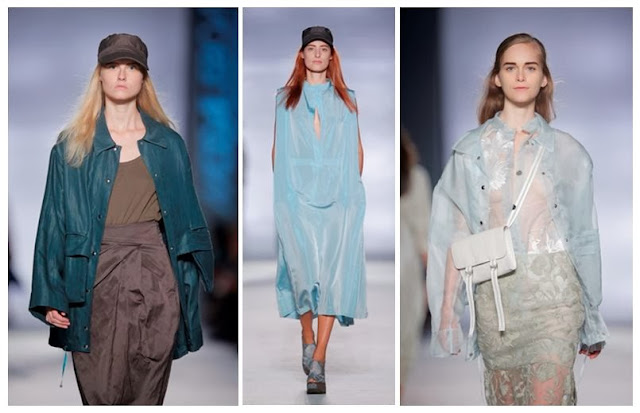
Pedro Pedro's tactile collection focused on texture, right down to the glossy hair of the models.

There was an interesting clash of femininity (delicate layers, long hair, little satchels) and masculinity (flat grey caps, overcoats, the face as a blank canvas) in the clothing here. I feel that these are the kind of ensembles worn by a Burberry devotee who seeks something a bit more individual and pared down; something more authentic than the sleek trench coat.

Lisbon Fashion Week womenswear with pale blue coat and white waistcoat
 Ricardo Preto went for practical pieces emphasised by folds, with iridescent sheer layers underneath.

Unlike Pedro Pedro's bare models, the ladies at Ricardo Preto sported washes of gaudy eyeshadow in purple, blue and red, worn against a muted colour palette of blues, greys and greens in the clothing itself. I loved the different silhouettes created by the changing volume of the outfits - cocoon coats and slimline waistcoats vying for attention on the same catwalk.

Senegal inspired blue dresses and white top by Portuguese fashion designer
SayMyName had an Avatar-meets-Gaga feel to its S/S14 line.

According to the notes, SayMyName was inspired this season by the robes of a Senegalese brotherhood, but (to my untrained eye) I felt like there was a distinct note of Gaga to the proceedings. I loved the oily slickness of the dresses, clinging in places and glossing over the figure in others. There was a real sense of craft and playfulness that I couldn't resist.

Monochrome looks on the Portugese catwalk
 Nuno Baltazar made an impression in black.

How much do I want to be a Nuno Baltazar woman? She's like one of those effortlessly cool types that I always clock at Fashion Week, strutting through the courtyard at Somerset House in vertiginous heels, without a care in the world. I picked these black and white pieces to show you, but there was some colour in the collection, however my stand-out picks reflect the power of simple pieces to really make an outfit. Barbed wire print and clever drapery? Yes, please.

Banana print shirt and shorts on the catwalk
 Os Burgueses delivered a collection inspired by '1960s wallpaper'. 

The power of print was evident from Os Burgueses' range for this season. A humble banana became key to the quirk appeal of these outfits, topped off by punk-lite belts and precisely wrapped head scarves. These looks had the feeling of playing in the dressing up box at first glance, but you just know they'll be worn by fashion leaders who never put a hair out of place. I'm envious.

Yellow pinafore or dungaree dress with dinosaur print top
Ricardo Dourado's range was called Drop the City and blended simple street wear with intricate dinosaur prints.

If you're seeking something a bit more streetwise from Fashion Week, you can't fail to be impressed by Ricardo Dourado's vision for Spring/Summer 2014. His ideal customer seems to be a woman who isn't afraid of fashion's chameleon potential; she wants to be someone else and is happy to experiment with ballooning fabrics, off-the-wall prints and man repelling dungaree dresses. What's more, she's proud of the way she looks.

I've definitely been inspired by the work of these designers; Lisbon is clearly one to watch on the global fashion stage.

Thursday, 19 September 2013

London's on Fire for S/S14: Meadham Kirchhoff, Giles and Vivienne Westwood Red Label

The catwalk was set ablaze this season by three great designers in London, each with their own slightly different fan-base. Meadham Kirchhoff is the brainchild of two talented young upstarts with a suitably edgy following, Giles has his endless celebrity endorsements and  mainstream fans from his brilliant New Look diffusion line, and Vivienne Westwood's Red Label boasting its incredible price tags and customer elite sitting not-quite-comfortably alongside her protestations that we all cut down on the number of clothes we buy. Ahem.

Controversial comments aside, these three shows had a lot in common; they all showed models looking empowered and fiery, whether channeling the Lolita look or going for something significantly more dishevelled. 

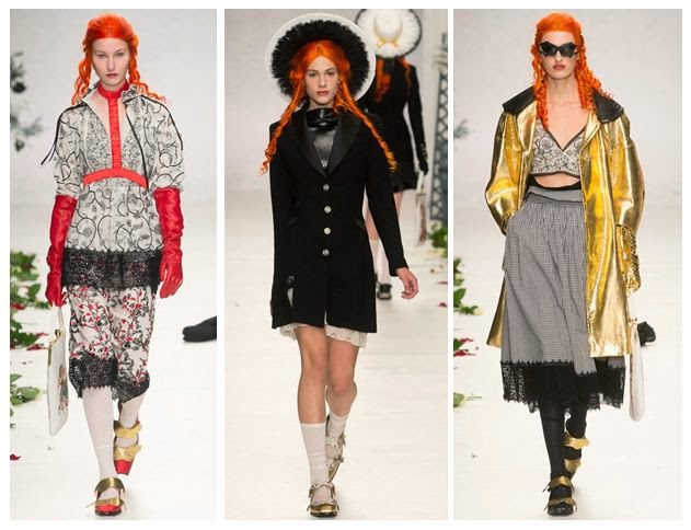
 L-R: Meadham Kirchhoff, Giles and Vivienne Westwood Red Label showed expressive styles with fiery traits - lace bras, bat-like headpieces and fierce make-up coordinated with a masterclass in layering that shouldn't work but somehow totally does. [All images via Style.com].

Both Meadham Kirchhoff and Giles chose to braid the hair of their models, whilst at Westwood it was all left to hang out in glorious waves, as though just undone from its plaits. The colours may not have been glowing at all times, in fact they could be pretty muted occasionally, but the prints and draping created lashings of drama to help things along.

 The boys  at Meadham Kirchhoff brought us a gold-tinged vision of summer with the prospect of raiding the dressing-up box for those accessories. 

Red satin princess-style gloves: check. Edwardian jacket fresh out of Downton: check. Gold jacket from that 80s fancy dress night: check. Finish it all off with strappy gold shoes and a piercingly bright orange wig and you're good to go.

This is what I call Lolita meets Little House on the Prairie (with a touch of Wednesday Addams). The Meadham Kirchhoff woman isn't afraid to wear her inner child on her sleeve, but that doesn't mean you should mess with her. She mixes decades and patterns better than you, and she can also drink you under the table.

 After reappropriating famous paintings and working with beautifully burned fabrics to set the mood of a smouldering country pile, Giles Deacon has finally created his own relics using these moody photographic prints by Glen Luchford.

There's a brilliant behind-the-scenes studio piece on Giles fresh on the Grazia website right now, explaining loads more about the creative process behind this collection. Amazingly, Giles spotted the photos being posted on Instagram by Luchford, many of them previously unpublished, and he was able to use them in the designs. There's an interesting cross-over with Prada here, as some of the pieces in the collection use prints from Glen's test shots for a Prada campaign back in 1997. 

What I love about the shapes of this part of the collection is that they flatter most figures and don't seek to exploit the women wearing the pieces. There's that all-important draping and forgiving volume that allows you to breathe underneath, rather than be constrained.

Westwood's combination of Pre-Raphaelite hair and distressed layers of clothing with slight Victorian and Edwardian nods (braces, muted florals, sharp masculine tailoring) was totally absorbing.

Being a Vivienne Westwood show, there were always going to be elements of punk spirit tied into all of this extravagance; the Climate Revolution t-shirts and the childish doodling of the make-up certainly added to that, along with the vertiginous multi-strap heels, but having Lily Cole steal the show in a beautifully simplistic and feminine beige dress made sure that this collection would be remembered for its balance of anger with feminine wiles. Trust Westwood to make beige look empassioned instead of bland. 

These three designers definitely lit up the catwalk for me, and they made a strong impact. I'll be watching out for the high street's interpretation of these looks.

Sunday, 24 February 2013

Lakme Fashion Week: Designers to Watch in 2013

Although the fashion world is currently revolving around the Big Four (New York, London, Milan and Paris - we're currently still on Milan), it's worth noting that another important showcase is just around the corner. Lakme Fashion Week will be held in Mumbai from 22nd-26th March, where we'll get to see Spring/Summer Resort collections for 2013. As a bit of an Indiaholic (I've seen a fair few Bollywood films, I'm saving up to go to India and I love reading the Vogue India website), I couldn't resist bringing you a taste of Indian style.

The organisers of LFW Mumbai (don't get it confused with London's LFW) listed their Next Gen and Emerging Designers back in January, so I've picked a few of my favourites that I'll definitely be looking out for next month.


Ilk, by Shikha Grover and Vinita Adhikari - from Noida

Lakme Fashion Week designers Ilk - cream textured clothing with drapery
[Images via Ilk's website]. 
Dreamy textures and drapery make up Ilk's latest offering.

You may have spotted Ilk on the independent online boutique, Not Just a Label. Their most recent collection was called I Lose Myself and featured deconstructed threads, layers of different textures and pops of neon in accessories. They really push themselves to experiment with forms and with influences when they are designing (for example, I Lose Myself was based on ideas about 'what metamorphic thinking is not' and 'anatomical exploration'). Expect big ideas and wearable pieces.


Nikhil Thampi - from Mumbai

Nikhil Thampi fashion at Lakme Fashion Week and worn by Evelyn Sharma
[Images via Vogue.in and Google Images].
Nikhil Thampi's vampish designs are irresistible and flattering.
The dress in the centre is completely backless except for two leather straps and was worn with leather leggings by Evelyn Sharma.

Since 2011, Thampi has been charming India with his designs, which have been seen on some seriously glamorous celebrities such as Anoushka and Evelyn Sharma. His dresses tend to involve sweeping folds of fabric, open backs and clean lines without busy patterns, making them a popular choice for red carpet events. However, there's also a quirky side to his work - see his chainmail and leather corset and a velvet dress with leather straps as examples of something a little less traditional.

Thampi always wanted to be in fashion but was set to join the family business instead. What changed his mind was when he helped out a friend who was preparing to show at Lakme Fashion Week, bringing him back into the industry. Although he isn't formally trained, his work shows that he obviously made the right choice in becoming a designer.


Aarti Vijay Gupta - from Mumbai

Aartivijay Gupta - chromatic prints, doodling and colour charts
 [Images via Vogue.in].
Gupta's creations are clever and make brilliant use of her print skills.

I've written about Aarti Vijay Gupta at LFW before, as I was so impressed by her A/W 2012 collection based on colour charts and technical patterns, mixed with black and white doodles. People have also compared her work to that of Masaba, a label which has recently focused on repeat patterns of symbols and objects, such as hand prints, cows or letters (as seen in Permia's Pop-Up Shop).

It's also worth noting that Aarti Vijay Gupta's Pantone-esque exploration of colour also saw her creating a print of shirt templates, which was echoed by Lacoste's recent use of shirt print fabric in their S/S 2013 line. Clearly conceptual ideas such as this are not exclusive to one brand, and it's great to see the trend spanning continents.

Which Lakme designers get your vote? Do you keep an eye on Fashion Week around the world? Let me know. Oh, and if you need even more persuading that India is where it's at, check out this brilliant feminist commentary from (male) designer Sabyasachi on female beauty laws.

Monday, 16 April 2012

Top Spring/Summer 2012 Trends

As we're mid-way through the season, it seems fitting to look at the trends that have really made an impact in fashion and beauty. Here are seven of the best, giving you a week's worth of looks to road test:

 [Images via Style.com - please click to enlarge. 
L-R: Viktor & Rolf, Comme des Garcons, Meadham Kirchhoff].

1. Living Doll

On the Catwalk: Viktor & Rolf, Comme des Garcons and Meadham Kirchhoff all went for the doll aesthetic, fuelled by satin ruffles, frou frou skirts and very high necklines. Accessories included knee high socks, liberal amounts of glitter and incredibly long eyelashes, with Red Riding Hood-style capes seen at Vivienne Westwood to cover up. 

Wear with: tons of feline eyeliner, a sweet shop necklace and a quirky handbag, taking your cue from Olympia Le Tan's book clutch bags as seen on A-listers including Michelle Williams, who went for JD Salinger's Catcher in the Rye as her arm candy.

2. Cut and Paste

On the Catwalk: paste jewellery was seen at Miu Miu (in the form of cameo necklaces) and Dolce & Gabbana (used to embellish bodysuits and dresses), whilst Christian Dior's Spring Couture collection included jackets and skirts with exaggerated and obvious stitching lines. Meanwhile, laser-cut fabric turned heads at Louis Vuitton, Oscar de la Renta and Valentino, among others. The rule of thumb: either less is more, or more is more, with intricate layers of jewels or stripped back cluster sections of lace-like fabric holes doing the talking. Either way it's a feminine trump card that is more ladylike than the doll look.

Wear with: white tights and a beehive hairdo, applying as much Ellnett hairspray as possible - it's used by countless hair stylists and models.

[L-R: Stella McCartney, Lanvin, Balenciaga].

3. Olympic Arms

On the Catwalk: the shoulder was a key focus at Stella McCartney and Lanvin, where athletic arms really shone and you could forget about digging out your sports bra. The sports luxe trend relies on lashings of satin, halternecks, the occasional basketball vest shape and plenty of baseball jackets. Balenciaga provided padded shoulders that American jocks could almost carry off with aplomb. 

Wear with: a hint of body shimmer and bronzer (not too much or you'll give it an Essex feel), alongside a neoprene rucksack, fluoro eyeliner and Topshop hi-tops if you're going down the casual vest route.

4. Serious Talons

On the Celebrities: Both Adele and Lady Gaga have, ahem, spiked interest with their pointed manicures. If you're looking to really go for something different in beauty then this is definitely a style worth considering, as you'll never be able to stand a boring squared-off row of false nails again. Grab a rounded set and file them to an inverted 'V' shape if you can't find cool enough options on the high street.

Wear with: a pair of killer heels and some chandelier earrings. This look is versatile enough to work with several different styles, from leather jacket and hot-pants to the little black dress.

 [L-R: Charlotte Ronson, Prada, Louis Vuitton].

5. The Life Aquatic

On the Catwalk: it didn't have to be sea-themed, but aqua was everywhere during the S/S 2012 fashion weeks, from Charlotte Ronson's cool USA chiffon vibe to the elegant lace-clad Rodarte girl and the city-dwelling Prada woman with her long coat hiding a sneaky crop top. Marc Jacobs at Louis Vuitton brought us aqua tweed and gorgeous triple-strap kitten heels, House of Holland introduced cloudy aqua denim amidst sugared almond shades, and we all suddenly felt the need for an injection of that pale greenish-blue. This may have been the tip of the iceberg as far as pastels go right now, but it was a bloody big iceberg; aqua is the colour du jour.

Wear with: take a tip from Prada and go for bright red, making the blue tones really pop in comparison. Don't forget an aqua manicure or pedicure (try Barry M's Blue Moon) and a slick of pale lip gloss.

6. Deco Decade

On the Catwalk: Whether you blame the recession's glance back to the Great Depression, the Great Gatsby remake or the fact that Downton Abbey will be placing its third series in this decade, there was no denying the historical link between Dolce & Gabbana, Alberta Ferretti and Etro was firmly set to Art Deco. Milan Fashion Week, in particular, went crazy for the 1920s, but many other designers payed heed to all things Jazz Age, including Ralph Lauren. Key quirks included geometric lines, burnished gold accents on dresses, thin headbands and t-bar or Mary Jane shoes. Even at Victoria Beckham, the drop waist dress could be seen to have a 20s origin if you looked hard enough.

Wear with: the Marcel wave. A notoriously fiddly hair do, this is one of the most iconic things about the 1920s. Curl your hair and set the kinks with curling tongs and metal hairdressing clips, ideally following some of the brilliant step-by-step guides on Youtube.

 [L-R: Mary Katrantzou, Rodarte, Erdem].

7. Heavy Petal

On the Catwalk: the queen of intense floral prints is Mary Katrantzou, who continued to use them in her work but also added newer influences like underwater and animal forms which sat well with the flowers that made her famous. Meanwhile Erdem, another London print king, looked to chintzy blooms that stood out thanks to vintage-style hats, giving everything an air of cool granny chic. Lastly, those California Dreamers at Rodarte - sisters Kate and Laura Mulleavy - made us look afresh at Van Gogh's sunflowers for our floral cues.

Wear with: all black or white creates a blank canvas from which the prints can almost blossom. Try a black pencil skirt with a simple black beret, a plain white t-shirt and studded kitten heels, or black leather trousers and minimalist boots.

Of course, this is by no means a comprehensive list, as there's still half a season for micro trends to emerge and expected trends to sell pitifully (yep, it can happen). Just bear in mind that these seven are going to be sticking around for a while yet, so you'd better get used to it!

Friday, 3 February 2012

Sugar and Spice and All Things Nice... On the Cheap


 [Lace Cami Bra in Lemon, Coral and Black, £5.99 each, New Look].
 I severely doubt I could squeeze into one of these lace bras, but they're the perfect way to inject some sherbet colours into your wardrobe on a budget. They'd look great over a white t-shirt (ahem, maybe not for work) or under a sheer black shirt (yup, not for work either, unless you're in the fashion industry, or you might be regarded as a little inappropriate). The mixture of innocence, girliness and sluttish behaviour is quite irresistable if you're already in love with the version of Spring/Summer that Meadham Kirchhoff gave us this season.

Who you're channelling in the lace bra:
[Meadham Kirchhoff, S/S 2012 show; image via Tumblr].

*


[Lime Moped Print Sweat Top, £22.00, River Island]. 
I know this isn't remotely shaped like a Prada item, or even made of the right fabric to emulate the car print, but the point is that the motif has been translated in a new way. This is the street, everyday look with the same spirit. What's more, it could work with a sheer maxi skirt and Converse or as a cover-up for the gym.

Who you're channelling in that top:
[Prada S/S 2012 ad campaign with car print chiffon shirt and dress; image via Tumblr].

*


[Unicorn Sweat, £26.00, Topshop].
It has to be said: I do love a good unicorn. They're so much more exciting than horses (except for War Horse, obvs) and they look a bit more punk. That's perhaps why Lady Gaga loves them too. Topshop's adoption of the motif against this bold azure colour works really well and manages to look fresh. You could wear it over a collared shirt for office chic, or over a slip dress and lace-up boots with fishnets to release some teenage angst like it's the 90s all over again.

Who you're channelling in that sweater:

[Lady Gaga's leg tattoo, which reads 'BORN THIS WAY'; image via Tumblr].

Wednesday, 11 January 2012

S/S 2012 Trends in Hair: Eccentric and Eclectic


 [Image via RUSH Hair].
Here are some of the most eyecatching hair ideas from the S/S 2012 catwalk that we can expect to be cropping up on celebrities and on the high street soon. First up is the grunge look at Belle Sauvage, styled by RUSH Hair, which I can see catching on with inner city hipsters (yeah, it won't work as well if you live in a rural village like I do). Basically the hair is almost woven and spun into these patterns, and it's worn with grunge style - edgy prints, lots of black and ample piercings.


[Image via Catwalking.com].
Thanks to the swathe of prominent brides in 2011 (I'm looking at you, Kate Middleton, Kate Moss and Lily Allen, and possibly even at Kim Kardashian for the 0.5 seconds you were married),  veils and headpieces were seen on quite a few catwalks. I'm not saying we're all going to be getting hitched or covering our faces, but things will get a lot more romantic. I'm talking flowers strewn in your hair, plaits, ribbons and flowing waves. This is not the moment to break out the straighteners.

[Image via Company.co.uk].
At Preen we got a taste of romanticism but with a younger vibe.  Pinned back sections of hair and cute side partings set the scene for rural charm, with lots of blusher and clean eyes. This look can work well at the office or on a date. You can freshen up with dry shampoo and sweep your parting into a similar style quite easily, with just a few kirbigrips and some hairspray. Just don't make it look too 'done'.

[Image via Head1st.net].
Louise Gray's off-the-wall designs were nicely complimented by these corkscrew curls. I've already told you to put down the straigheners this season, and here's more proof. If you do have naturally curly hair then why not show it off? It would certainly have saved these models time. I also like the flick of neon eyeliner- it's what I'd call 'organised madness'.


[Image via SuicideBlonde on Tumblr].
Another strong contender in this season's hair stakes is the Marcel Wave. Ok, so it's not one for going to work in, but it would be perfect for a big night out. As you can see from the image above, there's a certain knack to it, but once you get going then you can achieve this look all by yourself. The reason this will be big for S/S 2012 is that we're surrounded by period films and television. With The Great Gatsby currently being made (and photos from the set cropping up online all the time), the mood is 1920s. Added to this is the current film du jour, The Artist, which is a black-and-white silent movie. On telly you've got Downton Abbey, whose next series will be set in the 20s, and Boardwalk Empire. Added to this will be the clothing trends of the drop waist and beaded embellishments, and you've got a craze going.


[Image via Tumblr]. 
The model of the moment is Charlotte Free, who took to many of the S/S 2012 catwalk shows with her pink hair. I used to have my hair this colour and it was a really liberating thing to do. Not great for job interviews, but definitely fun. On the high street, expect to see lots of wash-in, wash-out dyes and streaks of candy stripe shades.


[Image via the V&A]. 
Julia Margaret Cameron's Circe is an enduring image, and many of her photographs are currently on display at the Victoria and Albert Museum's Photographs Gallery. This is basically a good example of how to combine the bridal chic I mentioned previously with something a little more carefree. Expect to see children with flowers and beaded headbands.


[Image via LOVE Magazine]. 
Lastly, one to perhaps not try at home, but it's a stunning visual nonetheless. Here's model Nyasha for LOVE Magazine, with this intense headpiece last Autumn. It's an example of how Victoriana is seeping into the mainstream at the moment, with taxidermy making waves in art and trinkets and charms being everywhere in accessory trends. I think 2012 will be the year that things get a little more Gaga and we all become bolder with our hair. Not this bold, but you get the idea!

Sunday, 9 October 2011

The Battle for SS13 Fashion Week - Clashing Schedules and Ignored Letters


[Image via Google, not attributed to any photographer].

You may have heard about the rumblings of discontent surrounding next September's Fashion Week, where the Spring/Summer 2013 collections will be shown, as there are due to be significant clashes between the core four cities of London, Milan, New York and Paris. In case you've got a little lost on the current situation, here's how things are looking at the moment.

The difficulties have arisen due to Milan and Paris going against a pre-arranged schedule that has served the industry since 2008, which means that people attending the shows and meeting designers will now be left torn between which country to pick. Irritatingly, Milan will now run parallel to two days of New York and a staggering four days of London (that's pretty big, considering the entire length of LFW is five days for womenswear and one for menswear). We're looking at a schedule which shapes up to be as follows:

New York (Mercedes Benz) Fashion Week, organised by the Council of Fashion Designers of America: 13th September
Milan Fashion Week, organised by rhe Camera Nazionale della Moda: 19th September
London Fashion Week, organised by the British Fashion Council: 21st September
Paris Fashion Week, organised by the Chambre Syndicale: 25th September.

In light of the situation, Diane von Furstenberg (a.k.a President of the CFDA) and Harold Tillman (Chairman of the BFC) wrote a polite but firm letter to the other bigwigs, the Camera Nazionale della Moda of Milan and the Chambre Syndicale of Paris, reminding them that everything has gone swimmingly before, so if it ain't broke then don't try and fix it. Their argument was that the pre-existing agreement worked well, giving every fashion capital 'its own slot whist respecting each of the other's places on the calendar', and they claimed that the CNM was wrong to assume that those dates would only be used for three years. Furthermore, to jeopardise the success of each other's Fashion Weeks undermines 'the delicate balance that has worked so effectively' and that they need to think about 'the greater good of the industry'. It's a very persuasive and sensible statement, and one which focuses on the fairness and compromise that all of the cities had to make in order to develop a schedule which worked for everyone.

So what was the verdict from the CNM and the CS? Well, the head of Milan's CNM petulantly replied, 'Let the best one win,' which hardly helped matters. Paris has been less intrusive to the scheduling and less vocal, whereas Milan has continued to stand firm with its decision of double overlapping. British Vogue editor Alexandra Shulman was interviewed about the fiasco and staunchly defended London Fashion Week for being 'one of the biggest fashion capitals in the world' and suggested that many would prefer to see the shows here over a trip to Italy. Meanwhile the Telegraph newspaper pointed out the difficult logistics for designers such as Christopher Kane, who has his own brand of clothing at LFW and an ever-popular show in Milan with his Versus line for Versace. He must be tearing his hair out at the thought of even more stress during an already tense part of the year as a key industry player.

I think the real problem lies in Milan's bullishness regarding the whole situation. There seems to be no room for compromise, which is strange considering their 2008 agreement with the other cities did last three whole years. I don't understand why it is so important for them to choose the week of the 19th, and why they want to jeopardise the potential of their homegrown talent. If buyers and journalists are forced to choose, there will always be losers, and they will be the designers, who have invested so much time, creativity and money into the shows. Strangely the CNM has stated that all levels in the designer hierarchy 'unanimously agreed on the schedule', which shows 'Italian pride' - is that pride really worth the anger of the three other giants in the fashion calendar? I'm sure that, were the clash of dates to mean that Milanese fashion brands failed due to lack of interest, they would not be so keen to boast of Italian pride. The industry needs to remember that co-operation and compromise are not dirty words, and there can be a way of keeping everyone happy without all of this mess.

UPDATE:

In mid-January it emerged that London and New York were the ones to back down. The new schedule looks like this:
New York (Mercedes Benz) Fashion Week: 6th - 13th September 2012.
London Fashion Week: 14th - 18th September 2012 (though from June 2012 there will be a separate Menswear event, as opposed to just one day, so we can expect this to follow suit for the S/S 2013 season as well).
Milan Fashion Week: 18th - 25th September 2012.
Paris Fashion Week: 25th September - 2nd October 2012.

Personally, although I'm annoyed that New York and London had to be the ones to back down, I am now not-so-secretly thrilled that my friend's wedding no longer clashes with Fashion Week here in the UK, so I didn't spend the entire wedding reception checking Twitter for updates and wondering if I could sneakily blog from my phone. Yes, fashion news addiction is a powerful and drug-like thing...

Friday, 7 October 2011

Paris a la Mode


[All images my own. Please ask before reproducing].
I loved so much about the street style in Paris - the variety, the overall looks and the accessorizing. Everything seems a lot more theatrical and the men are unashamedly interested in fashion. You won't find many tracksuit bottoms here. The image above was one of my best photos from the trip - effortless all black chic, topped off with chunky boots.


Simple nude tones from this tourist at the Notre Dame - she unintentionally blended in with the sunlit stonework, but her tunic dress looked gorgeous.


In a snapshot of the exhibition space where I was working as part of my internship, here's a mannequin showing off minimalist clothes by the Spanish designers Uke, whilst the front rail holds sumptuous leather bags by the duo Haerfest.


Again, another exhibition shot from Rendez-Vous, this time featuring clothing by Ambrym, who are French. Their inspiration for SS12 includes beetles and shadow puppetry.


A night walk revealed this very dapper gent crossing the square by the Hotel de Ville. From his tweed jacket to his grey trilby, he's definitely looking to the past, and it really works.


A slightly blurry shot as I passed through the Metro and caught this woman doing a couture-esque shoot with a professional photographer. Don't particularly like her outfit - it's far too conservative for me, with the skirt suit and pearls - but it was fascinating seeing her modelling.


Back at Rendez-Vous, here was our exhibition neighbour Richard de Latour's stand. He produces edgy jewellery and accessories, mainly in black or silver, and they're all highly covetable.

Another shot of the Uke stand at Rendez-Vous. I really liked the simplicity of their clothing and the organised tonality of the colour palette - it seemed really different from the Spanish fashion scene.


Another shoot I walked into in passing, this time by the Louvre. I like the band of red on the model's dress, and the different layers on the outfit.


The model having some down-time whilst the professional photographer (obvs not me) took some establishing shots. It felt like I was glimpsing their world and it was really exciting.

Thursday, 6 October 2011

PFW: Miu Miu and Balmain both feeling traditional


[Images via Vogue Italia].
Miu Miu's vision for SS12 was decidedly girly, with lace and satin being the dominant fabrics and most pieces falling on, or just above, the knee. Bands of black had been transformed into capelets with ribbon ties, adding the finishing touch to layers of clothing. The use of a murky teal colour was fairly innovative for spring, considering most designers bombarded us with pastels.


If you were thinking things looked a bit far adrift without a Miu Miu print, panic not. Several pieces were given repeated motifs, which jarred nicely with the inky black lace. Make-up, meanwhile, really stood out - a sweep of matte red on lids and nude lips, but the hair seemed a little unimaginative. I would've liked to see black ribbons in there somewhere, maybe.


The look here is edging towards Renaissance glamour, which is very different to the kitsch of SS11. I'm not sure I can imagine current ambassador Hailee Steinfeld in any of these three outifts, without her seeming too mature for her age, but perhaps the capelets will work on the young celebrities such as Hailee that love Miu Miu.


As you can see from this parting shot, there was some patchworking and combining of different key fabrics that left a lot of the pieces feeling like re-workings of each other, trying to go one better than the one that came before. I think that patchwork could be a big trend if it's picked up by the high street, as Miu Miu has set a strong example with this coat (also available in other colours).


[Again, all images via Vogue Italia].
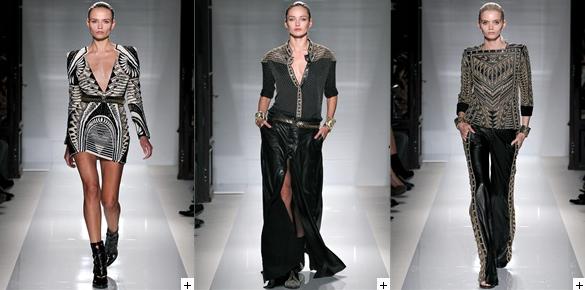
Balmain's SS12 collection played it safe with their classic shapes of skintight trousers and bold-shouldered jackets, alongside a muted colour palette. The focus was on embellishment and the incorporation of embroidery and brocade elements. I can see the middle look from this montage being hot for eveningwear next season, as it's easy for the high street to replicate using PVC and chunky belts or bangles to accessorize.


I love these shorts. Why? Because the embellishment doesn't try to hide the female form - it enhances it by emphasising the curve of your thighs (okay, so maybe that's not a big curve on the model, but you get what I mean). You just know that these shorts are made to be partied in, with chunky heeled boots and a simple top. The choice of black, with long sleeves and gold buttons, is a good one, but in everyday life you could pair them with a rock band-emblazoned vest or a slightly undone white shirt.


Further love of everything embellished, whether it be a power dress or a pair of trousers (though I do feel that the latter is a bit 90s - remember when we all had diamantes up the side of our jeans?). The middle option is what you might call metallic-lite, with simpler adornments that stick to key areas (shoulder and central shirt edge), so that the split skirt can really shine. It's clear that Balmain knows what works.


It wasn't all black at the show - here's a good example of a paler Balmain option, with baby blue brocade trousers (personally I wouldn't wear them, but they're certainly eyecatching). The vertical-horizontal meeting point of the gold belt and shirt edge is really nice and neat - you could replicate it quite easily with a selection of metallic fittings (studs, etc.) and a belt from a charity shop or market. This collection has really shown that the key Balmain styles will always be popular, and that loads of gold doesn't have to be tacky.
Related Posts Plugin for WordPress, Blogger...