Showing posts with label AW. Show all posts

Wednesday, 26 February 2014

Milan Fashion Week A/W14: Salvatore Ferragamo and Sportmax Have Arty Animal Instincts

Being a self-confessed lover of all things leopard print (from shoes to pyjamas), I always have my eye out for a peek of it on the catwalk, especially as it rarely goes out of fashion. Many style bibles may claim that zebra takes over in certain seasons, but the truth is that leopard is here to stay, reminding us of everything from 1950s kitsch to 1980s sex kitten glamour, purely because there are so many visual references aligned with it.

Naturally I was pleased to see leopard print appearing in the collections of two Italian heavyweights, Salvatore Ferragamo and Sportmax, but I also noticed some other thematic similarities between the two, such as delving into other animal prints (specifically patent black coats with a croc or snake finish) and experimenting with painterly touches. 

Rawr Prints

Tan leopard print coats and overcoat
 [Images via Style.com]. Ferragamo favoured soft leopard tailoring worn for high impact.

Leopard dresses and jacket on Italy catwalk
Sportmax opted for a brighter and more precise print, teamed with leather trims.

I love how differently the print has been interpreted by each designer, and how far removed the two central looks can be, with Ferragamo's 70s-style tan cape battling against the 90s slim-fit approach from Sportmax. 

Black Lines

Black dresses with varying textures on the catwalk
 The power of applied volume and precisely placed belts is at hand.
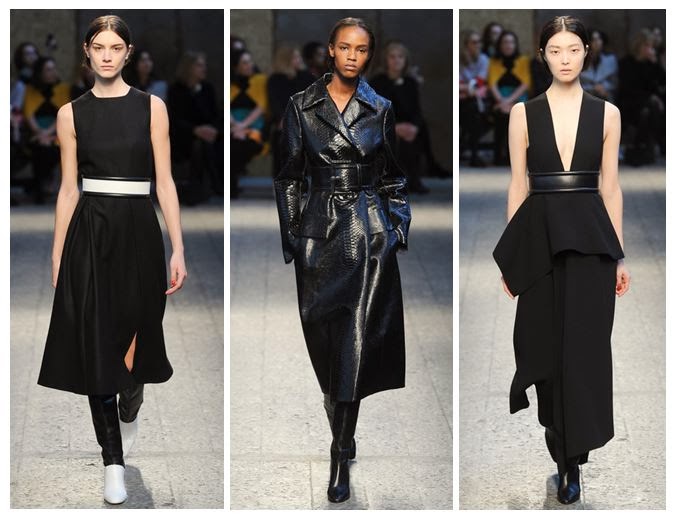
Snakeskin coat on the Milan catwalk
 Here, the belts are almost obi-style in thickness, cutting straight across the body and almost creating two separate canvases.

I think it's safe to assume that a belted patent black coat, to knee length or below, will be a staple purchase for A/W 2014 and beyond. Personally my favourite is Ferragamo's collarless minimalist number - it's neat and edgy.

 A Fashionable Animal

Salvatore Ferragamo autumn winter
 Whatever the silhouette you're going for, Ferragamo has you covered.

Animal prints as a trend for Autumn Winter 2014
 Sportmax shows its full range of animal prints in action.

This is where the real trend-led pieces come in; the ones that are less classic and more instant fashion fixes. Enter high necks, puff sleeves, print skirts and other easy separates to pair with the rest of your wardrobe.

Artistic Licence

Painted leather and fabric seen at Milan Fashion Week
 Painted leather, oil slick effects and bursts of colourful dye transform these looks.

Paint splattered clothing on trend for AW14
Clear artistic inspiration from Jackson Pollock shaped the latter part of this collection.

It's interesting that both designers chose to combine animal prints with paintbrush effects, allowing them to push their collections in new directions, and that the end results continue to be so different. You'd hardly say that the watercolour-esque mustard lines of Salvatore Ferragamo were from the same school of thought as the Jackson Pollock splodges employed by Sportmax. 

I suppose the uniting factor about these two ranges is fun; the prints are fun, the experimentation is fun, and the wearers are going to have the most fun of all.

Sunday, 16 February 2014

LFW A/W14: House of Holland and Paul Smith Dressing Women for Women

Some people say you should dress for yourself; others say you should dress for the job you want, or for a man. However, the option of dressing for other women is also a potent one, and it's been taken to heart by two polar opposite designers at London Fashion Week - Henry Holland, the man behind House of Holland, and Paul Smith

HOH iridescent AW14 lime trousers
 [Images via Style.com]. HOH brings the iridescence to the yard.

Paul Smith AW14 pyjamas
Paul Smith's laid-back eveningwear as daywear: the student's dream. Note the damask trousers, too.

Whilst the collections are hardly identical, with HOH offering a heady mix of slogans, sequins and fur whilst Paul Smith showed off dark prints and upper-class pyjama party chic, I did find some similar takeaways from them. Both took advantage of damask prints to great effect and both used shiny finishes to give their catwalk looks that extra bit of polish, but ultimately it felt that both were dressing women without the need to gain a man's seal of approval. 

House of Holland aw14 damask
 Henry Holland can do cocktail hour, and even an LBD. 

Floral and paisley prints clashing with stripes
You can never have too many prints, Mr. Smith.

These were not great looks for first dates with a man, meeting his parents or going to a job interview (even Smith's brilliantly louche suits wouldn't have gone down well with a male-led HR department) and they weren't aimed at catching a man's eye across the bar. These were pure fashion looks, aimed at the sisterhood and, in the case of Smith, borrowing from the boys in order to subvert masculinity. 

Sequinned lipstick motif and orange tutu HOH
 Layer it up as you like over at HOH.

Suits for women by Paul Smith
The boys would never look this good in masculine tailoring.

Meanwhile, HOH's lipstick and cocktail decor, set beside gauzy layers over ripped jeans, was certainly bold and brassy, but probably not likely to get many seals of approval were it donned by the ladies of Take Me Out. Instead, I felt it was about celebrating girliness and not giving a toss about what men want to see you in.

It's really liberating to see British designers bringing such a carefree attitude to dressing and not to prescribe women yet more body-con dresses or man-pleasing basics. We love clashing patterns, playing with textures and wearing something daring, so keep up the good work. Not all of us are dressing to please the men in our lives, and we don't intend to start any time soon.

Tuesday, 13 August 2013

The fashion loop: what's so radical about A/W13's high street buys?

I bloody love Autumn/Winter clothing collections; it's no secret that I normally find them more exciting and creatively diverse than Spring/Summer, when pastels, neon and all things 'cute' come out of the woodwork with ritual predictability. But this year I've found that the bigger ritual and the feeling of being stuck on repeat has come from my first glimpses of A/W13 on the high street.

Soft pale pink mid length jacket Zara AW13
That pink coat could have been bought last year, but it's a new Zara offering.
[image via Company.co.uk].

Whilst I loved the big trends of A/W12, with the burgundy and the khaki and the navy, the continual appeal of leather trousers (which have been knocking around for a few years now), the quirky squirrel and owl motifs on jumpers, the punk nail art, the fake fur and mohair in crazy colours, the dark florals, the tartan prints, the pale pink coats, the spaghetti strap silky camisoles and slip dresses, the houndstooth and the metallics and the faux-leather midi skirts, I've found them to be coming around again with very little difference in what's being offered. 

Clearly retailers know when they're onto a good thing, and we obviously all bought up the stuff last year, but how much of it - realistically speaking - needs replacing (apart from my faux-leather trousers, which need yearly replenishment as the knees always go)? How many trends are we going to buy into for the second or third consecutive year and not even bat an eyelid, dampening the impact of the really unusual trends for this coming season, like Celine's bag lady chic and Stella McCartney's oversize pinstripes? In amongst all of the recycling, the Celine and Stella tributes aren't given the edge that they need to stand out against the repeated failsafe hits.

Brocade suit from M&S in ladylike goth trend of AW12
 Brocade for A/W12 from Marks and Spencer [image via Telegraph.co.uk].

Brocade vintage style dress Marks and Spencer
Brocade comes back again for A/W13 [image via Telegraph.co.uk].

It just feels oddly like a huge case of deja-vu as I walk round the shops and browse the internet, seeing the same tartans, the same kooky jumpers, the same punk luxe and grunge pieces. In fact, currently in the Zara sale you can pick up a faux-leather burgundy pleated skirt, which looks remarkably like it could work for the upcoming season, so just buy it now and save it for a month or two and you'll be ahead of the game... or just wondering if it's a ploy to make you need the inevitable newer and shinier version that they're bound to bring out. 

Of course, people may have missed out on certain key purchases first time around, and I'm all for getting the items I should have put in my basket in 2012 (pale pink coat, please), but there's honestly very little at the moment that feels distinctly new or innovative to make this feel like a new season. Maybe the retailers are afraid to take a risk and they feel safer picking up the trends that have been recycled by designers again and again; maybe it's down to the trend forecasters looking to street style photographers and hipsters, who are all looking at each other, and we've just run out of ideas? Has there been a saturation point? Or can we expect a sudden injection of originality in September and October, when the real hardcore winter fashion starts to hit home?

Leather jacket with stitching detail and soft shearling collar AW12 Zara
 Shearling meets leather for A/W12 at Zara with this short jacket [image via Look.co.uk].

Zara leather and soft collared coat
Here it comes again, with the 'combination cropped jacket' for A/W13 [image via Zara.com].

If you think I'm catastrophising, I'd ask you to go into any high street fashion retailer - Zara, M&S, H&M, Primark - and check out their early A/W13 drop right now. Look at the items carefully and try and picture them in light of what was on sale a year ago. Does anything feel like it's too new, design-wise, to be something you could have bought in 2012? I challenge you to find five items that are definitely from this year's Autumn/Winter collection and couldn't be mistaken for last year's, or 2011's. Let me know if you're successful. The best examples I could track down were some rather brilliant furry winklepickers and slipper shoes from M&S - pure fun, but I need more like this in order to feel confident that retailers aren't getting lazy.

Wednesday, 15 August 2012

Vogue US Hits 916 Pages With September Issue

Vogue US September Issue
Lady Gaga works it on the cover. 
[Images via Fashion Gone Rogue, one of my favourite sites].

Vogue US is considered by many slaves to fashion as the Bible, and it'll be even harder to shake that reputation with their ground-breaking September issue, totaling a massive 916 pages. I can't speak for the content because it's not out here in the UK yet, but by the sounds of the cover descriptions then it's going to be going for all-out style worship, creating a retrospective. 

Who better, then, to grace the front page than Lady Gaga? Arguably she knows about going stratospheric, considering her legions of fans and the uber-cool Haus of Gaga at her disposal to create outfits. Here she's styled by the legend that is Grace Coddington and photographed by Mert & Marcus, inside the shoot.
 
Vogue US September Issue Gaga
 
I can't say that I actually buy Vogue US that regularly (maybe once a year, if that, as it isn't half as good as its Italian counterpart, though I always skim through it and look out for any shoots featured on Fashion Gone Rogue) but I'm definitely set to buy this issue. If a magazine can churn out that many pages then I'll be keen to see top quality interviews with top designers, editors and creatives, as well as working out whether the advert-to-content ratio is worth their 'biggest ever' page claim. 
 
Another interesting proposition is 'Fall Fashion for All' - I'll have my politically correct radar going off for that one, as it'll be worth seeing just how diverse this gets. Will we see tokenism or actual genuine inclusion of women outside the 'white, size 0, very young' category? I really hope that 'for all' means what it says.

As for the 'Hair is the New Make-Up' feature? That's surely one for the Neophiliacs column in Private Eye magazine...

Saturday, 4 August 2012

Lakme Fashion Week: India's Take on A/W 2012

Felix Bendish for Lakme Fashion Week AW12
Felix Bendish knows how to open at Lakme Fashion Week.

Far from there just being four style capitals of the world, Fashion Week takes over in many nations twice a year and brings the new season to buyers and press. You might not get to read as much about them unless you specifically look for designers or round-ups, but it's worth keeping an eye on what the catwalk has to offer when it's not based in London, Paris, Milan or New York. 

Today I'm turning my attention to India, where Lakme Fashion Week is a huge event. I watched the Bollywood film Fashion a few years ago and have been admiring the country's creative output ever since. Here are the designers who you should be watching, if autumn/winter 2012 is anything to go by...

Aarti Vijay Gupta LFW AW12
 Aarti Vijay Gupta produced a really intelligent and graphic collection.

Mixing quirky sketches and precise colour wheels and educational charts, this was Aarti Vijay Gupta's exercise in how to add a touch of the cerebral to your clothes. The glasses worn by the models might have taken the geek motif a bit too literally but otherwise this was a really well-produced range that wouldn't look out of place in a British boutique. I definitely want the last dress in the image above - the anatomical print is just too good to miss.

Dolly J LFW AW12
 Dolly J's take on autumn/winter reminded me a lot of Ralph Lauren.

I could see a lot of Ralph Lauren's extravagant evening gowns and autumnal colour palette in Dolly J's range, but she gave it an injection of personality that added Bollywood flavour with the embellished top seen on the left and the layers of different fabrics and finishes on the chest of the dress on the right. And, whereas Lauren kept things severe with Downton Abbey decorum, Dolly's outfits were a lot more free-spirited.

LFW AW12 Kiran Meghna, Gaurav Gupta, Tahera Peeran
 One of the coolest trends I spotted was 'half and half':
cutting vertically into the design with a different colour or style.
L-R: Kiran &; Meghna; Gaurav Gupta; Tahera Peeran.

I love the cut-and-paste style of panelled clothing (apart from horrendous 90s patchwork denim - yes, it still makes me shudder) and when it's done as well as these three examples then it shows how much fun you can have when you divert from the norm. My favourite is Gaurav Gupta's pink dress with half a sleeved jacket, which takes a leaf out of Vivienne Westwood's book with an Anglomania feel.

LFW AW12 Drashta Sarvaiya, Nupur Kanoi, Mrinalini
 Some designs gave a strong nod to Western fashion. 
L-R: Drashta Sarvaiya; Nupur Kanoi (looking very Balmain); Mrinalini.

LFW AW12 Gaurav Gupta, Virtues, Pankaj & Nidhi
 A trio of eye-catching shapes on the catwalk that caught my attention. 
L-R: Gaurav Gupta; Virtues; Pankaj & Nidhi. 

Lakme Fashion Week: Virtues AW12
Virtues went for a sculptural edge with a distinct Gothic-meets-folklore feel.

Another unmissable collection that I was drawn to was the folkloric Virtues, with heavy boots and bold trims contrasting with flowing fabrics. What's more, most of it was distinctly wearable and wouldn't look out of place on the red carpet or in the pages of Western fashion magazines. I definitely think that more fashion editors should look to Indian designers for inspiration and photo shoot material, as there's a wealth of talent out there.

[All images taken from Vogue India and the official Lakme Fashion Week website].

Tuesday, 31 July 2012

Dior A/W2012: Illustration

Dior Dress A/W2012

Just a hint of colour to suggest the cerise pink of this dress.

Another illustration has made its way out of the vaults - yep, I've been digging up loads of my old sketches. This is a glimpse of what Dior brought us for A/W2012, which reminded me of Roksanda Ilincic-style gowns due to the t-shirt shape on the body. The layers of tulle give a nod to the opening credits of Sex and the City, but this is a more polished look than what our heroine SJP was striving for on the streets of New York. The colour wasn't representative of the rest of the collection, by any means, but that's kind of why it stood out for me: a flash of something urgent amidst the other (still remarkable) pieces.

I found the model a tad too skinny so I fleshed her out a bit - she might not have made it onto the catwalk this way, but I think she looks a lot healthier.

[Illustration my own - please ask before reproducing].

Friday, 25 May 2012

A/W 2012-13 at Yumi, Part 2: A Closer Look

A cosy but fun swing coat in mustard-tinged yellow.

What I love about this coat: the bold button fixtures are practical but they also add clout; the rose print is abstract enough to resemble polka dots from far away, which is more forgiving than a tight ditzy floral pattern; the contrasting collar works so much better than keeping things the same, and it makes the colour more forgiving for people like me who have a sallow complexion.

Ready for a close-up? 

The pink jumper seems to have a touch of mohair/angora, which I think makes it even more tempting. As for that big gold button, it's a simple vintage touch that helps to make this coat look extra special.

'Prints charming' with these bird designs.

The owl blouse is what I often refer to as Holbein blue: a bright teal shade that was often used by the artist Hans Holbein the Younger, which really stands out. The simple print isn't too complicated and it uses little bows in between the owls.

Inside the showroom

You can just catch a glimpse of the fashion film made by Fleur from the PR team. It was also vintage-inspired, with that sort of dreamy sun-drenched feel (think California or Carnaby Street).

Those finishing touches...

I love a good retro accessory, so you can see why I was drawn to the radio, satchel and case on the shelf above the new collection. I like how the satchel's floral print mirrors that of the coat and blouses with their black rose motif.

Chintz and knits

Having worked previously in White Stuff and been involved in creating window displays and visual merchandising in-store, I felt right at home with the china plates, old lampshades and woodland wallpaper used here. Everything worked well together and helped to show off the collection without dominating it.

Duck, duck, goose

I'm a little bit in love with this print. Not being up on my bird species, I want to say it's a mallard, but I have a feeling that I'm way off the mark. Birdwatching aside, this is a fun print that isn't going to make you look too girly as it has an arty edge.

Specs appeal...

A classic range of monchrome prints featuring glasses, bow ties and top hats was highly effective and made a great focal point. The whole Mad Men vibe is going to have that spectacle cardigan flying off the shelves.

Putting on the Ritz...

This shirt doesn't actually glow - it's just me playing around with photo effects. However, it really shows off the moustache design and I'm sure this will be another big seller.

Colour block corner.

Some girls are indecisive about colour, but this clutch does the hard work for you. Channeling Celine, it's a wearable piece that looks sturdy enough to survive a good few nights out.

Nailed it.

Nail artist Sophie Harris-Greenslade of The Illustrated Nail, whose work has been featured in Stylist, ElleUK.com and I.D Magazine, was on hand (excuse the pun) to provide amazing designs. Not only was she incredibly accurate and inventive, but she was also great fun to talk to. I came away with a beautiful set of nails featuring polish by Essie and Barry M alongside intricately painted heart and lipstick motifs. Stay tuned for the photos.

Wednesday, 23 May 2012

A/W 2012-13 Preview at Yumi: Photo Essay


This week I was given a sneak preview of Yumi's collection for A/W 2012-13. My full blogger report is still in the pipeline, but I thought I'd show you some of the brilliant prints and textures coming into play for next season. The big trends I picked up on were English Eccentric (repeated motifs included bow ties, ducks, owls and spectacles) and the Swinging Sixties (swing coats, Peter Pan collars, colours like mustard and burned orange, shiny PVC/Vinyl raincoats in ultramarine and pillar box red). I love the girly vibe and the way that the pieces could be dressed up or down.

Just to brighten things up mid-week, they even provided a pick 'n' mix stand, a nail artist and retro-style drinks. Look out for more photos, including my top picks from the collection, coming soon.

Wednesday, 7 March 2012

PFW A/W2012: Kanye West Relies on Old Ideas for Attention

 [Images via Stereogum]. 
Boots with multiple straps... where have we seen that before?

I'm still not convinced by the whole 'Kanye West, Fashion Designer' thing. Personally I find him to be outspoken and out of touch with reality, and his desire to be cutting edge all the time (and to often rant in CAPITAL LETTERS LIKE HE IS SHOUTING) seems to wear a little thin. It was with trepidation that I researched his latest efforts on the catwalk, and rightfully so. The image above illustrates the kind of pieces that West considers to be ground-breaking, as if he has invented the wheel. Multiple straps on shoes, boots and heels are hardly news to many fashion lovers, especially when they look as clunky as this.

 In which Kanye has just got the memo about the goth/grunge look from last Autumn/Winter

A large part of this show was about old aesthetics and the generic looks that we're all too familiar with, from bondage-tainted leather jackets to smudgy black kohl and high necked pieces which add to the severity of the whole affair. It would have been nice to see individual quirks and influences in the collection, or something that reflected personality rather than recycling of industry standard trends such as the massive fetish moment last time we embraced Autumn/Winter.

This is what the wool from a foetal lamb looks like. Brace yourselves

I have spoken on the blog before about my views on real fur in modern society, but this really takes the biscuit. I don't consider myself to be much of an animal lover, let alone an activist, but it's genuinely horrifying to see what the coat of a foetal lamb looks like when it's been turned into a two-piece. There really isn't an excuse for using this as a fabric, no matter how cool you think it might look (which, incidentally, is not cool at all). Where is the inventiveness in taking an unborn animal and using it for a fashion statement? What's wrong with experimenting and producing digital prints, like Mary Katrantzou or Etro, but using your own ideas? Why not explore the textures of knitwear or faux fur and add your personal touch? How about slogans that mean something to the designer? It really strikes me that this collection is leaning on the use of various animal offcuts to make headlines, and that is both lazy and immature. 

To be honest, I wouldn't have expected anything less from the self promotion machine that is Kanye West, but it's disappointing to see that all his interning and studio time hasn't led to any creative development.


Related Posts Plugin for WordPress, Blogger...