Showing posts with label art. Show all posts

Wednesday, 26 February 2014

Milan Fashion Week A/W14: Salvatore Ferragamo and Sportmax Have Arty Animal Instincts

Being a self-confessed lover of all things leopard print (from shoes to pyjamas), I always have my eye out for a peek of it on the catwalk, especially as it rarely goes out of fashion. Many style bibles may claim that zebra takes over in certain seasons, but the truth is that leopard is here to stay, reminding us of everything from 1950s kitsch to 1980s sex kitten glamour, purely because there are so many visual references aligned with it.

Naturally I was pleased to see leopard print appearing in the collections of two Italian heavyweights, Salvatore Ferragamo and Sportmax, but I also noticed some other thematic similarities between the two, such as delving into other animal prints (specifically patent black coats with a croc or snake finish) and experimenting with painterly touches. 

Rawr Prints

Tan leopard print coats and overcoat
 [Images via Style.com]. Ferragamo favoured soft leopard tailoring worn for high impact.

Leopard dresses and jacket on Italy catwalk
Sportmax opted for a brighter and more precise print, teamed with leather trims.

I love how differently the print has been interpreted by each designer, and how far removed the two central looks can be, with Ferragamo's 70s-style tan cape battling against the 90s slim-fit approach from Sportmax. 

Black Lines

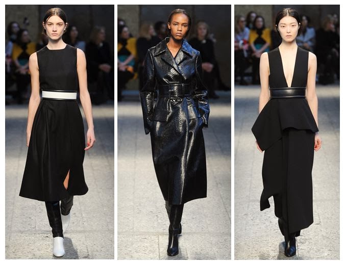
Black dresses with varying textures on the catwalk
 The power of applied volume and precisely placed belts is at hand.

Snakeskin coat on the Milan catwalk
 Here, the belts are almost obi-style in thickness, cutting straight across the body and almost creating two separate canvases.

I think it's safe to assume that a belted patent black coat, to knee length or below, will be a staple purchase for A/W 2014 and beyond. Personally my favourite is Ferragamo's collarless minimalist number - it's neat and edgy.

 A Fashionable Animal

Salvatore Ferragamo autumn winter
 Whatever the silhouette you're going for, Ferragamo has you covered.

Animal prints as a trend for Autumn Winter 2014
 Sportmax shows its full range of animal prints in action.

This is where the real trend-led pieces come in; the ones that are less classic and more instant fashion fixes. Enter high necks, puff sleeves, print skirts and other easy separates to pair with the rest of your wardrobe.

Artistic Licence

Painted leather and fabric seen at Milan Fashion Week
 Painted leather, oil slick effects and bursts of colourful dye transform these looks.

Paint splattered clothing on trend for AW14
Clear artistic inspiration from Jackson Pollock shaped the latter part of this collection.

It's interesting that both designers chose to combine animal prints with paintbrush effects, allowing them to push their collections in new directions, and that the end results continue to be so different. You'd hardly say that the watercolour-esque mustard lines of Salvatore Ferragamo were from the same school of thought as the Jackson Pollock splodges employed by Sportmax. 

I suppose the uniting factor about these two ranges is fun; the prints are fun, the experimentation is fun, and the wearers are going to have the most fun of all.

Friday, 6 December 2013

From Viktor & Rolf to Van Gogh: The Ultimate Amsterdam Fashion Week Outfit

Amsterdam Fashion Week is known for being a hotbed of talent, showcasing the best in Dutch design to a clamouring fashion pack from around the world. So, when Fashion Chick invited bloggers to dream up their ultimate outfit to wear in Amsterdam for the occasion, I couldn't resist taking up the challenge. Here's what I came up with and why I chose each piece...

Amsterdam-inspired fashion outfit in Van Gogh yellow
[Clothing images via Fashion Chick. Background image, Van Gogh's Sunflowers, via Wikimedia Commons].

I wanted to capture the bold silhouettes of Dutch designers such as Viktor & Rolf, but also get a flavour of the Netherlands' great art scene, which is a constant source of inspiration for creative types. From vintage art legends such as Van Gogh in the newly re-opened Rijksmuseum to up-and-coming talented students, it's an inspiring place to be.
  • I started with a Vivienne Westwood Anglomania Halton dress, covered with text and being a real statement piece. If you want to see more oversized text, the iAmsterdam sign is a cool place to hang out in the city - I'd have to make a pilgrimage in my fashion ensemble.
  • I added a black cape by Lovarni to give a nod to the Viktor & Rolf retrospective at the Barbican several years ago, where dolls were clad in their designs, including voluminous cape-like coats.
  • Accessories were Miu Miu cat's eye sunglasses, which add to the doll aesthetic, and a sunflower yellow spider clasp bag by Charlotte Olympia worthy of any Van Gogh fan with a designer budget. Of course, there had to be some real Viktor & Rolf in the mix, so I chose a waist cinching leather mirrored sphere black belt to work well with the Anglomania dress.At only €49 from Hervia (sourced using Fashion Chick), this is a real bargain.
  • To continue the sunflower yellow injection of colour, I went for Topshop's Logan flared heel platforms, which add to the vintage feel of the whole outfit, perfect for taking out on the town at all those Fashion Week after-parties.
Aside from the items I've chosen, I'd also be keen to browse the city's best shops. I've done my research thoroughly and I know there are some great retro boutiques to visit, like Wini Vintage, as well as the Nine Streets, a key shopping area. To top it all off, the World Fashion Centre mall offers a huge range of stores and would keep me busy for hours.

So, that's my dream outfit to bring to the streets of Amsterdam, and an idea of what I'd get up to if I was jetting off to experience the best of Dutch design. Would you channel sunflower yellow or would you go for something totally different? Let me know what you think.

Wednesday, 28 August 2013

Lakme Fashion Week: Aarti Vijay Gupta puts the art into Winter/Festive 2013

Fashion Month may not have begun yet for New York/London/Paris/Milan, but Lakme Fashion Week has already come round again - how time flies in the style calendar. Right now, the hottest Indian designers have just shown or are about to show their collections to the crowds, causing Bollywood's finest to flock to the side of the catwalk (or even to be part of the show). 

First up in this series of posts is a design talent who has the edge when it comes to prints; this season she's really showed her artistic knowledge.

 Aarti Vijay Gupta hits the right notes with her Winter/Festive designs.
 [Images via The Fashion Weekend.]

 I love the cut of this trouser suit.

Aarti Vijay Gupta has to be my favourite designer to come out of India. I've written about her many times previously on the blog and compared her eye for prints to that of Mary Katrantzou, and this season's offering was even more fun and fearless. She called it simply 'I Love Music' and combined linear drawings of trumpets, drums and pianos with classic music-themed paintings by Salvador Dali and Pablo Picasso (The Red Orchestra and The Old Guitarist, respectively). 

 Dali's surrealist painting sees a skeletal man playing another like a cello.
[Image via Wikipedia.org.]
 
 Picasso's Old Guitarist was part of his Blue Period.
[Image via Wikipaintings.org].

This was a youthful and lively collection, standing out from the current punk trend that's rocking the UK and feeling more authentic. As ever with Gupta, the shapes of pieces were edgy and directional, from crisp jumpsuits to minimalist sheath dresses, accessorised with the white spectacles that have become a signature part of her work. It feels like she has really hit her stride.

If you want to see more examples of art inspiring fashion from the blog, check out the Ansel Adams and David Hockney-esque prints by Warehouse and the Delaroche tribute dress by Giles Deacon that had me waxing lyrical. For even more designer insight, see my report from the front row of Holly Fulton's A/W 2012 show and my backstage interview with her about the connection between fashion and art. Make no mistake, readers: the two topics are firmly intertwined, as Aarti Vijay Gupta has proved so recently.

Monday, 15 April 2013

Dante Does Istanbul: Dilara Findikoglu Creates Her Own Wonderland

Today I've been talking Turkey, with a visit to Istanbul INN London, a promotional event to raise awareness of the city's cultural output, from food and drink to architecture and art. But the section that was strongest was definitely the fashion, where hot new designers showed that Istanbul deserves to be noticed on the international scene.

Dilara Findikoglu close-up of Dante's Islamic Inferno t-shirt
[Images taken at Victoria House, London].
A real mixture of fabrics, with a sports luxe feel, clashed with historical prints.

Inspired by Dante's Inferno, Turkish designer Dilara Findikoglu has created a totally unique and unforgettable collection which reminded me slightly of Mary Katrantzou (in her use of intense prints) and Alexander McQueen (in the careful attention to corporeality and also in using antique religious drawings as a basis). 

Dress, body harness and t-shirt by Dilara Findikoglu
 There's something for every type of dresser - from the daring harness wearer to the shift dress lover.
And I still can't get enough of those prints...

The collection is known as 'Dante's Islamic Inferno', due to the repeated references to Islamic architecture, such as beautiful glass or tile patterns, but also lettering in the prints. Other recurring motifs are as diverse as skulls, interlocking hands and palm trees, as well as the occasional anatomical heart and a miniature Medusa painting. 

Prints including Islamic text, palm trees and skulls, by Dilara Findikoglu
 You just know this collection would look amazing dressed up or down. Or just styled in a photo shoot in an abandoned warehouse.

Dilara studied fashion at Central St. Martins College in London and has also been a stylist and fashion editor for several magazines, so she's got a strong creative background, but she's also incredibly young (yep, just to make you feel like an underachiever!). Aside from Dante Aligheri, she says that she's inspired by 'parapsychology', 'Katie Shillingford' (of Dazed & Confused - one of my hair icons!) and 'flowers'.

Exhibition space at Istanbul Inn London - Dilara Findikoglu
The exhibition space was set up in this sort of homely-cum-creepy atmosphere, with armchairs and books but with clothes strung up like pieces of meat. I loved the contrasts.

My only gripe? I CAN'T FIND WHERE TO BUY THIS AMAZING STUFF. Seriously, I'm being tortured here. If you want to see more of Dilara's work, check out her Cargo Collective account, but otherwise you'll have to hold tight and wait for it to go on sale somewhere soon. I'm crossing my fingers for a pop-up shop...

Tuesday, 12 February 2013

Thom Browne A/W13: Alice in Wonderland, set in the 80s

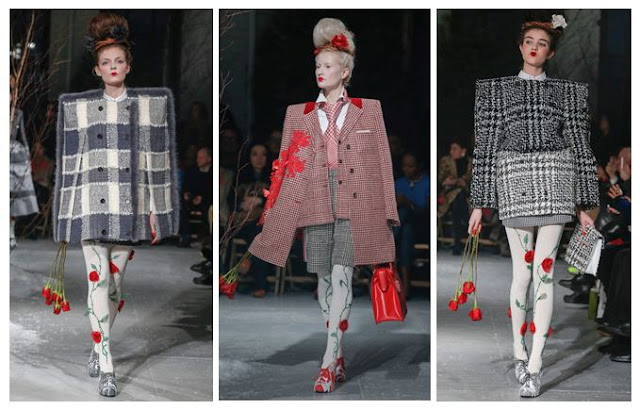
I've had my eye on Thom Browne's quirky designs for a while now, but this collection made me stop in my tracks. It's as if he made up a recipe with equal ratios of Lewis Carroll, Gwen Stefani, Russian dolls, 1980s power dressing and an angry Miss Havisham, then added an extra sprinkling of rose petals for good measure. My favourite parts of the concoction, including one of the best girl-with-attitude pouts yet:


Thom Browne Fall 2013 Red Roses and Pintucks
 [All images via Style.com, except where credited]
Excess All Areas

Browne's love of full volume design is always at the forefront of what he does - there's rarely any subtlety involved. That means an entire outfit in red, a pintuck-upon-pintuck dress with a corseted waist or a rose-strewn tulle gown with co-ordinating headpiece.

The typical Browne girl, if there is such a thing and she can be pinned down to a mere stereotype, is someone who refuses to be a wallflower. She probably loves cupcakes and Tim Burton films and wanted to be a horse when she grew up.

Thom Browne Fall 2013 Red Lips and Roses
 Roses Are Red

It's all about the 1980s bouffant, even down to the frizz. Backcombed to seemingly impossible heights, it then has corsages pinned carefully into place, teamed with groomed brows, a pinch of blusher and a geisha-style lip in vibrant red. The overall effect is that of a Russian doll who's been listening to power ballads and works in an office. Makes perfect sense to me...

Thom Browne Fall 2013 Grey
 The Lady is a Vamp

These shoulders are markedly different from the Henry VIII shoulders rocked at Burberry last season; they're more elegant and often angular rather than solidly inflated in appearance. If you've seen Browne's work before, you'll know he loves to exaggerate the silhouette like this, with American footballer shapes for men. 

These images also remind me of the micro-trend on street photography websites, for fashion editors and celebs to wear their jackets balanced on their shoulders, rather than putting their arms through the sleeves - the shapes here look very similar. Perhaps this is a case of the street influencing the catwalk?

Thom Browne Fall 2013 Red Embroidery and Embellishment
 The Gathering 

Hitch up, look sharp, as Dizzy Rascal didn't quite ever say. Gathered layers of fabric were heavily embellished or accessorised with everything from fur trims (though I hope they're not real) to Edwardian ruffles. The nipped in waist is a great antidote to the effect of wide skirts and fussy sleeves.

Thom Browne Fall 2013 Geisha Pout
 A Pout To Rival McKyla Maroney's Meme

This is a look that says, "I don't care if you hate what I'm wearing, because I bloody love it." Topped off by power brows, obvs. 

McKayla is Not Impressed at Fashion Week
Sorry, McKayla.
[Image via Memecrunch.com]

Thom Browne A/W 2013 Grids and Tweed
Squaring Up

Again, these are not Henry VIII or American footballer shoulders, but they're something else. In this case, more of a masculine shape, but made to seem all the more square and grid-like thanks to the choice of geometric tweed fabrics. There's also a sort of Alan Titchmarsh twist (yes, really - I haven't gone totally mad, but it is a tenuous link) in that the square patterns work really well with the climbing roses. Sort of like a trellis - see? Just me? Oh well. Maybe I've spent too long analysing this one. 

Still, Thom Browne's Autumn/Winter outlook is rosy as far as I'm concerned. Just get me some 80s tunes, a can of hairspray and some roses and I'll be desperately recreating the look in no time, though maybe not without the set designer's additions of men tied to hospital beds.

Saturday, 15 December 2012

Finchittida Finch Christmas Pop-Up Shop at Boxpark Shoreditch

Last Thursday night I wrapped up warm and made a festive pilgrimage to Boxpark in Shoreditch, where cutting-edge jewellery designers Tida and Lisa Finch, of Finchittida Finch, were celebrating their Christmas pop-up shop (complete with beautiful snowflake-print walls and decorations). I know the girls from school and college (ah, memories of A-Level Art!) and they've always been immensely talented, so it was great to catch up over some Beerlao and see what they've been up to. 

Finchittida Finch Jewellery in Boxpark
 Making a statement in silver and gold.

Finchittida Finch Jewellery - Monozygotic Talismans
 Arm yourself with some eye candy.

Specialising in intricate laser-cut statement pieces that have been sported in music videos by the likes of Ashanti, Mele and Lianne La Havas, you'll probably find that their work looks distinctly familiar, and you should be prepared to see much more of them in 2013. 

Finchittida Finch Jewellery - Monozygotic Talismans
 Each piece was set in a screen-printed jewellery box.

Finchittida Finch Jewellery - Monozygotic Talismans
 A necklace and body chain on display.

A large part of their inspiration for the current Monozygotic Talismans collection comes from their Lao heritage and fascination with Lao culture, which is transposed into symmetrical forms such as oversized earrings, body chains with multiple panels and quirky tribal alphabet initial necklaces, in a wearable colour palette of gold, silver and black. 

Finchittida Finch Jewellery - Christmas Pop-Up Shop
 Decisions, decisions...

Finchittida Finch - Monozygotic Talismans
 [Image via the girls themselves] L-R: Tida and Lisa, of Finchittida Finch.

Finchittida Finch Lao Heritage - Loy Krathong
 Their Tumblr blog shows recent celebrations of the Lao festival, Loy Krathong. 
 How fun and colourful does it look?! (Meadham Kirchhoff would totally love this).

 One reason for their use of symmetry is that Tida and Lisa are twins (hence the 'Monozygotic' reference). I loved the fact that they'd used the snowflake - yet another symmetrical design - as the basis for their Christmas shop.


Finchittida Finch Jewellery - Initial Necklace
 Judging from this photo, the letter 'S' is immensely popular amongst alphabet pendant fans.

Finchittida Finch Jewellery - Initial Necklace
You can see how the different tiny sections are cut to create the finished piece.


Finchittida Finch Tribal Alphabet Necklace
 Here's what I bought: a P, obviously... (as worn at home by my battered cherub statue).

Finchittida Finch will be hitting Boxpark with another pop-up stint throughout January. If you're in the area then make sure you check them out and bag yourself a unique piece of jewellery. For those of you unable to get to Shoreditch, head to their profile on ASOS Marketplace.

Sunday, 18 November 2012

Death: A Self-Portrait, at the Wellcome Collection

This Thursday I headed to the Wellcome Collection in London for the first day of an important new exhibition which tackles one of society's biggest taboos: death. Though we all know that death is an inevitable conclusion - the 'self-portrait' of the title refers to you, too - it's something which most cultures struggle to articulate and prefer to leave as an afterthought. The Wellcome does the opposite and confronts the Grim Reaper-shaped elephant in the room, which is both brave and eye-opening.

 La Vie et Mort postcard, c.1900-1910, with unforgettably clever imagery.
All images via the Wellcome Collection.

The exhibition is based on the huge collection of deathly artwork amassed by former art dealer Richard Harris (no, not the bloke who played Dumbledore), gathered over 12 years and covering all kinds of different cultures and time periods. From a 1300s skull sculpture to 1800s Japanese paintings, right up to an incredible plastecine piece (2011) by an Argentinian art collective, the theme of mortality is ever-present. If you're one of those people who finds morbid imagery a bit too creepy then this is a brilliant place to confront your fears and end up feeling a bit more comfortable with skeletons, bodies and rituals.

When Shall We Meet Again? Gelatin silver print, c.1900.

As someone who loves skull motifs and wrote an incredibly long art theory essay on anatomy in the art world, I was certainly in my element exploring the collection, from vanitas portraits to anonymous photos featuring people posing alongside skeletons. Death is one of those things that unites us all, rich or poor, and it completely goes against the kind of things I write about on this blog for the rest of the time - all those outfits and handbags mean very little once you're gone, except for maybe helping you to look your best in the funeral home. This exhibition looks at some of the ways in which people try and keep memories alive, through portraits and ritualistic altar building, and also the ways in which they begin to accept death, such as in the use of memento mori in imagery. There was also a lot of attention paid to anatomical discoveries and the advances that helped us to understand the body, which obviously involved cadavers, and there was a really touching sepia photo from an anatomy class that was titled 'When will we meet again?' that caught my eye. The contradiction of preserving bodies by exploring an expired one is something that anatomists are constantly aware of.

If you're at all interested in skulls and conceptual imagery then you need to pay a visit to the Wellcome Collection; it's free, fascinating and you will come away with some very big questions. There is also a series of events accompanying the exhibition, so take a look at the website and find out how you can get under the skin of this important topic. It definitely puts things in perspective.

Death: A Self Portrait - 15th November 2012 - 24th February 2013.

Wellcome Collection, 183 Euston Road, London NW1 2BE (nearest tube station is Euston Square).

Tuesday, 25 September 2012

Illustrations: LFW S/S13 Hellen Van Rees

LFW Vauxhall Fashion Scout SS13 Hellen Van Rees
Some quick drawings I made on my lunch break using the Paper app, based on the work of Hellen Van Rees at London Fashion Week's Exhibition as part of Vauxhall Fashion Scout.

I love the deconstructed threads of Van Rees' pieces and how the colours blended together: grey, aqua, acid yellow and black. Those boxy structures around the collarbone and down the side of the top were fantastically 3D and worked incredibly well as both a talking point and something you could imagine being worn - perhaps not in everyday life, but in a more surreal environment, where fashion is artistic rather than functional (i.e. not in the middle of Asda).

What also struck me is how democratised her work seemed: it would look just as impressive on a size 8 as it would on a size 18, because the structural forms are where the focus lies.

LFW Vauxhall Fashion Scout SS13 Hellen Van Rees
This piece felt like a play on the peplum trend, and it definitely worked (my sketch, less so, but you get the general idea).

Van Rees stood out for me as being willing to take risks and really experiment with texture and space - not just bringing out a collection of black space age garments and expecting everyone to think she'd reinvented the wheel. What she brought was innovation and a sense of fun; I could imagine Lady Gaga wearing her designs for a night out as much as a serious model in an editorial shoot.

Sunday, 9 September 2012

Black Light: Alexander Wang S/S 2013 vs. Viktor & Rolf S/S 1999

When I read about the amazing black light finale at Alexander Wang's S/S 2013 show, I couldn't help but compare it to the work of Viktor & Rolf. Wang's use of visual trickery to completely transform his collection is fantastic, but it's worth comparing it to what Viktor & Rolf created for for their own Spring/Summer collection of 1999. Let's hit the lights.

Alexander Wang

Alexander Wang SS13 Black Light
[Image via Style.com]

The only warning of what was to come was the announcement that flash photography was not allowed at Wang's latest show. Bewildered attendees must have wondered why, as it was only in the closing moments that the lights went down to reveal an ethereal glow from the clothing. What could have ended up like a tacky disco moment was instead made into a sleek piece of artistry because of the cut-out nature of each piece, creating bold panels of white and complemented by a single line on each model's head that marked their bodies out against the darkness. Wang referenced the futuristic film Tron to put the effect into context.

So, how was the panelled effect achieved so successfully? Using fishing line. This makes each part seem to be suspended in thin air, which adds to the artistry of the whole collection, right down to the simplistic white stilettos with thin straps that divided the legs into neat sections. Essentially the black light helped us to see each look in its own right, without distractions.


Viktor & Rolf

Viktor & Rolf SS99 Black Light

[Image via Google Books]. 

It's such an early moment for the design duo that V&R's Black Light doesn't even feature on Style.com (my Bible for quality catwalk images that don't look like they've been taken by someone nine rows from the front row using a dodgy Blackberry). Instead I turned to Fashion at the Edge: Spectacle, Modernity and Deathliness by Caroline Evans, to find what the author described as 'their last spectral collection before they launched themselves into the real world of embodied fashion and commerce'. The designs were firstly shown in black light, then in normal conditions, to show the transformation.

What I gleaned from the images was that Viktor & Rolf were already establishing themselves as not being easy to categorise: the designers who couldn't be neatly put into a box. This was about having original ideas and wanting to put on a show, making the wearer feel like a gallery piece rather than a sex object or a dowdy housewife. It was part-freak and part-opulent, yet somehow the aesthetic worked, down to the skeletal lines on a trouser suit.

Comparing the Two

Wang's use of lighting might seem like an afterthought compared to V&R's theatrical staging, but I think we have to remember that Wang is able to take fewer risks as the creator of a highly commercial brand. What he has produced is just enough quirk to raise the stakes of Fashion Week, without alienating buyers and your middle-of-the-road fashion lover. Keeping trendsetters and trend followers equally happy is not an easy task, but he seems to have pulled it off without totally plagiarising his black light trailblazers.

Sunday, 26 August 2012

Warehouse's Arty Prints: David Hockney and Ansel Adams Would Approve

After spotting an amazing canyon-print dress from Warehouse in one of the Saturday papers, I couldn't resist making comparisons between its design and that of David Hockney's Grand Canyon photo collage, and even his paintings of the landmark. Logging onto the website, I then tracked down another art-inspired dress that reminded me of legendary photographer Ansel Adams. As an art graduate I'm always chuffed to find major high street brands taking their cues from artists, and I thought I'd show you just how I made those connections.

Warehouse Canyon Dress
 [Images via Warehouse and Lalouver].
 The Canyon Print Dress (£70) is sure to make an impact.

I like that Warehouse has put such a bold print on the entirety of the fabric, not cutting into it with plain sections but allowing it to dominate. The horizontal bands are much like Hockney's intense collage, following the form of the wearer like his photos follow the canyon's shape.

Warehouse Canyon Dress - Hockney
[Images via Warehouse, Artnet (photo of the artist) and the National Gallery of Australia].
I'm guessing a little bit of Hockney inspired the designer.

What strikes me is how the multi-layered rock formations  and colour bands sit on one piece of chiffon but give the illusion of several pieces sewn together. You can see in Hockney's painting, A Bigger Grand Canyon (1999), that colour divides work well and help to illustrate the way that the canyon has different facets. There's also a warmth to the painting that translates to the dress - that fiery vermillion against a snippet of cool blue. Already I have a few locations in mind for creating an outfit post with this - either a dry river bed or an abandoned building - if only I can get saving up that £70...

Warehouse Ansel Adams Polaroid
[Images via Warehouse and Tumblr].
Poetic and with the lightness of a Polaroid.

A different cut to this Landscape Print Dress (£55) but still a big link to artistry, with this china blue and white print that reminded me of a teal Ansel Adams Polaroid photo of Yosemite Falls (1979). If you changed Adams' work to that same royal blue, I think the comparison would be even closer. I also love the pin-tuck in the waist band that makes the fabric kick out, like a waterfall.

Warehouse Landscape Print Dress
 There's also an element of Japanese artist Hokusai, but I'm more drawn to the photographic elements of the print.

The slight mullet hem brings this bang up-to-date and also helps to emphasise curves. The whole piece is lined to the hem, so don't worry about revealing your modesty.

Ansel Adams vs. Warehouse
 [Image via Weston Gallery, and close-up Warehouse].
This is an example of Adams' straight photography and how it complements the print of the fabric.

My final comparison shows how the delicate foliage and waterfall shot by Adams in Yosemite seems similar to the print on the dress. I don't know for sure whether the designer had referenced him directly, or even looked at his work, but I feel that there is a natural link there, and it's great to see that fashion is continually looking to the art world for its eye-catching prints.

Sunday, 5 August 2012

Sketchbook Magazine Goes Online: Interview with the Editor

Sketchbook Magazine Online
When I read recently that the iconic Sketchbook Magazine (staunch supporter of illustrators, fashion bloggers and creative types) was being re-launched, I was intrigued to see what the new look publication would be like. As a self-confessed magazine junkie who'd readily spend my weekly food shopping money on creative glossies, it's fair to say that anticipating the re-launch was a bit like counting down to Christmas. And the best bit? It's moved totally online, giving you unrivalled access to the best up-and-coming design talents from the creative industries - artists, fashion designers, photographers and graphic visionaries. I caught up with Editor-in-Chief Wafa AlObaidat to find out what Sketchbook 2.0 is all about, learn what the Sketchbook Design Society will do, and to seek advice for any budding illustrators out there who want to submit their portfolio. Say hello to your new favourite bookmarked website...

"We want to tap into a bigger audience, but also we have too much to share and our previous blog layout didn't do the site justice at all," explains Wafa. Fully aware of the importance of digital platforms in magazine publishing, she continues, "We also wanted to compete with other online magazines of an international standard and, in order to do so, our online presence has to be strong." 

I completely agree; working with online content on a daily basis in my full-time job, I can see how easy it is for blogs and websites to reach people and create a permanent resource for them that is indexed by Google, whereas print versions don't have the same longevity. But will there ever be a printed edition again? "Ideally we want to get Sketchbook in print and online and we are ready for that transition but it was time to upgrade the site and allow for more of a regular platform for contribution."

One of the magazine's strengths is its collaborative style: the idea that you could add your own work to the living, breathing showcase that is the website seems incredibly tempting: "We want to get them to collaborate with other creatives within our network," she says. They receive over 50 portfolios a day and "pagefuls of invites to events" which are then distributed to correspondents around the world. Obviously the beauty of taking things online means that these events will now be reported as they happen, with daily updates and a fast turnover of editorial content. Alongside all of this is the brand new initiative that Wafa is championing, known as the Sketchbook Design Society, found as a tab on the website:

"It's a member-based organization of design professionals, educators, administrators, students and associates in communications, marketing, media and design-related fields. Our goal is to raise the general standard of design in Bahrain [where she's based] and the Middle East, and we hope to inspire local designers and engage the public."

It all sounds promising, but I can't help wondering if there's any time left for pop-up projects - something the publication became famous for with its 3 week series of live events in London's Carnaby Street back in 2010, which included Issue 1 cover star Susie Bubble as a speaker. "Once we establish a society of creatives, we may then continue to pop up and do spontaneous events,"Wafa reassures me. 

Sketchbook Magazine Tablet


So what do you need to know if you're looking to submit something to the site, either as a feature or a creative contribution? If you're fresh out of uni then don't panic - "A big slice of our audience are emerging and young creative designers and illustrators and recent graduates of art school." Here are Wafa's top tips for getting involved with the site and on launching your career:

  • Get your CV done in a creative way and check out the fan mail section on our site for inspiration. Creatives who email us with interactive portfolios are the ones that get a call back. 
  • Get as much PR coverage as possible, and also continue to contribute to get your name out there, and build your name in the industry. This will allow clients to email you for services.
  • Define who you target audience is and start emailing them requesting to work with them. 
  • Be active online, social media wise, and do as much work as you can!  
Basically, if you're sitting at home wondering whether to submit something, then the world's your oyster as far as I can see. The new look website is a springboard for you to carve out a name for yourself and it's a great way to see what your peers are producing as well. Even if you're an observer rather than a creator, it's just as fascinating to see what graduates are coming up with and find out about industry news.

When asked for three words to describe the all-new Sketchbook, Wafa has a think and then picks five: "Clean, modern, minimal, user friendly, smooth." Just another example of how the publication goes beyond expectations. 

To join the Sketchbook Design Society, head to the dedicated tab (next to the Magazine tab) on the homepage.

[All images courtesy of Sketchbook]. 

Tuesday, 31 July 2012

Dior A/W2012: Illustration

Dior Dress A/W2012

Just a hint of colour to suggest the cerise pink of this dress.

Another illustration has made its way out of the vaults - yep, I've been digging up loads of my old sketches. This is a glimpse of what Dior brought us for A/W2012, which reminded me of Roksanda Ilincic-style gowns due to the t-shirt shape on the body. The layers of tulle give a nod to the opening credits of Sex and the City, but this is a more polished look than what our heroine SJP was striving for on the streets of New York. The colour wasn't representative of the rest of the collection, by any means, but that's kind of why it stood out for me: a flash of something urgent amidst the other (still remarkable) pieces.

I found the model a tad too skinny so I fleshed her out a bit - she might not have made it onto the catwalk this way, but I think she looks a lot healthier.

[Illustration my own - please ask before reproducing].

Thursday, 19 July 2012

Going for Gold - Illustration

Gold Eye Make-up Illustration
Goldeneye.

Here's a little illustration I produced last month which has been waiting for the right time to pop up on the blog. There's nothing like a dramatic eye to get you noticed... 
Block colours have been hitting the catwalk left, right and centre, but this was also inspired by the influx of Art Deco-style accessories available at the moment (which will continue into next season and probably peak with the film adaptation of The Great Gatsby) and the gold lust of Team GB pre-Olympics. Get ready to see a lot more gold in the media frenzy, kids.

[Illustration my own. Please ask before reproducing].

Related Posts Plugin for WordPress, Blogger...