Showing posts with label LFW. Show all posts

Sunday, 16 February 2014

LFW A/W14: House of Holland and Paul Smith Dressing Women for Women

Some people say you should dress for yourself; others say you should dress for the job you want, or for a man. However, the option of dressing for other women is also a potent one, and it's been taken to heart by two polar opposite designers at London Fashion Week - Henry Holland, the man behind House of Holland, and Paul Smith

HOH iridescent AW14 lime trousers
 [Images via Style.com]. HOH brings the iridescence to the yard.

Paul Smith AW14 pyjamas
Paul Smith's laid-back eveningwear as daywear: the student's dream. Note the damask trousers, too.

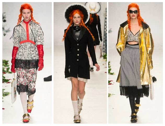
Whilst the collections are hardly identical, with HOH offering a heady mix of slogans, sequins and fur whilst Paul Smith showed off dark prints and upper-class pyjama party chic, I did find some similar takeaways from them. Both took advantage of damask prints to great effect and both used shiny finishes to give their catwalk looks that extra bit of polish, but ultimately it felt that both were dressing women without the need to gain a man's seal of approval. 

House of Holland aw14 damask
 Henry Holland can do cocktail hour, and even an LBD. 

Floral and paisley prints clashing with stripes
You can never have too many prints, Mr. Smith.

These were not great looks for first dates with a man, meeting his parents or going to a job interview (even Smith's brilliantly louche suits wouldn't have gone down well with a male-led HR department) and they weren't aimed at catching a man's eye across the bar. These were pure fashion looks, aimed at the sisterhood and, in the case of Smith, borrowing from the boys in order to subvert masculinity. 

Sequinned lipstick motif and orange tutu HOH
 Layer it up as you like over at HOH.

Suits for women by Paul Smith
The boys would never look this good in masculine tailoring.

Meanwhile, HOH's lipstick and cocktail decor, set beside gauzy layers over ripped jeans, was certainly bold and brassy, but probably not likely to get many seals of approval were it donned by the ladies of Take Me Out. Instead, I felt it was about celebrating girliness and not giving a toss about what men want to see you in.

It's really liberating to see British designers bringing such a carefree attitude to dressing and not to prescribe women yet more body-con dresses or man-pleasing basics. We love clashing patterns, playing with textures and wearing something daring, so keep up the good work. Not all of us are dressing to please the men in our lives, and we don't intend to start any time soon.

Thursday, 19 September 2013

London's on Fire for S/S14: Meadham Kirchhoff, Giles and Vivienne Westwood Red Label

The catwalk was set ablaze this season by three great designers in London, each with their own slightly different fan-base. Meadham Kirchhoff is the brainchild of two talented young upstarts with a suitably edgy following, Giles has his endless celebrity endorsements and  mainstream fans from his brilliant New Look diffusion line, and Vivienne Westwood's Red Label boasting its incredible price tags and customer elite sitting not-quite-comfortably alongside her protestations that we all cut down on the number of clothes we buy. Ahem.

Controversial comments aside, these three shows had a lot in common; they all showed models looking empowered and fiery, whether channeling the Lolita look or going for something significantly more dishevelled. 

 L-R: Meadham Kirchhoff, Giles and Vivienne Westwood Red Label showed expressive styles with fiery traits - lace bras, bat-like headpieces and fierce make-up coordinated with a masterclass in layering that shouldn't work but somehow totally does. [All images via Style.com].

Both Meadham Kirchhoff and Giles chose to braid the hair of their models, whilst at Westwood it was all left to hang out in glorious waves, as though just undone from its plaits. The colours may not have been glowing at all times, in fact they could be pretty muted occasionally, but the prints and draping created lashings of drama to help things along.

 The boys  at Meadham Kirchhoff brought us a gold-tinged vision of summer with the prospect of raiding the dressing-up box for those accessories. 

Red satin princess-style gloves: check. Edwardian jacket fresh out of Downton: check. Gold jacket from that 80s fancy dress night: check. Finish it all off with strappy gold shoes and a piercingly bright orange wig and you're good to go.

This is what I call Lolita meets Little House on the Prairie (with a touch of Wednesday Addams). The Meadham Kirchhoff woman isn't afraid to wear her inner child on her sleeve, but that doesn't mean you should mess with her. She mixes decades and patterns better than you, and she can also drink you under the table.

 After reappropriating famous paintings and working with beautifully burned fabrics to set the mood of a smouldering country pile, Giles Deacon has finally created his own relics using these moody photographic prints by Glen Luchford.

There's a brilliant behind-the-scenes studio piece on Giles fresh on the Grazia website right now, explaining loads more about the creative process behind this collection. Amazingly, Giles spotted the photos being posted on Instagram by Luchford, many of them previously unpublished, and he was able to use them in the designs. There's an interesting cross-over with Prada here, as some of the pieces in the collection use prints from Glen's test shots for a Prada campaign back in 1997. 

What I love about the shapes of this part of the collection is that they flatter most figures and don't seek to exploit the women wearing the pieces. There's that all-important draping and forgiving volume that allows you to breathe underneath, rather than be constrained.

Westwood's combination of Pre-Raphaelite hair and distressed layers of clothing with slight Victorian and Edwardian nods (braces, muted florals, sharp masculine tailoring) was totally absorbing.

Being a Vivienne Westwood show, there were always going to be elements of punk spirit tied into all of this extravagance; the Climate Revolution t-shirts and the childish doodling of the make-up certainly added to that, along with the vertiginous multi-strap heels, but having Lily Cole steal the show in a beautifully simplistic and feminine beige dress made sure that this collection would be remembered for its balance of anger with feminine wiles. Trust Westwood to make beige look empassioned instead of bland. 

These three designers definitely lit up the catwalk for me, and they made a strong impact. I'll be watching out for the high street's interpretation of these looks.

Sunday, 15 September 2013

Hellen Van Rees' S/S14 Presentation: Fuzzlayerglossbox

And so to London Fashion Week, where I began my adventures with the presentation from innovative Dutch designer Hellen Van Rees. I've previously covered Hellen's work here on the blog, and also for Running in Heels. It was fascinating to see how she's developed since then, especially as she's been garnering praise for her eco-friendly fashion stance (hello, Humanity in Fashion Award) and taking on the challenge of holding a TED talk on the theme of sustainability. This was her first solo presentation at Vauxhall Fashion Scout's Freemasons' Hall, giving her the chance to really shine.

The 15 looks she created for the collection had been influenced by 1920s-30s dressing, Boardwalk Empire and Coco Chanel. They showed a more mature side to the ideal Van Rees woman, with floor-length dresses and delicate chiffon pieces complemented by 2D cuboid panels, replacing the 3D cubes that were so prevalent in her earlier ranges.


Model in white chiffon dress with rectangular patent panels
 A minimalist all-white top and mid-length skirt combination in look 3.

Wedge shoes with interwoven threads
 Wedge heels finished all of the outfits and really brought the looks together.

Waist belt in patent black with cuboid pattern
 The varying dimensions of this belt created drama at the waist. They also reminded me of city skylines, with the blocks like skyscrapers.

Patent white tabard-style layer with woven sleeves and underlayer
 The models' wispy backcombed hair and red lipstick was one example of the juxtapositions in this show.

Close-up of weaving technique seen in S/S14 collection
 Here you can really get a feel for the different textures as they sat alongside each other.

Two models in patent black dresses with chiffon
 The oil slick effect here worked really well against the chiffon.

Model in white stands in front of decadent painting at the Freemasons' Hall, London
 As you can see, the setting of the Freemasons' Hall and its dark portraits added that bit more drama.

Monochromatic dresses by Hellen Van Rees
 Multiple panels made up these dresses. The bolero jacket on the right continued the cube-shaped theme.

Close-up of woven dress with colourful threads
 Just look at those threads. My instant reaction was to connect the diamond pattern to the quilted panelling of a Chanel 2.55 handbag, but also the coloured threads remind me of Bridget Riley paintings.

Model wears white panelled dress with woven details
 Pure polished glamour.

Halterneck black dress with rectangular panels
 This was one of several halterneck pieces, with frayed hems.

Model in white stands in front of London Fashion Week bloggers
 The presentation allowed press and bloggers to walk between the models, creating shots like this when us mere mortals were stood alongside the creations.

Blogger walks past model during Hellen Van Rees' S/S14 presentation
 Wandering around the room gave a great opportunity to see the designs from all angles and in different lights.

Polished make-up with bronze cheeks and red lipstick at Hellen Van Rees
 The white fraying looked like feathers.

Juxtaposing fabric textures at the Freemasons' Hall presentation
 Glossy white vs. multicoloured threads, and high necklines all round.

Close-up of eco-friendly weaving by Hellen Van Rees
 An open back balanced out the high neckline of this dress.

Jacquard patterns and frayed hems for spring
 Simple buns were the order of the day when it came to hair - nothing that would be too distracting.

Detail of undulating waves on a maxi-dress from the collection
More of those Bridget Riley-esque threads? Oh go on, then.

Fuzzlayerglossbox shows a definite growth in Hellen Van Rees' work and I'm sure it will be a hit with buyers as well; personally I'd love to see UK stockists introducing her to their customers, so we can show our support.

Monday, 18 February 2013

Jonathan Saunders A/W13: A Whole New Meaning to Squeaky Clean

Proving that London always adds some much-needed quirk to the Fashion Week proceedings, Jonathan Saunders delivered an A/W2013 line that balanced bondage a la Fifty Shades of Grey with more respectable (read: you could wear these to a cocktail party) vintage-inspired dresses.


Dresses by Jonathan Saunders at London Fashion Week, with PVC detail
 [All images via Showstudio.com].
How much gloss would madame like?

Saunders gave his audience a lot of flexibility when it came to choosing how much PVC they would like and where they wanted it to sit, whether it was a tight waist piece or a full-on white PVC dress with a billowing skirt. The differing levels meant that the Saunders woman could be as obvious or as subtle as she wanted.

Sweetheart necklines and off-the-shoulder dresses at Jonathan Saunders, LFW
 Goodnight sweetheart

These sweetheart necklines worked well, in either soft khaki, black PVC against duck egg blue or more blatant bright red. The multi-strap leather heels also hint at something less than innocent.

Black PVC dress, jacket and waistband on the Jonathan Saunders A/W13 catwalk
 Restricted style

The dress on the right and the jacket in the centre show how well the PVC works against more voluminous fabrics in earthy colours, whilst the dress on the left is much less forgiving. The only neutral tone left is the brown of the shoes and the model is barely visible against what she is wearing. I like how Saunders has played with nipped in waists and wide skirts, but also how he has attempted a fuller skirt with the synthetic fabric.

Red and black dresses by Jonathan Saunders
From innocence to experience

These three looks are unashamedly full-on; you couldn't conceal their intentions if you tried. The flashes of red on the shoes and the top of the dress, and the leopard print, are adding signals for you to look at the models - they're Kat Slater trademarks that somehow work brilliantly in high fashion as well.

Saunders has created a collection that goes against the stereotype of the British prude and instead gives us an assertive woman who isn't afraid to be looked at; in fact, she's looking right back.

Sunday, 17 February 2013

Eudon Choi A/W13: Let's Get Waisted

I was really impressed by Eudon Choi's Autumn/Winter 2013 collection - it had a nice blend of quirky accessories and really wearable pieces, from structured jackets to chunky knitwear in pink and turquoise - but the main draw for me was the waist detail. Say hello to next season's focal point - waist belt not necessary.


Eudon Choi A/W13 Dresses - London Fashion Week
 [All images via Vogue.co.uk]
Dresses were gathered at the waist or drop-waist and sat beautifully.

It was all about femininity here, but with a touch of toughness on top of the sugar coating. Dainty shoes with pom-poms sat below long-sleeved dresses in several different styles, meaning there was something for every body shape. 

The leather version on the left flatters boyish figures and gives the illusion of wider hips, whilst the v-neck in the centre has a higher flaring and means that women who have 'child-bearing' hips would be able to emphasise their waist. Lastly, the version on the right suits top-heavy women who can't get away with the deep v in the centre but still need a mid-waist cinch.

Eudon Choi A/W13 Trousers - London Fashion Week
 Skirts aside, there was still plenty drawing attention to the mid-section.

These coats (left and right) show how effective a simple coloured panel can be. As before, the panel that sits lower is perfect for those of you who want to emphasise your hips, whereas the higher cut disguises the hips and focuses on balancing the top half out. The top and trousers in the centre add height because of the continual pattern and the slimming vertical stripes, so it's a perfect combination if you're petite.

Eudon Choi A/W13 Skirts - London Fashion Week
No more skirting the issue... here are the easy pieces you need.

Stand-out skirts were paired with effortless basics like these billowing white shirts and this navy coat with what looks like a shearling trim. There was a nice symmetry between the floral headpieces and the pom-poms on the shoes as well.

This felt like a collection that wasn't just designed for the typical fashion industry silhouette; it would work on anyone with curves, too - whether they come from the hips or the chest, or indeed both. Eudon Choi added a great blend of sugar and spice to next season, accessible to all.

Friday, 15 February 2013

Inside the BFC Showspace at London Fashion Week - A/W13

LFW Somerset House - BFC Showspace
 Organised (but always fashionable) chaos.

 I popped into the BFC Showspace in Somerset House for Vodafone's Mary Katrantzou showcase, which gave us a chance to look over two of her previous collections and see what makes her designs so unique. 

As ever, the Showspace lounge was cutting-edge, with cool seating areas, vending machines full of Vitamin Water and a super-cool VIP area.

Plant-filled glass table at Somerset House for LFW
 Anyone for a spot of gardening?

The BFC Showspace in Somerset House - LFW A/W13
 It's always easier to queue with a glass of champagne in your hand.

Unfortunately my photos of the catwalk didn't come out very well (it's the luck of the draw as to where you sit), so I'll spare you the results, but it was great to see Mary's work on the models. I've only seen it previously in the designer exhibition rooms, when it's on the hangers, but you get much more of an idea of how things hang on the body when you see them in motion.

LFW A/W13 Somerset House - Manolo Blahnik Illustrations at the BFC Showspace
 Manolo Blahnik's beautiful illustrations brought the courtyard to life.

Here's to a great Fashion Week.

Sunday, 6 January 2013

Burberry Prorsum S/S13: Henry VIII Redux, with music by Tom Odell

When it comes to debating the S/S13 catwalk shows in real-time, it's hard to pick favourites and decide what to write about, so quite often I just end up leaving the rest in a mental 'To Do' pile and never quite getting round to discussing them. This year, one of my blogging resolutions (don't worry, there aren't that many) was to rediscover some of the weird and wonderful shows later on. So, let's begin...

Burberry Prorsum SS13 Cape
 [Image via Style.com]
Tudor elegance and exaggeration made for a strong range from Christopher Bailey.

My first choice was Burberry, completely by accident, as I've recently been spending a lot of time listening to music by Tom Odell. When YouTube started auto-filling 'Tom Odell Burberry', I knew where I'd heard his song 'Another Love' before - as the opening tune for the Quality Street-esque womenswear Prorsum collection back in September 2012 at London Fashion Week. I'm going to see Tom in March when he'll be gigging in Brighton and I can't wait to hear more of his stuff. For the record (inadvertent music-related joke there), his song worked brilliantly with the collection and it hinted at some of the drama in the clothing; capes, playing with proportions, flashes of colour and unexpectedly brilliant metallics.

Here's the video, along with other music by Birdy and Ren Harvieu.

Regal Inspiration for the Collection


The most obvious thematic reference I could find from the show, which I severely doubt even appeared on the mood boards at Burberry HQ, was Henry VIII. Here's why.

Burberry Prorsum SS13 Shoulders
 [All images via Style.com]
Exaggerated Shoulders and Arms

In portraits you'll notice that Henry was shown as being incredibly large, with huge arms and shoulders worthy of an American football player. Although he wasn't the thinnest bloke around, he actually used a lot of padding in his clothing to make himself appear bigger, therefore coming across as more powerful and domineering to his public and to any potential enemies. It's basically the equivalent of an animal puffing itself up to look more threatening.

For Burberry Prorsum the puffed up aesthetic was also used to look powerful, but it also came across as fashion-forward thanks to the beautiful metallic material and the minimalist outfits. No heavy embroidery and detail needed here, unlike the Tudors, who had a penchant for embellishment.

Burberry Prorsum SS13 Capelets
Capes

Ok, so Burberry went for a mixture of capelets (seen above) and full capes, but either way they looked great. Whereas the models look chic, Henry would have worn a cape for things like hunting, not hanging around at cocktail parties, but I'm sure he'd approve of these tailored numbers.

Burberry Prorsum SS13 Green Sleeves
Green Sleeves

It was said that the song Greensleeves was written about Anne Boleyn during her pregnancy. Those Tudors certainly knew how to make morning sickness fun. In light of this, it would be fairly apt if Kate Middleton (the most famous 21st century royal sufferer) started wearing some olive green pieces from the collection.

Burberry Prorsum SS13 Holbein Blue
 Holbein Blue

Hans Holbein the Younger was a really popular artist at the time of Henry VIII and painted royalty - including the man himself - on many occasions. One of his signature colours was this beautiful teal blue which he often used in the background of his paintings. Holbein's portrait of Henry VIII was called 'the best piece of propaganda ever' by the BBC (he portrayed the king as a strong and impressive man, rather than the ailing 45-year-old that he actually was). Anyway, Henry might not have ever been painted with this colour, but it's still something that I closely associate with him. It's also really striking on the catwalk, especially amongst all those jewel tones.

Burberry Prorsum SS13 Gold
Gold

It was either fresh and impossibly shiny or burnished to perfection, but there was more than a hint of gold for S/S13. The Tudors couldn't get enough of the stuff in their castles, palaces and ceremonies, so it's hardly surprising that we should find some here. Christopher Bailey's designs were tempting thanks to clever tailoring and flattering ruched fabric. The gold jacket in the centre is particularly eye-catching, though it might not be as easy to carry off in the British suburbs than in a piece of fashion editorial.

Burberry Prorsum SS13 Battle
 Ready for Battle

That nipped-in waist and those power-dressing jackets made me think of Tudors in combat, whilst the fluted material looked a bit like gauntlet gloves or Elizabethan ruffs (from the era of Henry's daughter). Again, it's about exaggerated forms and creating a silhouette that makes the wearer seem more impressive. I also loved the tailored cups on the trench coat (centre), which looked like something to be worn in a fashion battle.

And here are three Henry VIII directions that the collection thankfully didn't take:
  • Gout
  • Multiple wives
  • Beheading
But hey, let's leave something for A/W 2013, guys.

In all seriousness, there was so much inspiration to take away from Burberry Prorsum this season that it was hard to narrow down the selection. Though the creative team might not have been thinking of fearsome monarchs at the time, there's something decadent and definitely Tudor about the collection that I absolutely love.

Tuesday, 25 September 2012

Illustrations: LFW S/S13 Hellen Van Rees

LFW Vauxhall Fashion Scout SS13 Hellen Van Rees
Some quick drawings I made on my lunch break using the Paper app, based on the work of Hellen Van Rees at London Fashion Week's Exhibition as part of Vauxhall Fashion Scout.

I love the deconstructed threads of Van Rees' pieces and how the colours blended together: grey, aqua, acid yellow and black. Those boxy structures around the collarbone and down the side of the top were fantastically 3D and worked incredibly well as both a talking point and something you could imagine being worn - perhaps not in everyday life, but in a more surreal environment, where fashion is artistic rather than functional (i.e. not in the middle of Asda).

What also struck me is how democratised her work seemed: it would look just as impressive on a size 8 as it would on a size 18, because the structural forms are where the focus lies.

LFW Vauxhall Fashion Scout SS13 Hellen Van Rees
This piece felt like a play on the peplum trend, and it definitely worked (my sketch, less so, but you get the general idea).

Van Rees stood out for me as being willing to take risks and really experiment with texture and space - not just bringing out a collection of black space age garments and expecting everyone to think she'd reinvented the wheel. What she brought was innovation and a sense of fun; I could imagine Lady Gaga wearing her designs for a night out as much as a serious model in an editorial shoot.

Wednesday, 19 September 2012

LFW S/S13 - A Snippet of Street Style

London Fashion Week Street Style Men S/S13
 A typically eclectic slice of menswear from the courtyard at Somerset House.
[All photos my own.]

London Fashion Week Kate Nash S/S13
 Kate Nash arrives at London Fashion Week, dressed as a space marshmallow. 

London Fashion Week Ada Zanditon S/S13
 Ada Zanditon shows her new collection, Tigress Reign, with a Kill Bill-inspired video to boot.

London Fashion Week Accessories S/S13
 The Exhibition drew me to plenty of fascinating accessories - this is just one of many. 
More photos to follow.

London Fashion Week Phannatiq S/S13
 Stylist Alexis Knox listens to the soundtrack for the Phannatiq video at the Felicities PR event.

Fyodor Golan LFW Fashion Fringe
 Last year's Fashion Fringe winners, design duo Fyodor Golan, stood next to me!

London Fashion Week Street Style S/S13
 This lady was incredibly stylish and I couldn't resist a snapshot.

Fashion Fringe 2012 Haizhen Wang
 2012 Fashion Fringe winner Haizhen Wang lifts his trophy as one of his models looks on.

Fashion Fringe 2012
Here's a selection of what I brought home.

There are so many images still to upload onto the blog, so please do bear with me. I'll eventually put everything on Flickr as well, because there are far too many photos to include on here (yes, really!). 

Some of my catwalk shots did disappoint me, as strangely my fresh-out-the-box Nikon P510 bridge camera wasn't as effective as my Canon SX210IS, where I can always manage to rely on the fail-safe 'Kids and Pets' mode if it all goes tits-up in terms of bright lights and fast moving models. Instead I've ended up with lots of ghostly white outlines of the clothing and the camera has paid too much attention to what the crowds were doing, which is a shame (and doubtless my own fault) but is something I will be rectifying by illustrating what I saw instead. If all else fails, turn to pen and paper. 

Anyway, stay tuned for more LFW images throughout the next few days, and some doodles too.
Related Posts Plugin for WordPress, Blogger...