Showing posts with label prints. Show all posts

Wednesday, 26 February 2014

Milan Fashion Week A/W14: Salvatore Ferragamo and Sportmax Have Arty Animal Instincts

Being a self-confessed lover of all things leopard print (from shoes to pyjamas), I always have my eye out for a peek of it on the catwalk, especially as it rarely goes out of fashion. Many style bibles may claim that zebra takes over in certain seasons, but the truth is that leopard is here to stay, reminding us of everything from 1950s kitsch to 1980s sex kitten glamour, purely because there are so many visual references aligned with it.

Naturally I was pleased to see leopard print appearing in the collections of two Italian heavyweights, Salvatore Ferragamo and Sportmax, but I also noticed some other thematic similarities between the two, such as delving into other animal prints (specifically patent black coats with a croc or snake finish) and experimenting with painterly touches. 

Rawr Prints

Tan leopard print coats and overcoat
 [Images via Style.com]. Ferragamo favoured soft leopard tailoring worn for high impact.

Leopard dresses and jacket on Italy catwalk
Sportmax opted for a brighter and more precise print, teamed with leather trims.

I love how differently the print has been interpreted by each designer, and how far removed the two central looks can be, with Ferragamo's 70s-style tan cape battling against the 90s slim-fit approach from Sportmax. 

Black Lines

Black dresses with varying textures on the catwalk
 The power of applied volume and precisely placed belts is at hand.
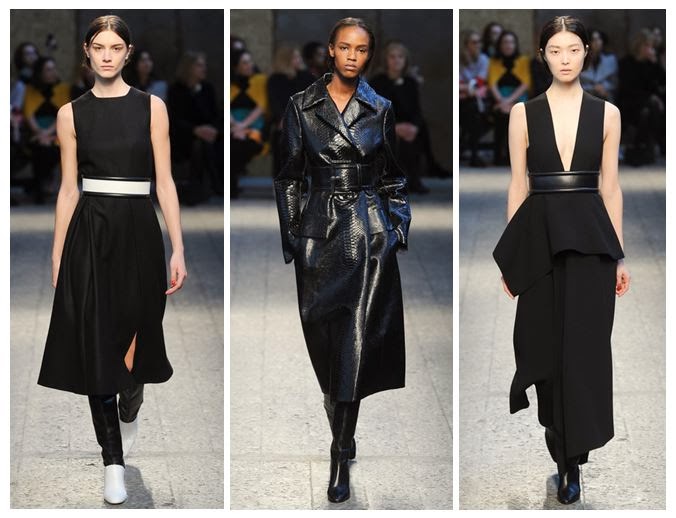
Snakeskin coat on the Milan catwalk
 Here, the belts are almost obi-style in thickness, cutting straight across the body and almost creating two separate canvases.

I think it's safe to assume that a belted patent black coat, to knee length or below, will be a staple purchase for A/W 2014 and beyond. Personally my favourite is Ferragamo's collarless minimalist number - it's neat and edgy.

 A Fashionable Animal

Salvatore Ferragamo autumn winter
 Whatever the silhouette you're going for, Ferragamo has you covered.

Animal prints as a trend for Autumn Winter 2014
 Sportmax shows its full range of animal prints in action.

This is where the real trend-led pieces come in; the ones that are less classic and more instant fashion fixes. Enter high necks, puff sleeves, print skirts and other easy separates to pair with the rest of your wardrobe.

Artistic Licence

Painted leather and fabric seen at Milan Fashion Week
 Painted leather, oil slick effects and bursts of colourful dye transform these looks.

Paint splattered clothing on trend for AW14
Clear artistic inspiration from Jackson Pollock shaped the latter part of this collection.

It's interesting that both designers chose to combine animal prints with paintbrush effects, allowing them to push their collections in new directions, and that the end results continue to be so different. You'd hardly say that the watercolour-esque mustard lines of Salvatore Ferragamo were from the same school of thought as the Jackson Pollock splodges employed by Sportmax. 

I suppose the uniting factor about these two ranges is fun; the prints are fun, the experimentation is fun, and the wearers are going to have the most fun of all.

Wednesday, 5 February 2014

Unlikely Inspiration: Ikea Channels Christopher Kane


Whilst browsing the huge warehouse space at Ikea Croydon last weekend, I can honestly say I didn't expect to find a significant nod to Christopher Kane amongst the tea lights and pine shelves, but lo and behold there was one. In fact, a whole range of prints had sprung up, focusing on plant life and biology, in a major reference to Kane's S/S14 collection, which he had referred to as 'sterilised petals'.

 [Image via Ikea.com] Who knew walnuts were so on-trend?

 [Image via Style.com] The catwalk goes botanical.

What Christopher Kane addressed was the perfect print quality of a biological drawing, with the symmetry of the petals and the overall flower structure creating something that's easy on the eye and flattering on the figure. Plus it doubles up as revision if you're studying biology or botany in any capacity, especially as Kane referenced textbooks in the collection itself, and education in the music choice of the catwalk show.

 [Image via Ikea.com] A more traditional botanical drawing on sale.

 [Close-up image via Ikea.com]. The brain-like walnut in detail.

With Ikea bringing the scientific side of florals into the home, it's a clear sign that Kane is onto a winner. It's normal for colour trends to cross over into interiors but I've never seen a mainstream home ware brand so obviously take a cue from just one designer. The walnut print, in particular, is an unmistakeable tribute to the S/S14 range.

[Images via Style.com] Snippets of Kane's floral notes.


Perhaps in the future we should expect to see more lone design inspiration making its way onto the shelves of Ikea - Rodarte-esque sunflowers or goth weaving? Dolce & Gabbana-esque Italian domestic seaside images featuring buxom models in pasta earrings? The floor is open...

Friday, 24 January 2014

The Cambridge Satchel Company's Brand Evolution: S/S14 Looks Bright

Today I received some of the shiny new images from the S/S14 collection by the Cambridge Satchel Company, which has gone from strength to strength since its formation around a kitchen table back in 2008. This latest range shows just how determined the brand is to achieve longevity and not just be part of a short-term satchel trend. No wonder it's just had a cash injection of over £12 million from Index Ventures. Peach Pink and Bellflower Blue are going to be it-colours for the season, mark my words.

 [Images via Cambridge Satchel Company S/S14 launch and Google+ profile].
These longer strap options won't hang around for long this season.
 I would snap up this navy clutch in an instant.

Candy clutches (and traditional black) are sure to be successful.

Whilst I'm yet to get my hands on one of these bags, I can definitely see the appeal of their latest evolution into clutches, two-tone variants and long shoulder strap numbers. The key to keeping the brand fresh is to offer something desirable and different, as well as the same reliable models that the public knows them for. 

 Two tone works well in both of these colour ways.

Even small adjustments, such as panels made from leopard print or tartan fabric, Vivienne Westwood designed prints or iconic Harris Tweed, show that there is more than one ideal CSC customer and they will all be catered for. I've seen the Accessories Editor of Elle carrying a neon number at London Fashion Week, but I've also seen grandmas, students and mums buying into the brand as well. 

 There's nothing like a bit of punk spirit from a British brand.

Admittedly the designers could have easily become stuck in a rut of continually reinventing the wheel and trying not to shake up tradition, knowing how well the standard styles were selling, but instead they've tried new innovations and colour combinations regularly. Fluoro, double colour and metallic options have all proved popular, suggesting there's no let-up in satchel fever, and the company's products are stocked in over 100 countries. 

 These fluoro music bags would certainly brighten up a dull music lesson...

Taking a look at the latest styles, I have a feeling that Bellflower Blue is going to look great with S/S14 outfits, whilst the patent croc print clutches are real investment pieces for smarter occasions. The Cambridge Satchel Company has come a long way from its humble kitchen table beginnings, and I'll be eagerly anticipating its next move.

Thursday, 19 September 2013

London's on Fire for S/S14: Meadham Kirchhoff, Giles and Vivienne Westwood Red Label

The catwalk was set ablaze this season by three great designers in London, each with their own slightly different fan-base. Meadham Kirchhoff is the brainchild of two talented young upstarts with a suitably edgy following, Giles has his endless celebrity endorsements and  mainstream fans from his brilliant New Look diffusion line, and Vivienne Westwood's Red Label boasting its incredible price tags and customer elite sitting not-quite-comfortably alongside her protestations that we all cut down on the number of clothes we buy. Ahem.

Controversial comments aside, these three shows had a lot in common; they all showed models looking empowered and fiery, whether channeling the Lolita look or going for something significantly more dishevelled. 

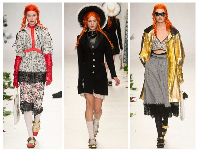
 L-R: Meadham Kirchhoff, Giles and Vivienne Westwood Red Label showed expressive styles with fiery traits - lace bras, bat-like headpieces and fierce make-up coordinated with a masterclass in layering that shouldn't work but somehow totally does. [All images via Style.com].

Both Meadham Kirchhoff and Giles chose to braid the hair of their models, whilst at Westwood it was all left to hang out in glorious waves, as though just undone from its plaits. The colours may not have been glowing at all times, in fact they could be pretty muted occasionally, but the prints and draping created lashings of drama to help things along.

 The boys  at Meadham Kirchhoff brought us a gold-tinged vision of summer with the prospect of raiding the dressing-up box for those accessories. 

Red satin princess-style gloves: check. Edwardian jacket fresh out of Downton: check. Gold jacket from that 80s fancy dress night: check. Finish it all off with strappy gold shoes and a piercingly bright orange wig and you're good to go.

This is what I call Lolita meets Little House on the Prairie (with a touch of Wednesday Addams). The Meadham Kirchhoff woman isn't afraid to wear her inner child on her sleeve, but that doesn't mean you should mess with her. She mixes decades and patterns better than you, and she can also drink you under the table.

 After reappropriating famous paintings and working with beautifully burned fabrics to set the mood of a smouldering country pile, Giles Deacon has finally created his own relics using these moody photographic prints by Glen Luchford.

There's a brilliant behind-the-scenes studio piece on Giles fresh on the Grazia website right now, explaining loads more about the creative process behind this collection. Amazingly, Giles spotted the photos being posted on Instagram by Luchford, many of them previously unpublished, and he was able to use them in the designs. There's an interesting cross-over with Prada here, as some of the pieces in the collection use prints from Glen's test shots for a Prada campaign back in 1997. 

What I love about the shapes of this part of the collection is that they flatter most figures and don't seek to exploit the women wearing the pieces. There's that all-important draping and forgiving volume that allows you to breathe underneath, rather than be constrained.

Westwood's combination of Pre-Raphaelite hair and distressed layers of clothing with slight Victorian and Edwardian nods (braces, muted florals, sharp masculine tailoring) was totally absorbing.

Being a Vivienne Westwood show, there were always going to be elements of punk spirit tied into all of this extravagance; the Climate Revolution t-shirts and the childish doodling of the make-up certainly added to that, along with the vertiginous multi-strap heels, but having Lily Cole steal the show in a beautifully simplistic and feminine beige dress made sure that this collection would be remembered for its balance of anger with feminine wiles. Trust Westwood to make beige look empassioned instead of bland. 

These three designers definitely lit up the catwalk for me, and they made a strong impact. I'll be watching out for the high street's interpretation of these looks.

Wednesday, 28 August 2013

Lakme Fashion Week: Aarti Vijay Gupta puts the art into Winter/Festive 2013

Fashion Month may not have begun yet for New York/London/Paris/Milan, but Lakme Fashion Week has already come round again - how time flies in the style calendar. Right now, the hottest Indian designers have just shown or are about to show their collections to the crowds, causing Bollywood's finest to flock to the side of the catwalk (or even to be part of the show). 

First up in this series of posts is a design talent who has the edge when it comes to prints; this season she's really showed her artistic knowledge.

 Aarti Vijay Gupta hits the right notes with her Winter/Festive designs.
 [Images via The Fashion Weekend.]

 I love the cut of this trouser suit.

Aarti Vijay Gupta has to be my favourite designer to come out of India. I've written about her many times previously on the blog and compared her eye for prints to that of Mary Katrantzou, and this season's offering was even more fun and fearless. She called it simply 'I Love Music' and combined linear drawings of trumpets, drums and pianos with classic music-themed paintings by Salvador Dali and Pablo Picasso (The Red Orchestra and The Old Guitarist, respectively). 

 Dali's surrealist painting sees a skeletal man playing another like a cello.
[Image via Wikipedia.org.]
 
 Picasso's Old Guitarist was part of his Blue Period.
[Image via Wikipaintings.org].

This was a youthful and lively collection, standing out from the current punk trend that's rocking the UK and feeling more authentic. As ever with Gupta, the shapes of pieces were edgy and directional, from crisp jumpsuits to minimalist sheath dresses, accessorised with the white spectacles that have become a signature part of her work. It feels like she has really hit her stride.

If you want to see more examples of art inspiring fashion from the blog, check out the Ansel Adams and David Hockney-esque prints by Warehouse and the Delaroche tribute dress by Giles Deacon that had me waxing lyrical. For even more designer insight, see my report from the front row of Holly Fulton's A/W 2012 show and my backstage interview with her about the connection between fashion and art. Make no mistake, readers: the two topics are firmly intertwined, as Aarti Vijay Gupta has proved so recently.

Monday, 15 April 2013

Dante Does Istanbul: Dilara Findikoglu Creates Her Own Wonderland

Today I've been talking Turkey, with a visit to Istanbul INN London, a promotional event to raise awareness of the city's cultural output, from food and drink to architecture and art. But the section that was strongest was definitely the fashion, where hot new designers showed that Istanbul deserves to be noticed on the international scene.

Dilara Findikoglu close-up of Dante's Islamic Inferno t-shirt
[Images taken at Victoria House, London].
A real mixture of fabrics, with a sports luxe feel, clashed with historical prints.

Inspired by Dante's Inferno, Turkish designer Dilara Findikoglu has created a totally unique and unforgettable collection which reminded me slightly of Mary Katrantzou (in her use of intense prints) and Alexander McQueen (in the careful attention to corporeality and also in using antique religious drawings as a basis). 

Dress, body harness and t-shirt by Dilara Findikoglu
 There's something for every type of dresser - from the daring harness wearer to the shift dress lover.
And I still can't get enough of those prints...

The collection is known as 'Dante's Islamic Inferno', due to the repeated references to Islamic architecture, such as beautiful glass or tile patterns, but also lettering in the prints. Other recurring motifs are as diverse as skulls, interlocking hands and palm trees, as well as the occasional anatomical heart and a miniature Medusa painting. 

Prints including Islamic text, palm trees and skulls, by Dilara Findikoglu
 You just know this collection would look amazing dressed up or down. Or just styled in a photo shoot in an abandoned warehouse.

Dilara studied fashion at Central St. Martins College in London and has also been a stylist and fashion editor for several magazines, so she's got a strong creative background, but she's also incredibly young (yep, just to make you feel like an underachiever!). Aside from Dante Aligheri, she says that she's inspired by 'parapsychology', 'Katie Shillingford' (of Dazed & Confused - one of my hair icons!) and 'flowers'.

Exhibition space at Istanbul Inn London - Dilara Findikoglu
The exhibition space was set up in this sort of homely-cum-creepy atmosphere, with armchairs and books but with clothes strung up like pieces of meat. I loved the contrasts.

My only gripe? I CAN'T FIND WHERE TO BUY THIS AMAZING STUFF. Seriously, I'm being tortured here. If you want to see more of Dilara's work, check out her Cargo Collective account, but otherwise you'll have to hold tight and wait for it to go on sale somewhere soon. I'm crossing my fingers for a pop-up shop...

Tuesday, 26 March 2013

Lakme Fashion Week S/S 2013: Why Aarti Vijay Gupta's Map Print Is Bang On Trend

When I saw the catwalk images from Aarti Vijay Gupta's Spring/Summer 2013 collection at India's Lakme Fashion Week, my heart skipped a beat. Not just because I'm a massive fan of her work, for its use of conceptual prints, but because I saw maps and stamps. 

For the designer it was the start of 'I Love India', a clutch of pieces that included references to Mahatma Gandhi, Indian tigers and a coal train. For me, sitting in rainy old England, it was the chance to step into another country and to get a glimpse of it from AVG's perspective. 

 The print looks beautiful on a sari.
[Catwalk images via Lakme Fashion Week].

If there's one trend that's been simmering on the surface of this season, it's a print that relates to travel - from Mary Katrantzou's S/S13 stamp and coin inspired designs and her collaboration with Current Elliott, to Christopher Raeburn's map dress and Topshop's map-emblazoned bikini, swimsuit and scarf that are currently flying off the shelves at a store near you.

Mary Katrantzou for Current Elliott [Image via fashion-law.org].

Christopher Raeburn dress, S/S13 [Image via christopherraeburn.co.uk].


Topshop's traveller trend is in full swing [Images via topshop.com].

Whereas 2012 in commercial fashion was all about patriotic UK flags, with the Union Jack getting a boost from the Jubilee and the Olympics, 2013 is about where you're going, as well as where you're from. That's why cartography has become a recurring inspiration for clothing and accessories, along with travel-inspired jewellery such as beaded glass and thread bracelets.

 Whatever the colour palette, the maps still look edgy and crisp.


It's all about heritage prints and more stamps than you can shake a stick at.
Nice to see AVG's trademark glasses making an appearance again, too.

More than anything, this collection reminds me why I want to visit India; to get out my passport and explore a little more of that world map, but also to see the place that inspires great designers such as Aarti Vijay Gupta. I will be upholding the traveller trend as much as possible this year!

Sunday, 26 August 2012

Warehouse's Arty Prints: David Hockney and Ansel Adams Would Approve

After spotting an amazing canyon-print dress from Warehouse in one of the Saturday papers, I couldn't resist making comparisons between its design and that of David Hockney's Grand Canyon photo collage, and even his paintings of the landmark. Logging onto the website, I then tracked down another art-inspired dress that reminded me of legendary photographer Ansel Adams. As an art graduate I'm always chuffed to find major high street brands taking their cues from artists, and I thought I'd show you just how I made those connections.

Warehouse Canyon Dress
 [Images via Warehouse and Lalouver].
 The Canyon Print Dress (£70) is sure to make an impact.

I like that Warehouse has put such a bold print on the entirety of the fabric, not cutting into it with plain sections but allowing it to dominate. The horizontal bands are much like Hockney's intense collage, following the form of the wearer like his photos follow the canyon's shape.

Warehouse Canyon Dress - Hockney
[Images via Warehouse, Artnet (photo of the artist) and the National Gallery of Australia].
I'm guessing a little bit of Hockney inspired the designer.

What strikes me is how the multi-layered rock formations  and colour bands sit on one piece of chiffon but give the illusion of several pieces sewn together. You can see in Hockney's painting, A Bigger Grand Canyon (1999), that colour divides work well and help to illustrate the way that the canyon has different facets. There's also a warmth to the painting that translates to the dress - that fiery vermillion against a snippet of cool blue. Already I have a few locations in mind for creating an outfit post with this - either a dry river bed or an abandoned building - if only I can get saving up that £70...

Warehouse Ansel Adams Polaroid
[Images via Warehouse and Tumblr].
Poetic and with the lightness of a Polaroid.

A different cut to this Landscape Print Dress (£55) but still a big link to artistry, with this china blue and white print that reminded me of a teal Ansel Adams Polaroid photo of Yosemite Falls (1979). If you changed Adams' work to that same royal blue, I think the comparison would be even closer. I also love the pin-tuck in the waist band that makes the fabric kick out, like a waterfall.

Warehouse Landscape Print Dress
 There's also an element of Japanese artist Hokusai, but I'm more drawn to the photographic elements of the print.

The slight mullet hem brings this bang up-to-date and also helps to emphasise curves. The whole piece is lined to the hem, so don't worry about revealing your modesty.

Ansel Adams vs. Warehouse
 [Image via Weston Gallery, and close-up Warehouse].
This is an example of Adams' straight photography and how it complements the print of the fabric.

My final comparison shows how the delicate foliage and waterfall shot by Adams in Yosemite seems similar to the print on the dress. I don't know for sure whether the designer had referenced him directly, or even looked at his work, but I feel that there is a natural link there, and it's great to see that fashion is continually looking to the art world for its eye-catching prints.

Friday, 25 May 2012

A/W 2012-13 at Yumi, Part 2: A Closer Look

A cosy but fun swing coat in mustard-tinged yellow.

What I love about this coat: the bold button fixtures are practical but they also add clout; the rose print is abstract enough to resemble polka dots from far away, which is more forgiving than a tight ditzy floral pattern; the contrasting collar works so much better than keeping things the same, and it makes the colour more forgiving for people like me who have a sallow complexion.

Ready for a close-up? 

The pink jumper seems to have a touch of mohair/angora, which I think makes it even more tempting. As for that big gold button, it's a simple vintage touch that helps to make this coat look extra special.

'Prints charming' with these bird designs.

The owl blouse is what I often refer to as Holbein blue: a bright teal shade that was often used by the artist Hans Holbein the Younger, which really stands out. The simple print isn't too complicated and it uses little bows in between the owls.

Inside the showroom

You can just catch a glimpse of the fashion film made by Fleur from the PR team. It was also vintage-inspired, with that sort of dreamy sun-drenched feel (think California or Carnaby Street).

Those finishing touches...

I love a good retro accessory, so you can see why I was drawn to the radio, satchel and case on the shelf above the new collection. I like how the satchel's floral print mirrors that of the coat and blouses with their black rose motif.

Chintz and knits

Having worked previously in White Stuff and been involved in creating window displays and visual merchandising in-store, I felt right at home with the china plates, old lampshades and woodland wallpaper used here. Everything worked well together and helped to show off the collection without dominating it.

Duck, duck, goose

I'm a little bit in love with this print. Not being up on my bird species, I want to say it's a mallard, but I have a feeling that I'm way off the mark. Birdwatching aside, this is a fun print that isn't going to make you look too girly as it has an arty edge.

Specs appeal...

A classic range of monchrome prints featuring glasses, bow ties and top hats was highly effective and made a great focal point. The whole Mad Men vibe is going to have that spectacle cardigan flying off the shelves.

Putting on the Ritz...

This shirt doesn't actually glow - it's just me playing around with photo effects. However, it really shows off the moustache design and I'm sure this will be another big seller.

Colour block corner.

Some girls are indecisive about colour, but this clutch does the hard work for you. Channeling Celine, it's a wearable piece that looks sturdy enough to survive a good few nights out.

Nailed it.

Nail artist Sophie Harris-Greenslade of The Illustrated Nail, whose work has been featured in Stylist, ElleUK.com and I.D Magazine, was on hand (excuse the pun) to provide amazing designs. Not only was she incredibly accurate and inventive, but she was also great fun to talk to. I came away with a beautiful set of nails featuring polish by Essie and Barry M alongside intricately painted heart and lipstick motifs. Stay tuned for the photos.
Related Posts Plugin for WordPress, Blogger...