Showing posts with label feminity. Show all posts

Thursday, 19 September 2013

London's on Fire for S/S14: Meadham Kirchhoff, Giles and Vivienne Westwood Red Label

The catwalk was set ablaze this season by three great designers in London, each with their own slightly different fan-base. Meadham Kirchhoff is the brainchild of two talented young upstarts with a suitably edgy following, Giles has his endless celebrity endorsements and  mainstream fans from his brilliant New Look diffusion line, and Vivienne Westwood's Red Label boasting its incredible price tags and customer elite sitting not-quite-comfortably alongside her protestations that we all cut down on the number of clothes we buy. Ahem.

Controversial comments aside, these three shows had a lot in common; they all showed models looking empowered and fiery, whether channeling the Lolita look or going for something significantly more dishevelled. 

 L-R: Meadham Kirchhoff, Giles and Vivienne Westwood Red Label showed expressive styles with fiery traits - lace bras, bat-like headpieces and fierce make-up coordinated with a masterclass in layering that shouldn't work but somehow totally does. [All images via Style.com].

Both Meadham Kirchhoff and Giles chose to braid the hair of their models, whilst at Westwood it was all left to hang out in glorious waves, as though just undone from its plaits. The colours may not have been glowing at all times, in fact they could be pretty muted occasionally, but the prints and draping created lashings of drama to help things along.
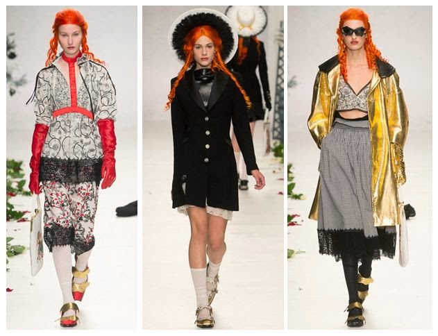
 The boys  at Meadham Kirchhoff brought us a gold-tinged vision of summer with the prospect of raiding the dressing-up box for those accessories. 

Red satin princess-style gloves: check. Edwardian jacket fresh out of Downton: check. Gold jacket from that 80s fancy dress night: check. Finish it all off with strappy gold shoes and a piercingly bright orange wig and you're good to go.

This is what I call Lolita meets Little House on the Prairie (with a touch of Wednesday Addams). The Meadham Kirchhoff woman isn't afraid to wear her inner child on her sleeve, but that doesn't mean you should mess with her. She mixes decades and patterns better than you, and she can also drink you under the table.

 After reappropriating famous paintings and working with beautifully burned fabrics to set the mood of a smouldering country pile, Giles Deacon has finally created his own relics using these moody photographic prints by Glen Luchford.

There's a brilliant behind-the-scenes studio piece on Giles fresh on the Grazia website right now, explaining loads more about the creative process behind this collection. Amazingly, Giles spotted the photos being posted on Instagram by Luchford, many of them previously unpublished, and he was able to use them in the designs. There's an interesting cross-over with Prada here, as some of the pieces in the collection use prints from Glen's test shots for a Prada campaign back in 1997. 

What I love about the shapes of this part of the collection is that they flatter most figures and don't seek to exploit the women wearing the pieces. There's that all-important draping and forgiving volume that allows you to breathe underneath, rather than be constrained.

Westwood's combination of Pre-Raphaelite hair and distressed layers of clothing with slight Victorian and Edwardian nods (braces, muted florals, sharp masculine tailoring) was totally absorbing.

Being a Vivienne Westwood show, there were always going to be elements of punk spirit tied into all of this extravagance; the Climate Revolution t-shirts and the childish doodling of the make-up certainly added to that, along with the vertiginous multi-strap heels, but having Lily Cole steal the show in a beautifully simplistic and feminine beige dress made sure that this collection would be remembered for its balance of anger with feminine wiles. Trust Westwood to make beige look empassioned instead of bland. 

These three designers definitely lit up the catwalk for me, and they made a strong impact. I'll be watching out for the high street's interpretation of these looks.

Saturday, 25 February 2012

MFW A/W2012: Bittersweet Beauty from Raf Simons at Jil Sander

 [All images: Fashion Gone Rogue]. 

As I write this, I'm struggling to describe this collection. For designer Raf Simons this was his swansong at Jil Sander, where he has hung up his scissors and handed over to the lady herself. There are many rumours about Simons being in the frame for John Galliano's job at Dior, and this show proved that he would be more than capable of taking the reins. It was a masterclass in how to take a bolt of fabric and make it work as hard as you possibly can, beautifully framing the models and alternately revealing and concealing certain areas. 

Simons should be incredibly proud of what he has achieved here, which is perhaps most obvious in the drapery of this delicately pink coat. The material has a waterfall finish that is simplistic but really works, and the lack of jewellery means that there are no distractions. This coat does the talking.


The 1940s and 50s feel was evident in sleek pieces such as this combination of nude bodiced top and high-waisted trousers, creating a silhouette that played with proportions. There's a distinct feeling that you don't have to try too hard in this outfit, which is especially strong when the fashion world is so currently obsessed with kookiness and the kaleidoscope dressing of Nicki Minaj. The woman who chooses to wear this over a loud neon ensemble or comedy flares is saying that she can do things differently.
 

 A pure shot of 1950s glamour, this is like the grown up older sister to Prada's S/S12 sherbet-obsessed girl. The cut-out panel sounds tacky in theory but is actually quite sophisticated. Perhaps on a woman with the average British figure, this would be verging on cleavage overkill, but I don't think that was the look that Simons intended. I am secretly hoping that a celeb will get their hands on it and make it slutty, just to watch the Daily Mail go up in arms about it.


Another dose of sheer panel action, but this time on a looser cut dress with blocks of fabric. Again, the people at Jil Sander are certainly not aiming at women with real and often uncontrollable breasts (it's certainly not designed for running for a bus), but this is a sedate take on eveningwear. Although it's a polished look, you don't have to try too hard with this shape or colour - just a slash of red lipstick and heels is all it takes.
 

This dress reminded me of those 1950s science fiction books that used to imagine what life would be like in the 21st century, when we'd all have robot friends and flying cars. It's an idealised version of the future, where everything is smooth and minimalist and incredibly efficient. The accompanying cocoon coat is equally impressive and gives a nod to all things space-age.
 

A lesson in how to do the fetish/dominatrix look without getting propositioned by strangers on the street, this dress is cut for curves. I can see it working on Kate Winslet, who would enjoy the failsafe black but has shown her daring side in pieces such as Stella McCartney's infamous sheer spot dress.
 

 Yes, I know this one could look slightly dodgy if you imagine it was made with bin bags and not expensive synthetic material, but there's something playful about the trashiness of the look. Rightfully this should look cheap and the model should appear slightly hungover, possibly with remnants of kebab stuck to her heels, but in Jil Sander mode then she is silent, poised and deadly. The fussiness of the cut is in contrast to the clean lines that much of the collection promotes, and yet this somehow works.


Full-length coats are often sneered at, and I am one of the sneerers, but in the depths of winter they can be incredibly useful. When they're cut like this pink number with the pale yellow lining and wide collar, you can't help but be tempted by the idea. There's also the potential of hiding a garish outfit underneath, which you later reveal when you're in less respectable company.

In conclusion, this was an amazing final show by Raf Simons for Jil Sander, and it's no wonder that the crowds provided a standing ovation at the end. I look forward to seeing these pieces make their way into high street imitations, heralding a return to minimalism and expensive-looking cuts.

Friday, 17 February 2012

LFW A/W2012: PPQ's Bicycles and Beauty Spots


[Images collaged from live stream feed of London Fashion Week].
When PPQ opened their show with a model pushing a bicycle like it was the latest accessory to have on your arm, I knew things were going to be good. This nod to all things British and quirky was mirrored by their Autumn/Winter collection, which was 80% sheer class and 20% bonkers - perhaps not the make-up of the average Brit, but very eyecatching nonetheless. Models sported beauty spots and matte red lipstick, which firmly set things in retro mode.

As you can see above, the palette was heavily monochrome, with flashes of deep green only in the latter part of the show, which really made them stand out. I particularly liked the combinations of green satin and white tights with embellished silvery knees, and the outsized embellished white collar of a skinny jacket, as they both resembled a baroque and roll revival (baroque styling plus modern bling).

Texture-wise, we were given a variety of options, from the aforementioned satin to fluffy black coats and tartan scarves that draped across the body. My favourite fabric choice was the black PVC which appeared in the form of oversized knickers, pencil skirt suits and bags, just because it was incorporated so effortlessly into a chic and demure show that it bypassed the usual bondage connotations. This was PVC but not as we know it.

As for shapes and forms, I really enjoyed the crisp white shirt-cum-bodysuit seen just off centre in the collage above. It was a brilliant combination of modern and period dressing and it looked beautiful. I'm not sure if it will filter down to the high street in its original form, but I look forward to seeing which shops handle the gauntlet. One look that I would definitely bet is being re-worked in a factory as I type is the almost dalmatian print satin one shoulder dress in the top right hand corner; tied simply with a black bow and falling to maxi-dress length, it was a simple but elegant way to do quirky eveningwear. 

Something I am looking forward to recreating with some fabric is the draped dress seen centre right in the collage above, with its panel of thick woolen tartan and a belted waist. It reminds me of Alexander McQueen's McQ tartan dress from a few seasons ago, and I designed a similar dress for a Boohoo competition last year (such is my devotion to this kind of design). I hope to see high street stores like COS and Topshop picking up this style and making it their own. 

All in all, this was a very strong collection that gave us a polished woman who was anything but a wallflower. The individual twists in a lot of the pieces felt natural - this was not enforced absurdity, just little nuances that appeared to blend seamlessly with the more basic crowd-pleasing looks. The addition of bikes was perfectly timed, with media attention focused on all things British in the lead-up to the Olympics, and I'm sure that will generate them some extra column inches and gain PPQ some more fans.

Thursday, 13 October 2011

Motel Does Indeed Rock


[All images via Motel Rocks].
I have a thing about searching for the perfect bralette. Being curvy myself and not suited to some of these flat-chested trends (I look terrible in 1920s dresses, for example), the humble bra-style top is definitely on my style radar. It's feminine and flattering, but without putting everything on show. As you can see, Motel have come up trumps with this Lolita bralette (£22), which is available in a range of colours and has this fantastically sexy multiple strap detail on the back.


Here's the Lolita top in mustard. With a plain front, it's easy to pair with a number of different options, from high waisted skirts to floral harems. The black heels they've used are a great example of how to add glamour to this look and keep things vintage-inspired; think 40s and 50s prints and maybe put your hair in a victory roll.


For a more modern option, the Winnie playsuit with a gorgeous yellow floral kick (called Black Placement Rose) is a great investment at £42. It's wearable and the shape is kind to those of us who aren't blessed with womanly hips - the nipped in waist does the hard work for you. I'm going to put it on my Christmas list and hope that Santa is feeling particularly stylish this year.

www.motelrocks.com

Sunday, 18 September 2011

LFW: House of Holland's Sherbet Cocktail of Strong Females


[All images: ElleUK.com]. With a smart shirtdress, flashy patent black heels and a cinched belt, you'd be forgiven for thinking this was a workwear dream if you saw it drained of colour. In reality, Henry Holland's take on the smart woman involves giving her pink and purple panels that are more akin to schooltime sweet sharing rather than watercooler moments. The House of Holland woman is not afraid to be feminine, but she will stand out from the twinset and pearls look too - bridging a gap between the pre- and post-feminist takes on fashion.


This navy leather is particularly gorgeous as shorts, with gold zips helping to trace the form of the body. Again, our pastel palette has been corrupted, but the end result is exciting and fun.


Double plaid with clashing colours? Why the hell not? I can definitely see this look being reproduced in a magazine editorial shoot. It's a streamlined silhouette, keeping the pattern neat and seeming quite vintage in its layering of dress over trousers.


Here we have the British fashion take on matching: slightly off, but even more loveable because of it. American style tends to be more strict and conservative, but Henry Holland is never one to shy away from the leftfield (remember his cheeky slogan t-shirts which included 'Let's Play Naked Twister, Linda Evangelista'?). There's a semi-bomber jacket feel to the outer layer and it just misses the tones of the skirt, whilst the shoes introduce another print altogether.


Continuing to be animalistic (check out the python-print boots again - snakes are a key trend for AW/11-12 and look set to follow through to SS/12 by Holland's estimations), we're greeted by a new use of this focal lilac shade with the enlarged leopard spots. Again, sleek lines mean that there's a minimalism to the shape but a maximised approach to the fabric's visual impact. It's an almost dizzying affair, but sure to be popular with his customers.


An even more sure-fire win is this beautiful dress, which is incredibly flattering with its wide skirt and simple ombre dyed backdrop to the leopard design. I'm sure we'll see copycat pieces on the high street, utilising either the print or the basic outline, especially as AW/11-12's pinafores for everyday shoppers are already using a similar cut.


A bit of a Woman Warrior moment with the combination of the snake and single shoulder. It's the kind of thing Boudicca might've gone for if she'd been battling in 2012 - arms free to move, fierce aesthetics and concealing the decolletage (you don't need to flash the flesh to beat the opposition) to bring the strong collarbone and neck into prominence.


The pencil skirt gets a taste of that lilac shade again, and it's taken way out of the office with this crop top. Perhaps not the easiest look to translate to everyday life, it's probably going to be seen on a celebrity and will make you wish you had such abs.


Lastly, the one disappointing look for me was this: a lazy 90s tie-dye piece with ripped fishnets. I much prefer the short socks from Image 1 (prim yet quirky) and I found the aqua and lilac leopard print dress to be much more of an investment. I don't think you'd be wearing this to many formal occasions, or for a trip to Tesco, and you could make yourself something similar for a couple of quid with a packet of dye and some elastic bands if you really felt the need.

As you can see, this was a largely successful show in my opinion. It seemed slightly more mature than Holland's previous offerings, but without losing any of the fun-loving nature that forms the backbone of each garment. The main message from this collection would be: go out and be the best woman you can be, and don't be a wallflower.

Thursday, 15 September 2011

More New York Newness


[All images from Style.com]. Jenny Packham is a firm favourite with celebrities and she's gone stellar since Kate Middleton was spotted in her creations, so it's refreshing to see that she hasn't lost any of her charm. This gown is beautiful in buttery yellow and its low neckline is balanced out by the good draped coverage on the lower body. The ribbon belt adds to the innocence of the whole look.

Here's the naughty little sister of the previous dress: this fiery tomato red shade is incredibly popular at the moment (it was a hit with the cross-season 2011 trend of lurid stripes and clashing pink and red hues). The light ruffling adds interest without being too fussy. I would pair this with blue nail varnish and some burnished gold rings.


Like confetti or falling petals, this design is going to be a winner for women who have the budget to really go to town on an evening dress. It's feminine but not clingy, so if you don't have the curves of Christina Hendricks then you won't feel panic-striken. The pattern emerges from a central point on the waist and it nicely skims the hips. Expect lots of high street adaptations soon.


An excellent red carpet shape (again in tomato red), this is only a good look on the flat-chested or you end up seeming a bit too keen with the cleavage and the split leg detail. I would want a dress with this shape even more if it was dip-dyed at the base a little (I'm thinking of Gwen Stefani's wedding frock as inspiration).


An innovative shape (perhaps not one for Kate Middleton), it would work better in a jewel colour than white, but that single pin-tuck really sets things off.

Cranking up the trend factor a notch, the white lace with the Edwardian top detailing is clashing modern and traditional very nicely. I think the 3/4 sleeves are a great addition, too, because the obvious Edwardian thing is to go for a full sleeve, so this feels more imaginative. And if you need a Jenny Packham factoid, trivia fans, take this: Jenny's brother is the wildlife expert and presenter, Chris Packham. Yes, really.


Onto another ladylike show, this time at Creatures of the Wind. The red and turquoise clash is brilliant (I often mix it up myself) although I have a feeling that non-models would add a waist belt to this ensemble, otherwise you end up looking a bit square.


The freshness of this green print is gorgeous - yes, green and floral is obvious for Spring/Summer, but the bib addition and the darker green socks keep this quirky rather than stuffy. The mid-calf length is a continuation of AW/11's midi skirt trend. This dress would look brilliant underneath a leather jacket, to mess it up a bit.


The very geometric shape is clever and gives a nod to origami. The fabric seems a little heavy for summer, but the tailoring means that this is your smart outfit sorted in one item. You could pair it with loads of different shoes (wedge boots, flat ankle boots, stilettos, kitten heels, brogues) and it would always work.


There's a much younger feel to this image than the previous ones - that drop waist completely hides the hips and gives a nod to the sort of dresses that we all wore as girls. The deconstructed hem is a great addition, whilst the ankle socks and strappy sandals continue the youthful vibe. As soon as I saw this dress it reminded me of so many pieces by COS (H&M's more up-market brand), which always sell quickly, so I know this is going to be a well-copied and well-received style.

Friday, 12 August 2011

Spiders and Leopards, Oh My: Charlotte Olympia

[Images taken from the Charlotte Olympia website and collaged by me].

The shoe designs of Charlotte Olympia Dellal (yup, of the famous Dellal clan) are worn by celebs a-plenty and famed for their seductive glamour. We're not talking casual slip-ons for the supermarket here, we're talking shoes to get revenge in; shoes to get empowered in; shoes to release the inner womanly side that you may have been too afraid to confront - I'm talking to the girls who live in trousers, t-shirts and blazers.

As you can see from the image above, my leopard print addiction has reared its not-so-ugly head yet again with these lace-up heels (called Alice Siamese, £655). I love how the shape is very Victorian and reminiscent of the schoolmistress look, yet the pattern takes it somewhere completely different, far away from any kind of prim and proper affair. Other shoes for this season include the luxurious green Carmen wedge (£615) and the quirky Cindy Piano (£650). Additionally there's a pair called Polly (£665), which weren't named after me, but are leopard with a red platform, a.k.a my favourite pattern and colour: I pretty much had palpitations when I saw them. Definitely ones for the ever-increasing mental wish list.

I was also keen to see what Charlotte Olympia has to offer the less financially blessed customer, and this turned out to be a well-served demographic with the brand's accessories. Taking the spider's web as inspiration, these tights (£33, also in black, blue and yellow) are certainly bound to get you noticed, whilst the stud earrings (£75) would be timeless due to their simple linear structure and angular form.

If you want to see top notch footwear design and get some ideas for kick-ass heels, I'd urge you to check out Charlotte Olympia. You won't regret it.

www.charlotteolympia.com

Friday, 29 July 2011

My Favourite Designers, #1: Vivienne Westwood


I recently made a pilgrimage to the Vivienne Westwood shop on Conduit Street, in central London. It was a gorgeous set-up, with a glittering window display and very attentive staff. I chose this Prince Charming handkerchief (£15) to tie around my handbag, because I loved the fairytale feel to its text and the elegant rose print. It was really hard to walk away without buying up rails of clothes, but I'm aiming to save up for one of her dresses.


This Dryad dress (taken from Cocosa) really shows you why Westwood is hailed as celebrating the female form. Although the model here is slender, the shape of the garment is very flattering on curvaceous women - the nipped-in waist adds shape, whilst the scoop neckline is structured and given a formal edge with the collar detail.


One of Westwood's limited edition pieces in the Valentines range 2011 (from Hervia), this pendant is to die for - a phrase I don't utter lightly. Using a sample of traditional portraiture with the eye image, she has transformed the emblematic heart and arrow icon into something new and original, with the trademark orb design added on top.


A newer example of her jewellery prowess (taken from Hervia), this stamp piece harks back to previous collections but is modern and tongue-in-cheek. The sturdy chain also means it's built to last and will serve as the antithesis of the delicate women's bracelet. It's bold, eye-catching and fun.


Intended to be mismatched, these brogues are such a brilliant statement piece. Although they are unusual, they'd be great for wearing in a more liberally-minded workplace, as the formality of the brogue and its high-quality design means that you could easily wear these all day.

Three reasons why Dame Vivienne has topped my list:

1. She's ethically-minded and keen on free speech. Every ad campaign she runs in the media features the words 'Leonard Peltier is innocent', raising awareness of a Native American Indian man who has been convicted of a crime that many believe he did not commit.
2. She knows that not all women fit the size zero mould, and she caters for all of us with her body-enhancing clothes. You can rest assured that her clothes will not alienate you, and it will always be you wearing them (rather than the other way around).
3. She's a successful woman who doesn't give in to old age or the pressures of modern society. If she wants to wear a slogan t-shirt or a cocktail dress, she'll bloody well wear it, and she'll star in her own clothing promotions instead of hiring an identikit model.

I wish her many more years at the top of her game. If you're ever near Conduit Street, do go and check out her stores - there's one for men and another for women - because I can assure you that you won't be disappointed.

Tuesday, 26 July 2011

Balenciaga's tasters for Autumn/Winter - get your inspiration here


Here's one of the stunning images from the Autumn/Winter 11-12 campaign of Balenciaga (taken from their website), a brand often preoccupied with structural beauty and adorning the female form with powerful fashion. There's something of the warrior in this collection, with the tough black coat exterior boosting the intense floral print. I love that they chose to set this shot in a medieval landscape, which really shows off the architectural leanings of the clothing.


The company posted Behind the Scenes trailers on its Facebook page, which gave fans a hint of what was to come. Each snippet lasted just 11 or 12 seconds. Hair and make-up were minimal and un-fussy, to really concentrate on the shapes and patterns used. The midi-skirt is clearly still going to be strong for next season, as seen on two of the models on the right.


Colour-wise, aside from trusty black and white, we were introduced to royal blue and burned orange. I love the cape on the right, in particular - there's an echo of vintage nursing uniform, but it's given a modernised look here and all detail has been stripped away.


Accessories are sharp and clean, in contrast to the braiding and bulkiness of the black statement jackets. The large metallic clutch will surely filter down to the high street, and these fierce stilettos would sit well with lovers of Topshop and Zara footwear - I can envisage either brand translating this look for Autumn/Winter.

Thursday, 7 July 2011

Masters of Style (Somerset House) Part 1: Strong Female Figures


Prada, AW/1991-2, by Peter Lindbergh. This dress is like an enveloping dress coat, but also like a comforting duvet. Elements of both mean, for me, that the model is straddling the public/home image of herself as a woman.


Prada, SS/1994, by Peter Lindbergh. White clothing in summer is a no-brainer, but here it's got that Picnic at Hanging Rock feeling. The model (Christy Turlington) is mysterious and has a severe and potentially Gothic edge - school shoes and tights in the wrong season, and that edgy haircut, make for an unsettling but captivating vibe. She's off on an adventure and she's taking you with her.


Dolce & Gabbana, AW/1987-8, by Ferdinando Scianna. The everywoman of the Italian village suddenly becomes a star in her own right. She exudes grace, even in her dusty and bare surroundings.

Dolce & Gabbana, SS/1988, by Ferdinando Scianna. Is this woman in her own grand house, or is she exploring a palatial setting and pretending she rules it all? There's a definite fairytale feeling to this, and I love it.


Dolce & Gabbana, SS/1988 (cropped), by Ferdinando Scianna. Whilst one man pretends not to be looking, the other two are unashamedly staring at her. She can feel they're watching but she doesn't care - she's out of their league.

[All images taken from the Masters of Style booklet, complimentary with entry to the exhibition at Somerset House, London. I have reproduced these images to describe them fully, as you can't take photographs in the exhibition space itself].

Somerset House chose to produce a tribute to some of the biggest Italian fashion houses with this new display of their official photographs and adverts throughout the years. Curated by the fantastic Colin McDowell and created with the vision of Carmody Groarke, it's full of sumptuous imagery that will remind you just why these brands have stood the test of time. You can now even buy shares in Prada, though a single one will cost you nearly as much as a piece from their latest collection, because it's all about the whole Prada experience. With loyal customers around the world, and a creative vision that will draw you in, it's hard to argue with them. Seeing this exhibition has proved beyond doubt, in my opinion, that fashion is art.

One thing that blew me away in this exhibition was the way that the gaze was used in an empowering, and not exploitative way, to make the fashion models project a positive message: it's okay to want to look good. It's also okay to want to dress up, to make an effort and really push the boat out. It doesn't matter if nobody's watching, or if your onlookers do not approve. You can flaunt what you've got, and don't let anybody tell you otherwise.

I loved this show and I will be blogging about it again soon. The staff were really friendly and helpful, especially as my cousin (who visited with me) had lost her wallet. I would thoroughly recommend seeing this exhibition as it's a great insight into Italian fashion and the power of advertising.
Related Posts Plugin for WordPress, Blogger...