Showing posts with label influences. Show all posts

Wednesday, 5 February 2014

Unlikely Inspiration: Ikea Channels Christopher Kane


Whilst browsing the huge warehouse space at Ikea Croydon last weekend, I can honestly say I didn't expect to find a significant nod to Christopher Kane amongst the tea lights and pine shelves, but lo and behold there was one. In fact, a whole range of prints had sprung up, focusing on plant life and biology, in a major reference to Kane's S/S14 collection, which he had referred to as 'sterilised petals'.

 [Image via Ikea.com] Who knew walnuts were so on-trend?

 [Image via Style.com] The catwalk goes botanical.

What Christopher Kane addressed was the perfect print quality of a biological drawing, with the symmetry of the petals and the overall flower structure creating something that's easy on the eye and flattering on the figure. Plus it doubles up as revision if you're studying biology or botany in any capacity, especially as Kane referenced textbooks in the collection itself, and education in the music choice of the catwalk show.

 [Image via Ikea.com] A more traditional botanical drawing on sale.

 [Close-up image via Ikea.com]. The brain-like walnut in detail.

With Ikea bringing the scientific side of florals into the home, it's a clear sign that Kane is onto a winner. It's normal for colour trends to cross over into interiors but I've never seen a mainstream home ware brand so obviously take a cue from just one designer. The walnut print, in particular, is an unmistakeable tribute to the S/S14 range.

[Images via Style.com] Snippets of Kane's floral notes.


Perhaps in the future we should expect to see more lone design inspiration making its way onto the shelves of Ikea - Rodarte-esque sunflowers or goth weaving? Dolce & Gabbana-esque Italian domestic seaside images featuring buxom models in pasta earrings? The floor is open...

Tuesday, 12 February 2013

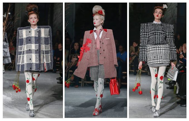
Thom Browne A/W13: Alice in Wonderland, set in the 80s

I've had my eye on Thom Browne's quirky designs for a while now, but this collection made me stop in my tracks. It's as if he made up a recipe with equal ratios of Lewis Carroll, Gwen Stefani, Russian dolls, 1980s power dressing and an angry Miss Havisham, then added an extra sprinkling of rose petals for good measure. My favourite parts of the concoction, including one of the best girl-with-attitude pouts yet:


Thom Browne Fall 2013 Red Roses and Pintucks
 [All images via Style.com, except where credited]
Excess All Areas

Browne's love of full volume design is always at the forefront of what he does - there's rarely any subtlety involved. That means an entire outfit in red, a pintuck-upon-pintuck dress with a corseted waist or a rose-strewn tulle gown with co-ordinating headpiece.

The typical Browne girl, if there is such a thing and she can be pinned down to a mere stereotype, is someone who refuses to be a wallflower. She probably loves cupcakes and Tim Burton films and wanted to be a horse when she grew up.

Thom Browne Fall 2013 Red Lips and Roses
 Roses Are Red

It's all about the 1980s bouffant, even down to the frizz. Backcombed to seemingly impossible heights, it then has corsages pinned carefully into place, teamed with groomed brows, a pinch of blusher and a geisha-style lip in vibrant red. The overall effect is that of a Russian doll who's been listening to power ballads and works in an office. Makes perfect sense to me...

Thom Browne Fall 2013 Grey
 The Lady is a Vamp

These shoulders are markedly different from the Henry VIII shoulders rocked at Burberry last season; they're more elegant and often angular rather than solidly inflated in appearance. If you've seen Browne's work before, you'll know he loves to exaggerate the silhouette like this, with American footballer shapes for men. 

These images also remind me of the micro-trend on street photography websites, for fashion editors and celebs to wear their jackets balanced on their shoulders, rather than putting their arms through the sleeves - the shapes here look very similar. Perhaps this is a case of the street influencing the catwalk?

Thom Browne Fall 2013 Red Embroidery and Embellishment
 The Gathering 

Hitch up, look sharp, as Dizzy Rascal didn't quite ever say. Gathered layers of fabric were heavily embellished or accessorised with everything from fur trims (though I hope they're not real) to Edwardian ruffles. The nipped in waist is a great antidote to the effect of wide skirts and fussy sleeves.

Thom Browne Fall 2013 Geisha Pout
 A Pout To Rival McKyla Maroney's Meme

This is a look that says, "I don't care if you hate what I'm wearing, because I bloody love it." Topped off by power brows, obvs. 

McKayla is Not Impressed at Fashion Week
Sorry, McKayla.
[Image via Memecrunch.com]

Thom Browne A/W 2013 Grids and Tweed
Squaring Up

Again, these are not Henry VIII or American footballer shoulders, but they're something else. In this case, more of a masculine shape, but made to seem all the more square and grid-like thanks to the choice of geometric tweed fabrics. There's also a sort of Alan Titchmarsh twist (yes, really - I haven't gone totally mad, but it is a tenuous link) in that the square patterns work really well with the climbing roses. Sort of like a trellis - see? Just me? Oh well. Maybe I've spent too long analysing this one. 

Still, Thom Browne's Autumn/Winter outlook is rosy as far as I'm concerned. Just get me some 80s tunes, a can of hairspray and some roses and I'll be desperately recreating the look in no time, though maybe not without the set designer's additions of men tied to hospital beds.

Sunday, 26 August 2012

Warehouse's Arty Prints: David Hockney and Ansel Adams Would Approve

After spotting an amazing canyon-print dress from Warehouse in one of the Saturday papers, I couldn't resist making comparisons between its design and that of David Hockney's Grand Canyon photo collage, and even his paintings of the landmark. Logging onto the website, I then tracked down another art-inspired dress that reminded me of legendary photographer Ansel Adams. As an art graduate I'm always chuffed to find major high street brands taking their cues from artists, and I thought I'd show you just how I made those connections.

Warehouse Canyon Dress
 [Images via Warehouse and Lalouver].
 The Canyon Print Dress (£70) is sure to make an impact.

I like that Warehouse has put such a bold print on the entirety of the fabric, not cutting into it with plain sections but allowing it to dominate. The horizontal bands are much like Hockney's intense collage, following the form of the wearer like his photos follow the canyon's shape.

Warehouse Canyon Dress - Hockney
[Images via Warehouse, Artnet (photo of the artist) and the National Gallery of Australia].
I'm guessing a little bit of Hockney inspired the designer.

What strikes me is how the multi-layered rock formations  and colour bands sit on one piece of chiffon but give the illusion of several pieces sewn together. You can see in Hockney's painting, A Bigger Grand Canyon (1999), that colour divides work well and help to illustrate the way that the canyon has different facets. There's also a warmth to the painting that translates to the dress - that fiery vermillion against a snippet of cool blue. Already I have a few locations in mind for creating an outfit post with this - either a dry river bed or an abandoned building - if only I can get saving up that £70...

Warehouse Ansel Adams Polaroid
[Images via Warehouse and Tumblr].
Poetic and with the lightness of a Polaroid.

A different cut to this Landscape Print Dress (£55) but still a big link to artistry, with this china blue and white print that reminded me of a teal Ansel Adams Polaroid photo of Yosemite Falls (1979). If you changed Adams' work to that same royal blue, I think the comparison would be even closer. I also love the pin-tuck in the waist band that makes the fabric kick out, like a waterfall.

Warehouse Landscape Print Dress
 There's also an element of Japanese artist Hokusai, but I'm more drawn to the photographic elements of the print.

The slight mullet hem brings this bang up-to-date and also helps to emphasise curves. The whole piece is lined to the hem, so don't worry about revealing your modesty.

Ansel Adams vs. Warehouse
 [Image via Weston Gallery, and close-up Warehouse].
This is an example of Adams' straight photography and how it complements the print of the fabric.

My final comparison shows how the delicate foliage and waterfall shot by Adams in Yosemite seems similar to the print on the dress. I don't know for sure whether the designer had referenced him directly, or even looked at his work, but I feel that there is a natural link there, and it's great to see that fashion is continually looking to the art world for its eye-catching prints.

Wednesday, 16 November 2011

Aussie Rules: Black Milk Clothing


[All images taken from Black Milk Clothing's official website].
What started as a brief foray into sewing a shirt became a full creative passion for James Lillis, the designer of Black Milk Clothing, based in Australia. Focusing on leggings, swimwear and dresses, with a smattering of tops and one very sexy lace catsuit, the brand knows exactly where it's going. The aim is to provide brilliantly patterned clothes that are sold exclusively online, and it works. The Galaxy Purple Leggings, above, are a great statement piece for wearing with basic tops or a shirt.


Some of you may know that I'm a massive fan of anatomical art, and that's actually how I came across Black Milk (via the brilliant site Street Anatomy). This skeletal swimsuit would make an excellent body over tights or a sheer skirt. It's beautiful and pays homage to some of the great anatomical illustrators like Andreas Vesalius.


The fantastically named Bone Machine leggings are another potential purchase - they're intricate but could easily pass for an abstract or tribal pattern. This is such a cool way to get into print, and you'd be hard-pushed to find another girl in the same outfit if you were wearing these.


Black Milk dresses are influenced a little differently, with the galaxy and skeleton prints still strong but a few visual links to more traditional art and design. I chose the Mucha dress to show you because it references Alphonse Mucha, a talented Art Deco painter and illustrator. It's a close-fitting number so it's not for the faint-hearted, but you'd get loads of compliments.

I am really impressed by Black Milk Clothing and I think it deserves to be seen. The designs are fresh and fashion-led but without compromising on quality. I'm considering placing an order once I can save up for overseas postage...

Tuesday, 25 October 2011

The House of Eliott: 1920s fashion inspiration


[All images my own, taken as screen grabs from ITV3].
Recently on British television, we've been treated to a re-run of a cult period drama involving two sisters who establish their own fashion house during the 1920s. The House of Eliott involves quirky costumes and sharp dialogue as the duo navigate their way through the ups and downs of the industry. As the above image demonstrates, the long hemlines and ever-present hats are actually quite relevant to today's style - maxi skirts have become the staple choice for many women, whilst headgear is perfect for A/W11-12, whether it's a bowler, a trilby or a cloche hat.


Beatrice Eliott, the older of the sisters, is seen here rocking a pre-Gaga feathered headpiece and a sheer dress. Much of the fashion house's early success comes from wearing the clothing to society parties and getting it noticed by potential clients. It's basically the 1920s equivalent of subliminal advertising.


Younger sister Evangeline (known as Evie) opts for a velvet halterneck dress and a metallic floral headband. Because of the age gap between the pair, with Evie being 18 and Beatrice being 30, we get to see how fashion can transcend age boundaries and how flexible it can be.


Ignoring the not-very-1920s lipgloss, this image is a great example of period dressing. Evie's high neckline is typical of the time, as daywear still contained a lot of references to Edwardian trends and often involved covering up. Her floppy hat, with its striped band, gives a nod to the tricorn shape but has been updated in soft black fabric.


Did I mention they like hats? Beatrice's statement piece is this matte black choice, which she's paired with a blazer and a pinstripe satin shirt. Her use of tailoring shows that she means business and it emphasises her determination to survive in a masculine world.

Long live the strong fashionable female!

To get the look on the high street, try these:

  • Topshop is great for hats and hairpieces. Last year it had a popular range of woolen turbans that were worn by Kylie Minogue. This year there's plenty of floppy 70s styles (think burgundy and tan) and some knitted headbands.
  • Galibardy has plenty of intense jewellery that will make a statement, whether it's a cocktail ring or a vintage-looking necklace. Wear with satin and loose hair.
  • Marks and Spencer currently has a brilliant black pleated maxi-skirt in its Limited Collection that would work well with a tailored white shirt and hobnail boots, if you want to give a nod to early 2oth century dressing.

Friday, 29 July 2011

My Favourite Designers, #1: Vivienne Westwood


I recently made a pilgrimage to the Vivienne Westwood shop on Conduit Street, in central London. It was a gorgeous set-up, with a glittering window display and very attentive staff. I chose this Prince Charming handkerchief (£15) to tie around my handbag, because I loved the fairytale feel to its text and the elegant rose print. It was really hard to walk away without buying up rails of clothes, but I'm aiming to save up for one of her dresses.


This Dryad dress (taken from Cocosa) really shows you why Westwood is hailed as celebrating the female form. Although the model here is slender, the shape of the garment is very flattering on curvaceous women - the nipped-in waist adds shape, whilst the scoop neckline is structured and given a formal edge with the collar detail.


One of Westwood's limited edition pieces in the Valentines range 2011 (from Hervia), this pendant is to die for - a phrase I don't utter lightly. Using a sample of traditional portraiture with the eye image, she has transformed the emblematic heart and arrow icon into something new and original, with the trademark orb design added on top.


A newer example of her jewellery prowess (taken from Hervia), this stamp piece harks back to previous collections but is modern and tongue-in-cheek. The sturdy chain also means it's built to last and will serve as the antithesis of the delicate women's bracelet. It's bold, eye-catching and fun.


Intended to be mismatched, these brogues are such a brilliant statement piece. Although they are unusual, they'd be great for wearing in a more liberally-minded workplace, as the formality of the brogue and its high-quality design means that you could easily wear these all day.

Three reasons why Dame Vivienne has topped my list:

1. She's ethically-minded and keen on free speech. Every ad campaign she runs in the media features the words 'Leonard Peltier is innocent', raising awareness of a Native American Indian man who has been convicted of a crime that many believe he did not commit.
2. She knows that not all women fit the size zero mould, and she caters for all of us with her body-enhancing clothes. You can rest assured that her clothes will not alienate you, and it will always be you wearing them (rather than the other way around).
3. She's a successful woman who doesn't give in to old age or the pressures of modern society. If she wants to wear a slogan t-shirt or a cocktail dress, she'll bloody well wear it, and she'll star in her own clothing promotions instead of hiring an identikit model.

I wish her many more years at the top of her game. If you're ever near Conduit Street, do go and check out her stores - there's one for men and another for women - because I can assure you that you won't be disappointed.

Sunday, 15 May 2011

Judy's Affordable Vintage Fashion Fair 2011 - get your glad rags on


[All images my own - please ask before reproducing].

The stalls were set up, the cupcakes were on display and the retro fashion was wall to wall; this could only be a vintage fashion fair (or a great trip in a time machine). Judy's Affordable Vintage Fashion Fair, which I will abbreviate to Judy's, is one of the most eagerly anticipated events for lovers of all things pre-modern. The fair travels and down the country, hitting major cities and delighting students and former hippies alike. The atmosphere was brilliant in Brighton today, with a dedicated throng of Early Bird entrants - including myself - clamouring to pass through the gates of the racecourse at 11am.

So what can you expect to find at such an event? Obviously clothing is a major draw, forming the bulk of the goods on show, and there was a heavy emphasis on the 1940s and 50s today in particular. You can expect to pick up a great tea dress from either era for about £30, and then take your pick of the beautiful costume jewellery nestled in between the clothing rails. Accessories abounded too, from battered but sturdy suitcases to dainty evening handbags or clutches. Menswear was catered for in many guises, from the denim of James Dean wannabes to the Fred Perry and Ben Sherman for the streetwise man, or the tweed jackets or bow ties of the aspiring dandy. My dad was pleased to find a great stash of cufflinks and ties, which he was drawn to with a magpie-like instinct.

The stallholders, too, are immersed in the vintage world and often have some of the best looks - see two examples above, including Eleanor, a milliner who makes excellent fascinators and headpieces. And another aspect of Judy's to mention was its sideline in furniture stalls, which arose from a collaboration with the Vintage Furniture Flea. Here you could find the perfect cushion, Ercol chair (which my dad remembered from the first time around...) or a piece of glassware. This was the perfect accompaniment to the clothing and accessories areas, although noticeably smaller in the number of stands. I hope that the furniture element will be retained in further Judy's events, because it definitely sat well aesthetically and it created a more holistic approach to vintage life.

So what did I come away with? Well, a 1950s hair slide, retro peony pink earrings, some miniature skeleton charms which will form part of a necklace I'm making, a black vanity case (a.k.a. my new handbag), and countless business cards that will probably result in many online purchases once I hit payday. Not to mention the two dresses, suitcases and a fascinator that I very nearly bought. It was a great day out and it has given me plenty of new ideas for outfit building and continuing to embrace vintage in my wardrobe. If Judy's is heading to a city near you, don't miss out.

www.vintagefair.co.uk

Sunday, 13 March 2011

Worrying Fashion Icons


[Image credits: Digital Spy, Now Magazine, and moi].

Some of my longest-running wardrobe interests are leather jackets, black boots, mini-skirts and leopard print. I share these with one of Eastenders' biggest scene stealers, the hard nut Shirley Carter, played by Linda Henry. The wardrobe designers on the soap have done an amazing job at establishing her character through clothing, giving her a clear personality that's not to be confused with our other animal print-loving Albert Square resident, Kat Moon. As I sat watching Eastenders the other day, it occurred to me just how many of the items in Shirley's closet I could easily have pulled out of my own, and this was a scary revelation. I wouldn't otherwise identify myself with her character in personality or temperament, but it's funny how the same garments can be representative of different people's individuality. For me, just like Shirley, the mini is a show of freedom and a determination to not be considered dowdy or plain. The leather jacket can survive anything, giving me the tough outer layer that I want to present to the world, however vulnerable I may actually be feeling underneath.

So, whose wardrobe secretly parallels your own?

Saturday, 29 January 2011

Musical Muse


(Images via Standart News and Last FM).

For those of you who didn't see the amazing Mark Knopfler program on BBC Four last night, you're in for a treat. Not only is this man amazing at writing lyrics and creating the most incredible guitar riffs and solos, but he is also known for his distinctive look in the 1980s. I knew he was famous for those little headbands, but I'd never quite appreciated the whole ensemble until I was watching the archive footage on this documentary; it's not only practical (who wants hair in your face when you're boiling on stage?) but it's about ignoring whatever anyone else may be wearing and doing your own thing. There are no logos or considerations for looking cool (besides maybe choosing something in a nice colour or a crazy pattern), because comfort and purpose have overtaken them. With sportswear looming large on the catwalk, the more functional terry towelling headband may yet make a comeback, but I hope this doesn't leave us with a lasting trend. The whole thing about Knopfler is that you can try and imitate what he does, but you'll never do it quite as good as him. I wish more men had the guts to dress however they want, without being restricted to obvious choices or whatever is in the shop window. It's time to be inventive.

Sunday, 16 January 2011

Crisis Clothing


I'm experiencing a problem which hasn't significantly reared its ugly head in nearly ten years; one of my peers is stealing my style. The last time this happened was in school, and my eclectic multi-layered t-shirts and baggy brightly coloured cords became the ultimate items for one of my closest friends. It was supposed to feel flattering but it just felt disappointing, and that's still my reaction now. The difference is, we're not at school any more; this decade's look-thief is someone who is normally quite content to do her own thing, yet recently she's been absorbing my hair colour, hair style, clothing ensembles and other such small and seemingly insignificant details. It's frustrating when I spend ages trying to express myself through what I wear or how I present myself, and then suddenly there she is, expressing me through her own body (if that makes any sense). It's truly maddening. I don't feel I can say anything because we haven't spoken properly in a while - that's right, this modern version of imitation is conducted by her checking on my Facebook photos and 'liking' them. It's a sad day when the technology that unites you with your friends also makes you want to slap them.

Friday, 23 July 2010

Maison Martin Margiela @ Somerset House


As you can see, I took a few sneaky photos at this exhibition, even though photography was technically banned. But I couldn't resist - Margiela's emulsion-covered t-shirts, brogues and jackets jumped out at me, as did his trompe l'oeil work. The whole exhibition had loads of elements which I'd put into my Art Degree Show and I wish that my tutors had been interested in fashion and taken the time to understand why I referenced so many designers in my project. Using materials like emulsion will always look fantastic and unusual when not on a wall. Adding something so purposeful yet out of context to a piece of wearable fabric is, in my opinion, a stroke of genius (excuse the painterly pun).

The middle photo shows the part where we explore the ideas behind a Margiela store, and a room was covered in mannequins, shredded paper and boxes (all, of course, in white). Everything felt clean yet disorganised, and wonderfully fresh.

The bottom photo shows one of his amazingly structural dresses. This is design not for commercial gain as the primary motive, but for a genuine love of creating new things and pushing the boundaries.
Related Posts Plugin for WordPress, Blogger...