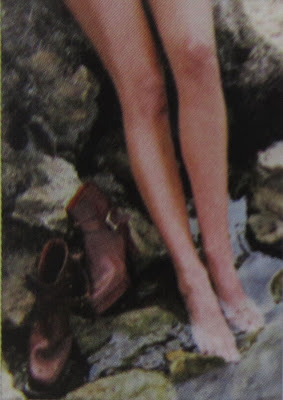
 [All images taken as photos from the original Masters of Style brochure, and reproduced for illustrative purposes. This image: Salvatore Ferragamo, SS/1980, photographed by Stefano Biliotti].
 I love this image because it taps into the voyeurism aspect of fashion: we like to look good and we like to watch others looking good. When we see a covetable item, we can't take our eyes off it. For me, this image was also reminiscent of the wartime figure of Kilroy peering over a wall (see the link here if you don't know what I'm talking about), only this is the fashion equivalent. It's an excellently subtle way to present a brand.

[Salvatore Ferragamo, SS/1982, courtesy of the brand's Museum]. This is really striking as an image because it uses hardly any colour and yet looks incredibly modern. The sleek look would appeal to the male businessman market being targeted here.

[Salvatore Ferragamo, AW/1992-3, photographed by Sergio Merli]. Again, a simplistic image which really works. Presenting the bags as a series, being interconnected by the chain handles, there is a sense of unity between them which would probably encourage rich shoppers to buy one in every colour.

[Missoni illustration, AW/1970-1, by Brunetta]. The pen and ink work here is light-hearted but effective: it leads your eye around the advert and makes you really look at the patterns of Missoni, rather than just the bold colours they are famous for.

[Miuccia Prada, SS/1989, by Albert Watson.]
The ankle is one of those strange parts of the body that was highly erogenous in the Victorian era. It's not something we tend to focus on in flat footwear, either - it's the domain of strappy stilettos and wedge heels. But there's something really personal about this portrait, and something a lot more arresting than a full body shot. We see the intimacy of arranging tights (which all girls know can be a bloody nightmare, but looks almost graceful here) and we see well loved brogues. Good work, Prada.

[Missoni family photo].
This was one of my favourites from the exhibition - it's like the family portrait from hell, until you realise that this isn't some weird clan from Bognor Regis - it's the privileged Missoni dynasty in their knitwear, and it costs a darn sight more than a few trips to the charity shop to look like this. Top marks for effort, and for keeping this one in the family archives. Although it's cheesy, it's also very sweet.
After adventuring in your new Prada boots, why not cool off in the nearest river, a la Christy Turlington? I joke. This image is, like Albert Watson's earlier effort, evocative of what designer footwear should be about: more than just cocktails and going to restaurants, which C-list celebs might have you believe. It's about quality design that lasts and can work with anything. It's about craftsmanship and giving yourself a treat that will treat you back. I'm converted - are you?


No comments:
Post a Comment