Showing posts with label NYFW. Show all posts

Tuesday, 12 February 2013

Thom Browne A/W13: Alice in Wonderland, set in the 80s

I've had my eye on Thom Browne's quirky designs for a while now, but this collection made me stop in my tracks. It's as if he made up a recipe with equal ratios of Lewis Carroll, Gwen Stefani, Russian dolls, 1980s power dressing and an angry Miss Havisham, then added an extra sprinkling of rose petals for good measure. My favourite parts of the concoction, including one of the best girl-with-attitude pouts yet:


Thom Browne Fall 2013 Red Roses and Pintucks
 [All images via Style.com, except where credited]
Excess All Areas

Browne's love of full volume design is always at the forefront of what he does - there's rarely any subtlety involved. That means an entire outfit in red, a pintuck-upon-pintuck dress with a corseted waist or a rose-strewn tulle gown with co-ordinating headpiece.

The typical Browne girl, if there is such a thing and she can be pinned down to a mere stereotype, is someone who refuses to be a wallflower. She probably loves cupcakes and Tim Burton films and wanted to be a horse when she grew up.

Thom Browne Fall 2013 Red Lips and Roses
 Roses Are Red

It's all about the 1980s bouffant, even down to the frizz. Backcombed to seemingly impossible heights, it then has corsages pinned carefully into place, teamed with groomed brows, a pinch of blusher and a geisha-style lip in vibrant red. The overall effect is that of a Russian doll who's been listening to power ballads and works in an office. Makes perfect sense to me...

Thom Browne Fall 2013 Grey
 The Lady is a Vamp

These shoulders are markedly different from the Henry VIII shoulders rocked at Burberry last season; they're more elegant and often angular rather than solidly inflated in appearance. If you've seen Browne's work before, you'll know he loves to exaggerate the silhouette like this, with American footballer shapes for men. 

These images also remind me of the micro-trend on street photography websites, for fashion editors and celebs to wear their jackets balanced on their shoulders, rather than putting their arms through the sleeves - the shapes here look very similar. Perhaps this is a case of the street influencing the catwalk?

Thom Browne Fall 2013 Red Embroidery and Embellishment
 The Gathering 

Hitch up, look sharp, as Dizzy Rascal didn't quite ever say. Gathered layers of fabric were heavily embellished or accessorised with everything from fur trims (though I hope they're not real) to Edwardian ruffles. The nipped in waist is a great antidote to the effect of wide skirts and fussy sleeves.

Thom Browne Fall 2013 Geisha Pout
 A Pout To Rival McKyla Maroney's Meme

This is a look that says, "I don't care if you hate what I'm wearing, because I bloody love it." Topped off by power brows, obvs. 

McKayla is Not Impressed at Fashion Week
Sorry, McKayla.
[Image via Memecrunch.com]
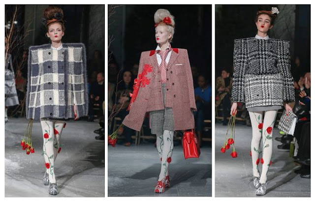
Thom Browne A/W 2013 Grids and Tweed
Squaring Up

Again, these are not Henry VIII or American footballer shoulders, but they're something else. In this case, more of a masculine shape, but made to seem all the more square and grid-like thanks to the choice of geometric tweed fabrics. There's also a sort of Alan Titchmarsh twist (yes, really - I haven't gone totally mad, but it is a tenuous link) in that the square patterns work really well with the climbing roses. Sort of like a trellis - see? Just me? Oh well. Maybe I've spent too long analysing this one. 

Still, Thom Browne's Autumn/Winter outlook is rosy as far as I'm concerned. Just get me some 80s tunes, a can of hairspray and some roses and I'll be desperately recreating the look in no time, though maybe not without the set designer's additions of men tied to hospital beds.

Wednesday, 12 September 2012

NYFW S/S13: Victoria Beckham Strikes Again

Victoria Beckham S/S13 New York
 Whoever underestimated VB must be kicking themselves by now.
[Images via Style.com].

Time and time again. Victoria Beckham's design skills prove that she knows what women want regarding power dressing without the shoulder pads. This collection, like those before it, showed how you can dress like you mean business without compromising on style. 

I particularly enjoyed the nods to geometric patterns and the overlaying of sheer panels, especially in the central image where you see that those panels are actually on one side of the shoulders and add an unexpected quirk to the design. 

Victoria Beckham S/S13 New York
 Angular panels of fabric (and some equally angular brogues) were juxtaposed with softer pieces like those nude sandals in the central image and the bright orange draped jacket on the right.

There's so much wearability in these pieces and it does seem a shame that they carry such high price tags, so I would like to see Mrs. Beckham creating a more affordable diffusion range in the future - I know she has her second line, Victoria by Victoria Beckham, but it still doesn't stoop to the levels of my humble purse. If it did, I'd combine the black cut-out jacket on the left with dresses from COS and vintage boots.

Victoria Beckham S/S13 New York Fashion Week
 This was my favourite look of the show: really simple but wearable and in trusty black.

All in all, the collection was as polished as ever but showed serious potential for inspiring the high street. She's created looks that are desirable without being gimmicky, and I can't wait to see what comes next.

Tuesday, 11 September 2012

Google Does Fashion: Diane von Furstenberg puts Google Glass on the Catwalk

 Diane suddenly realised she should've gone to Specsavers...
[All images via WWD, credited to Giovanni Giannoni].

I might have added comedy captions here (sorry, DVF) but I'm more than a little intrigued about Google's Glass technology being brought to the fashion world. The search engine giant already dominates the fashion industry in plenty of hidden ways - all those bloggers who want to rise to the top are at the mercy of Google's algorithm and the power of SEO overlord Matt Cutts, whilst new brands that need to be found online or department stores that need to be visible for key search terms above all of their competitors are also affected. This, in a way, is just a more blatant form of the big G's dominance, putting founder Sergey Brin on the front row and getting all of the models wearing his technology. I was half expecting someone from Bing to be shaking their fist angrily in the background and brandishing a pair of 3D specs, but somehow it didn't get that far.

The aim of Google Glass is to bring you connectivity without taking you away from real life, so you can record imagery and video or send messages but you're not staring at an intrusive screen throughout. To show how large companies and creatives can use it, von Furstenberg has been recording with Glass and will show how it's captured her work in a short video to be released, naturally, on Google +. Fashionistas were a little surprised at the design of the gadget but, as this is all in production stages, we can assume some modifications will be made before it hits the shops.

Aye aye, Google sets its sights on the NYFW runway. Parrot just out of shot.

Ok, pirate and optician jokes well and truly done, it's time to look at the practicalities of this thing. To be honest, I can see a lot of advantages to Glass, especially as I've often daydreamed about having a way of recording images and video in all of those places where you're not allowed to take your camera - art galleries that have crap postcard selections and demand you pay £60 for a print of a nice painting; times when you'd like to record a shop assistant being incredibly rude to you and send it to the smug CEO of the company after uploading it onto YouTube... ah, so many possibilities. Obviously with the introduction of Google Glass then those savvy shop assistants and gallery attendants will just tell you to take off your bloody tech device, but that's beside the point of the daydream, right? 

In simple terms, Glass is going to be about a personal view of the world for style mavens, whether that's used for promoting your fashion label or capturing every moment of a fabric buying trip to India. It'll keep you connected as you go, allowing you to filter ideas in something resembling a stream of consciousness. I think that, as long as they improve its slightly off-putting appearance, this will be a useful tool for everyone from designers to bloggers. Personally I can't wait to watch DVF's film and feel like I'm seeing through her eyes, if only through this new technology.

Monday, 10 September 2012

Theyskens' Theory S/S13: Boy Meets World

 Grunge for Spring/Summer? Hell yeah.
[All images via Style.com].

I am a little bit in love with Olivier Theyskens, even though he used to make demi-couture gowns that cost more than my combined university fees. There's something about his clothing that puts up two fingers to the doubters and makes you feel powerful (I assume - it's not like I have a secret stash of Theyskens' Theory in my room, though it would be a nice thought). Unlike the try-hard grunge look that seems distinctly pre-fabricated, this is genuine insouciance and you can tell that he's enjoyed crafting each piece, regardless of its reception. 

The top and trousers in the centre remind me mostly of grass stains, as if the wearer had spent long enough rolling down hills and scuffing her clothes to inadvertently create a look. Meanwhile the sheath dress on the right could have been sewn from a satin nightdress with a black voile thrown over the top in a last-ditch attempt to look presentable after a night on the tiles. Turning to the evening gown on the left, you can see it's made for putting your hands on your hips and into those pockets - not for being a wallflower.


 For those times when you feel a little bit different and don't want to chuck on jeans.

There was definitely an element of second glances in this collection, most notably in the ever-so-sheer demure-looking dress that flashes bright white underwear beneath this season's peplum. Similarly, but with less potential to offend the elderly, the blue house coat in the centre seems quite girly with its A-line shape, yet a closer look reveals that it's actually more like an oilskin men's jacket, but given an unusual cut, then thrown over a leather dress to give a mash-up of textures. Lastly, the beautifully sculptural maxi dress on the right is toughened up by embellishment and that stern pout from the model - you get the feeling she might have a knuckleduster on.

 Don't just go for the 'boyfriend' look as a phase - take that old jumper or suit jacket and wear it to death.

Boyish went for more of a grandad edge with chunky charcoal jumpers, elegantly cut jackets that verged on the masculine, and some deep v-necks that revealed gaping chests rather than ample cleavage. Those shiny black trousers on the left are perhaps a hard act to follow on the high street, with potential echoes of MC Hammer, but you can bet that fashion industry insiders will be clamouring to be shot in them by the likes of Scott Schuman and Tommy Ton.

As a parting note, everything gets bleached as the grunge kids draw back the curtains.

I wanted to end with more of the pure white Theyskens' Theory pieces, as they're so dazzling and might initially seem to go against the grungy aesthetic of the rest. Again, on a double take they seem a little less innocent. That white suit with those serious black boots gives a hint of A Clockwork Orange, whilst the baggy coat and silvery hair makes an otherwise simple, if short, shift dress seem like the choice of a post-gig rock star. The soft thigh-skimming jacket on the right is also fairly indecently short, but there's barely a hint of anything underneath (look away, middle America!). 

I can't get enough of this collection; there's so much fun behind the separates and they'd all add something to your wardrobe. Olivier Theyskens is a constant source of inspiration for me and I get the feeling he'll be lining the pockets of a few of our high street stores when they get creating copycat designs. Not naming any names, but you might want to head to Zara, Mango and COS to try and replicate the great man on a more budget-friendly scale...

Sunday, 9 September 2012

Black Light: Alexander Wang S/S 2013 vs. Viktor & Rolf S/S 1999

When I read about the amazing black light finale at Alexander Wang's S/S 2013 show, I couldn't help but compare it to the work of Viktor & Rolf. Wang's use of visual trickery to completely transform his collection is fantastic, but it's worth comparing it to what Viktor & Rolf created for for their own Spring/Summer collection of 1999. Let's hit the lights.

Alexander Wang

Alexander Wang SS13 Black Light
[Image via Style.com]

The only warning of what was to come was the announcement that flash photography was not allowed at Wang's latest show. Bewildered attendees must have wondered why, as it was only in the closing moments that the lights went down to reveal an ethereal glow from the clothing. What could have ended up like a tacky disco moment was instead made into a sleek piece of artistry because of the cut-out nature of each piece, creating bold panels of white and complemented by a single line on each model's head that marked their bodies out against the darkness. Wang referenced the futuristic film Tron to put the effect into context.

So, how was the panelled effect achieved so successfully? Using fishing line. This makes each part seem to be suspended in thin air, which adds to the artistry of the whole collection, right down to the simplistic white stilettos with thin straps that divided the legs into neat sections. Essentially the black light helped us to see each look in its own right, without distractions.


Viktor & Rolf

Viktor & Rolf SS99 Black Light

[Image via Google Books]. 

It's such an early moment for the design duo that V&R's Black Light doesn't even feature on Style.com (my Bible for quality catwalk images that don't look like they've been taken by someone nine rows from the front row using a dodgy Blackberry). Instead I turned to Fashion at the Edge: Spectacle, Modernity and Deathliness by Caroline Evans, to find what the author described as 'their last spectral collection before they launched themselves into the real world of embodied fashion and commerce'. The designs were firstly shown in black light, then in normal conditions, to show the transformation.

What I gleaned from the images was that Viktor & Rolf were already establishing themselves as not being easy to categorise: the designers who couldn't be neatly put into a box. This was about having original ideas and wanting to put on a show, making the wearer feel like a gallery piece rather than a sex object or a dowdy housewife. It was part-freak and part-opulent, yet somehow the aesthetic worked, down to the skeletal lines on a trouser suit.

Comparing the Two

Wang's use of lighting might seem like an afterthought compared to V&R's theatrical staging, but I think we have to remember that Wang is able to take fewer risks as the creator of a highly commercial brand. What he has produced is just enough quirk to raise the stakes of Fashion Week, without alienating buyers and your middle-of-the-road fashion lover. Keeping trendsetters and trend followers equally happy is not an easy task, but he seems to have pulled it off without totally plagiarising his black light trailblazers.

Saturday, 8 September 2012

MBFW S/S13: Alexander Wang and Cushnie et Ochs

So, New York Fashion Week is upon us (known as Mercedes Benz Fashion Week, corporate lovers). Here's what has grabbed my attention from Alexander Wang and Cushnie et Ochs for next season:

Alexander Wang

Alexander Wang SS2013
[All images from Style.com].

Wang brought us separates that worked together to create a blank canvas for the wearer to either personalise or use as a barrier to the world. The stark minimalism was tempered with an edge of cut-and-paste as layers of leather and cotton shirts built up to reveal a stunning monochromatic look overall. I can definitely see those thin-strapped stilettos being fed down to the high street.

Alexander Wang SS2013

The body was either elongated with metal zips, enlarged with wide jackets or sectioned horizontally with multiple-strap black boots that diced up the legs with a precision that reminded me strangely of the anatomist Gunther von Hagens (if you've ever seen his Bodyworlds exhibition, you might recall the body sliced into thin lines). Anyway, enough of the gore - this collection was about pure minimalism and playing with proportions using graphic lines. The finale, using black light to make the white pieces glow, proved that Wang wants you to make an impact in these clothes.


Cushnie et Ochs

Cushnie et Ochs SS2013

Another show full of clean lines came from Cushnie et Ochs, a design duo whose main palette was black and white, with splashes of aqua and cobalt blue. Though the footwear was less inspiring than Wang's, it continued the trend of stripped-back shapes (and also reminded me of 90s heels, which was a little scary). Where the designers excelled was in the necklines, shoulders and decolletage, adding points of interest that made their creations suddenly stand out. That meant embroidery on what appeared to be voile, an amazing heavy shoulder addition on the aqua dress in the centre, and wave-like cut-outs on the right.

Cushnie et Ochs SS2013

Here are some more neck and shoulder details that definitely inspired me. Each one looks so crisp, like it's been cut out with crimping scissors or a scalpel, and it entirely removes the need for necklaces or earrings. Perhaps there's a risk that these dresses could end up wearing you, rather than the other way around, but I'd be willing to give it a try and find out. I'd team one of these necklines with nude lips and cobalt blue angular eyeliner, then I'd add sculptural wedges a la Alexander McQueen.

I didn't just pair these two designer reports because they seemed vaguely similar; they both have their own take on minimalism and have added memorable traits that can translate into sales. I'm looking forward to seeing creative necklines and oversize zipped shirts in the shops.

Thursday, 1 March 2012

Preview Post: The 90s, with Jeremy Scott and Ashish

 [Images via Style.com and presented by me]. 
Jeremy Scott's show was a myriad of pop culture references from the 90s onwards.

Ashish's collection was also 90s-heavy, with the smiley face, yin and yang and many modern hippie references that channelled a Brit on a 'Gap Yah' style adventure.

This week I've been writing for This Affected Youth on the influence of the 1990s on both Ashish and Jeremy Scott's collections for A/W 2012. Although they took them in different directions, there were many shared symbols and themes in their designs, and I couldn't help but compare the two. 

To see the full post, please click here for This Affected Youth does Fashion Week.

Monday, 13 February 2012

NYFW Fall 2012: Theyskens' Theory is Decidedly Mixed


[All  images taken from Style.com].
Let's cut to the chase: I'm going to start with the good bits, especially as I'm always so excited to see what Olivier Theyskens comes up with for Theory. His own personal style is a mixture of sleek, straight hair and baggy or draped clothing, and you'll often see this combination in his designs for women, though there is a lot more emphasis on the former. The stone dress above caught my eye because it seemed so historical, like a combination of Victorian feminine dressing and Little House on the Prairie frontier-style practicality.


Outfit #2 from my shortlist is a more traditional Theyskens approach, with a rock vibe seeping through in the dirty gold sequinned jacket, the slouch-fit trousers and the patterned charcoal t-shirt. This doesn't feel like the same target female as the stone dress; this woman is comfortable with adding a more masculine edge to her look, and she doesn't need everything to be neatly finished and tucked in.


I can totally see this dress being adopted on the red carpet. The unusual neckline means that the mainstream press will probably stick the unsuspecting celebrity in the 'Worst Dressed' category, but I don't feel the need. It's little details like this that freshen things up in fashion, and stop a plain dress being, well, plain.

My favourite look from the show was this simple but effective sharp jacket, that seems to mould its way around the body like armour, with a flimsy skirt that has the consistency of tissue paper. It's a really interesting contrast, with so much protection focused around the torso and the legs completely exposed.


Another piece that's sure to make it into fashion editorials and the wardrobes of celebrities is this ethereal off-white dress. The high neck and fishtail base make for an overly covered form, but the sheer layers look as fine as smoke in certain places. It's elegant and doesn't expose any flesh, but it still manages to be exciting and not as conservative as you might think.

This is the last of the stunning moments from the collection. It's another dazzling piece that is classy and daring at the same time, worn simply with loose hair and smoke grey heels. Look away now if you don't want to see what else Olivier Theyskens added to the mix, because it's going to be pretty frustrating.

I know that he's a master at tailoring and cutting around the female form, but this outfit is hardly groundbreaking. It reminds me of synthetic suits that you'd buy in bargain basements circa 2000-2005 - the ones that were well shaped but felt really strange and smelt a bit funny. I know that this version would set you back a ridiculous amount of money, but it just doesn't add enough interest. The shape you see here is only so exaggerated because of the model's thin figure, but on your average UK size 10-16 woman you would struggle to justify the price, because so much of the lengthening effect would be lost. Those flares would drown a girl, and the jacket would pull against an average UK bust. It doesn't work for me as an exciting or flattering look and I don't feel it's made for real women. I know that Ready to Wear isn't made for the high street, but it should be more realistic than Couture in terms of the modern woman's figure.

Another misguided attempt, the cream coat looks like something straight out of a Middleton sister's wardrobe. Meanwhile the gold pencil skirt and off-gold top are a little bit like a mid-life crisis moment, with a desperate attempt to draw attention to something, but it ends up being your ankles rather than anything remotely flirtatious (yep, the ankles were last seen as a scandalous body part pre-WWI).

Okay, enough of the designer-bashing. I want to end with a decent everyday piece that straddles the line between the beautiful event gowns and the cool slouchy trousers with a metallic tinge. Enter the burned olive playsuit (or shorts and shirt - I'll admit, it's very hard to tell from the catwalk image). This is the blend of hiding and revealing flesh, without the formality of a dress. It's the way that the rock goddess from my second image could have a meeting of minds with the prairie girl from the first shot. It's wearable, slightly flirtatious, and it's really flattering. This is what we need to see more of; attention to detail that can work for different body shapes, and not just one. We want to see intuitive design, not the reinvention of the wheel with a cream coat.

It will be interesting to see if my choices of the good and bad Theyskens' Theory pieces mirror that of the fashion editors and writers, or if I'm just not on the same wavelength and actually the Middleton sister look is the perfect way to appear edgy. In which case, all will really be lost. I stand by my selection, and I hope that Olivier Theyskens manages to hit the mark more often next season.

Thursday, 9 February 2012

NYFW Fall 2012: Nicholas K's Cowboys and Flappers Mash-Up


[All images taken from Style.com]
What we've learned from Nicholas K: the bigger the hat, the bigger the strut. The hint of cowboy was undeniable with this kind of headwear. Exaggerated proportions made it even more fun, with rolled up sleeves and baggy boots to complement the look, and that fierce reddish orange eye make-up.


This ensemble reminded me of travel photography focusing on harsh landscapes and often inhospitable environments (I'm thinking rocky outcrops, freezing wastelands and unforgiving desert sun). The block shade of mid-grey is a nice contrast to the harsh khaki, black and white tones elsewhere in this show.


Another element of travel came through for me in this catwalk collection: the notion of layering up and wearing as many of your clothes as possible, so you travel lighter. Note the awkward hat, coat, necklace and boots that make an altogether disjointed but exciting outfit, especially when placed against the flapper wigs that all the female models wore, alongside fringed pieces and draped boyish vests underneath that celebrated the boyish 1920s body ideal.


In the sleeker menswear silhouettes later on then there's more of a 'cityboy does western' vibe coming across - everything's polished, tucked in and neat, in contrast to the earlier frenetic layering and undone buckles. This suggests that Nicholas K isn't just aiming at one type of man or dresser; you can find something in this collection whether you like to look genuinely bedraggled or you just want a hint of bed hair.

The whole collection was an interesting combination of influences that made everything appear fresh, even though many of the pieces may have looked unremarkable in their own right. It's all about the layering and juxtaposition of forms for Nicholas K, and he makes a strong case.
Related Posts Plugin for WordPress, Blogger...