Showing posts with label theatricality. Show all posts

Thursday, 11 July 2013

Style in Almodovar's 'Women on the Verge...'

Anyone who's watched a Pedro Almodovar film will appreciate that the director likes his women strong, captivating and usually taking centre stage, but when I sat down to watch Women on the Verge of a Nervous Breakdown (1988), I wasn't quite prepared for how arresting their costumes would be. 

Every female character had a distinct look that only she could carry off, whilst the only memorable male outfit was the bizarre cartoon-esque get-up sported by Madrid's most sensitive taxi driver - think big 80s bleached hair and a heavy dose of lime green, against a leopard print taxi interior. 

Almodovar's Mujeres title piece with vintage women
 These well dressed women hint at how much fun you'll have with the film if you love style.

Opening titles of 1988 Mujeres al borde...
 The slick and eye-catching opening titles.

Minimalist costume design with collaged jewels for Almodovar
This is the man to thank: costume designer Jose Maria de Cossio.

This film not only had major staying power because of its complex plot and unexpectedly good one-liners during traumatic moments, but it struck me that the costumes were impossible to get out of my head. I kept thinking about Pepa's Vans-style trainers and hibiscus-print shirt, contrasted with her more business-like long line cardigans, which she even double-layered at one point. 

Pepa wearing Hawaiian shirt and standing next to fire
 What to wear when your bed bursts into flames, as demonstrated by Pepa (Carmen Maura).

Pepa (Carmen Maura) searches through Ivan's wardrobe
 Pepa examines Ivan's wardrobe.

Pepa (Carmen Maura) wearing two cardigans and sitting on bench
This calls for two cardigans.

I loved the innocence of her best friend Candela's tube skirt and top ensemble, worn with knee-high socks and creepers - an outfit that could have come straight out of Topshop this season. Candela (Maria Barranco) then borrowed Pepa's black dress, slicked back her hair in true 80s style and took on a much more serious fashion personality, as she tried to get to grips with the crazy and dangerous situation she'd found herself in, which Almodovar has made brilliantly tragi-comic.

Maria, Candela and Carlos in Pepa's flat
 L-R: Marisa (Rossy de Palma), Candela (Maria Barranco) and Carlos (Antonio Banderas).
Candela's working the stripes and the embellished jacket.

Candela with slicked back hair and black dress
A serious event needs a sharper outfit.

For another key character Lucia (Julieta Serrano), fashion was all about looking to the past, because the happiest times of her life were decades old. Cue meticulously applied eyeliner, a beehive wig and childlike accessories such as white tights and a hat that looked like it was once a traffic cone.

Lucia talking to Carlos with eyeliner in hand

The eyeliner excuse: probably used by women around the world. As said by Lucia to Carlos.

Lucia wearing pointed hat, outside Madrid flat
Totally incognito.

The most interesting costume moments definitely appeared when things really started to unravel for the women. That meant weird hair and gazpacho-soaked clothing to go with the heightened tension and urgency.

Almodovar's Lucia in vintage clothes with set hair
Not quite sticking to smart-casual here, Lucia.

Mujeres al borde... Pepa's gazpacho-stained outfit in taxi with Ana
One of the morals of the story, as Pepa explains to Ana (Ana Leza).

Carmen Maura on telephone as Pepa
This could almost be the basis of a Lichtenstein painting.

Basically, I can't recommend this film enough if you're into costume design and you love the 80s. There's so much expressed by the outfits in Almodovar's Women on the Verge... and it's great to see it lighting up the screen.

Saturday, 4 May 2013

Why I'm unruffled by the Spring/Summer 2013 ruffle trend

Normally on this blog I do tend to focus on the things I love about fashion; the things that make me want to go out and shop, or at least try and customise something in tribute to what I've seen and can't get out of my head. Well, this time I definitely won't be jumping on the bandwagon, because Spring/Summer 2013's ruffles won't be making their way into my wardrobe any time soon. Here's why I object to the thrill of frills.

What Works On The Catwalk Doesn't Always Translate To Real Life

I think this is a firm case of something looking expressive and dramatic on the catwalk, but then seeming more like a retro prom queen disaster when you see it on the woman next to you on the street. 

Obviously if you're a bit of an exhibitionist then you will quite happily get in a right flap about ruffles and you'll love the extra attention that they bring, but there's an element of overblown excitement and fuss about the whole ensemble which just doesn't work for everyday life, even if you filter it down to the high street and imagine spending £30 on a cheap version of the dress below.

Monochromatic ruffles on a v-neck dress with asymmetric hem, by Balenciaga
[Image via Vogue.com]. Balenciaga's dramatic movement failed to move me. Sorry, Nicholas Ghesquiere.

I think the question is: in what situation would this Balenciaga ruffled dress be appropriate and attractive to other people? At a cocktail party, you'd seem very high maintenance and you'd probably have got through multiple lonely marriages with only small yappy dogs for company and the occasional use of a yacht in St. Tropez. 

In a club, you'd be the one wearing too much make-up, talking too loudly and trying to look girly; you'd then spend most of the night trying to fend off jokes from men asking if you're dressed for flamenco dancing or why you're so bloody keen to bring back the 80s.  

Maybe if you're Carrie Bradshaw or Miroslava Duma then you could work this look, but us mere mortals don't always want to be that theatrical.

I Don't Want To Resemble A Valance

Valances on beds and curtains are one of those unnecessary details that just create too much fuss and make you look a bit like a cat lady in waiting. Sadly, some of these poor embarrassing homeware trimmings have made their way into Zac Posen's S/S13 offering, suggesting that us mere mortals may soon be asked to resemble our posh relatives' spare bedrooms. If, like me, you're not keen on channeling this look, say no to the ruffles and stay minimalist.

Zac Posen ruffled and frilled blouse with pencil skirt for S/S13
[Image via Vogue.com]. Zac Posen gets ruffled up.

Peplum, Maybe. Ruffles, No. My Curves Can't Cope

I'm proud of having curves, yes, but when trends like this come along then it can seem like overkill for someone like me - whose ribs are quite hard to find and whose hips are definitely anything but boyish - to join in and let those curves be amplified to excess. I don't need to emphasise those areas with extra fabric, but what I'd rather do is try and find my waist, to add a little balance, or try and play down my chest, rather than break out a frilly cleavage. 

Whilst the ever-popular peplum skims over the stomach and kicks out slightly at the hips in a fluid line, the ruffled blouse explodes like a five-year-old after too many party snacks and fizzy drinks. It's unsubtle and messy. Of course, if you are curvier and you want to wear frills, then I'm not saying you can't pull them off and look great, but I just find that they're counter-productive for me, and they leave me feeling like a meringue, when I'd rather eat one. 

If you're one of the brave (and probably slim) minority of women looking to rock a ruffle this season, good luck to you. I'll be watching, bemused, from the sidelines, and sitting this one out.

Tuesday, 12 February 2013

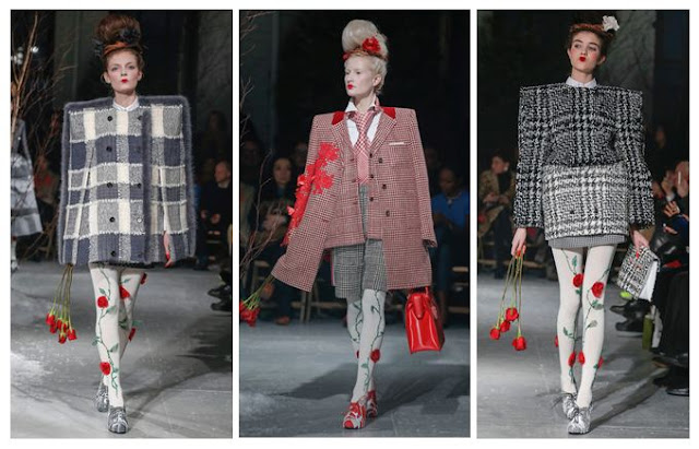
Thom Browne A/W13: Alice in Wonderland, set in the 80s

I've had my eye on Thom Browne's quirky designs for a while now, but this collection made me stop in my tracks. It's as if he made up a recipe with equal ratios of Lewis Carroll, Gwen Stefani, Russian dolls, 1980s power dressing and an angry Miss Havisham, then added an extra sprinkling of rose petals for good measure. My favourite parts of the concoction, including one of the best girl-with-attitude pouts yet:


Thom Browne Fall 2013 Red Roses and Pintucks
 [All images via Style.com, except where credited]
Excess All Areas

Browne's love of full volume design is always at the forefront of what he does - there's rarely any subtlety involved. That means an entire outfit in red, a pintuck-upon-pintuck dress with a corseted waist or a rose-strewn tulle gown with co-ordinating headpiece.

The typical Browne girl, if there is such a thing and she can be pinned down to a mere stereotype, is someone who refuses to be a wallflower. She probably loves cupcakes and Tim Burton films and wanted to be a horse when she grew up.

Thom Browne Fall 2013 Red Lips and Roses
 Roses Are Red

It's all about the 1980s bouffant, even down to the frizz. Backcombed to seemingly impossible heights, it then has corsages pinned carefully into place, teamed with groomed brows, a pinch of blusher and a geisha-style lip in vibrant red. The overall effect is that of a Russian doll who's been listening to power ballads and works in an office. Makes perfect sense to me...

Thom Browne Fall 2013 Grey
 The Lady is a Vamp

These shoulders are markedly different from the Henry VIII shoulders rocked at Burberry last season; they're more elegant and often angular rather than solidly inflated in appearance. If you've seen Browne's work before, you'll know he loves to exaggerate the silhouette like this, with American footballer shapes for men. 

These images also remind me of the micro-trend on street photography websites, for fashion editors and celebs to wear their jackets balanced on their shoulders, rather than putting their arms through the sleeves - the shapes here look very similar. Perhaps this is a case of the street influencing the catwalk?

Thom Browne Fall 2013 Red Embroidery and Embellishment
 The Gathering 

Hitch up, look sharp, as Dizzy Rascal didn't quite ever say. Gathered layers of fabric were heavily embellished or accessorised with everything from fur trims (though I hope they're not real) to Edwardian ruffles. The nipped in waist is a great antidote to the effect of wide skirts and fussy sleeves.

Thom Browne Fall 2013 Geisha Pout
 A Pout To Rival McKyla Maroney's Meme

This is a look that says, "I don't care if you hate what I'm wearing, because I bloody love it." Topped off by power brows, obvs. 

McKayla is Not Impressed at Fashion Week
Sorry, McKayla.
[Image via Memecrunch.com]

Thom Browne A/W 2013 Grids and Tweed
Squaring Up

Again, these are not Henry VIII or American footballer shoulders, but they're something else. In this case, more of a masculine shape, but made to seem all the more square and grid-like thanks to the choice of geometric tweed fabrics. There's also a sort of Alan Titchmarsh twist (yes, really - I haven't gone totally mad, but it is a tenuous link) in that the square patterns work really well with the climbing roses. Sort of like a trellis - see? Just me? Oh well. Maybe I've spent too long analysing this one. 

Still, Thom Browne's Autumn/Winter outlook is rosy as far as I'm concerned. Just get me some 80s tunes, a can of hairspray and some roses and I'll be desperately recreating the look in no time, though maybe not without the set designer's additions of men tied to hospital beds.

Sunday, 6 January 2013

Burberry Prorsum S/S13: Henry VIII Redux, with music by Tom Odell

When it comes to debating the S/S13 catwalk shows in real-time, it's hard to pick favourites and decide what to write about, so quite often I just end up leaving the rest in a mental 'To Do' pile and never quite getting round to discussing them. This year, one of my blogging resolutions (don't worry, there aren't that many) was to rediscover some of the weird and wonderful shows later on. So, let's begin...

Burberry Prorsum SS13 Cape
 [Image via Style.com]
Tudor elegance and exaggeration made for a strong range from Christopher Bailey.

My first choice was Burberry, completely by accident, as I've recently been spending a lot of time listening to music by Tom Odell. When YouTube started auto-filling 'Tom Odell Burberry', I knew where I'd heard his song 'Another Love' before - as the opening tune for the Quality Street-esque womenswear Prorsum collection back in September 2012 at London Fashion Week. I'm going to see Tom in March when he'll be gigging in Brighton and I can't wait to hear more of his stuff. For the record (inadvertent music-related joke there), his song worked brilliantly with the collection and it hinted at some of the drama in the clothing; capes, playing with proportions, flashes of colour and unexpectedly brilliant metallics.

Here's the video, along with other music by Birdy and Ren Harvieu.

Regal Inspiration for the Collection


The most obvious thematic reference I could find from the show, which I severely doubt even appeared on the mood boards at Burberry HQ, was Henry VIII. Here's why.

Burberry Prorsum SS13 Shoulders
 [All images via Style.com]
Exaggerated Shoulders and Arms

In portraits you'll notice that Henry was shown as being incredibly large, with huge arms and shoulders worthy of an American football player. Although he wasn't the thinnest bloke around, he actually used a lot of padding in his clothing to make himself appear bigger, therefore coming across as more powerful and domineering to his public and to any potential enemies. It's basically the equivalent of an animal puffing itself up to look more threatening.

For Burberry Prorsum the puffed up aesthetic was also used to look powerful, but it also came across as fashion-forward thanks to the beautiful metallic material and the minimalist outfits. No heavy embroidery and detail needed here, unlike the Tudors, who had a penchant for embellishment.

Burberry Prorsum SS13 Capelets
Capes

Ok, so Burberry went for a mixture of capelets (seen above) and full capes, but either way they looked great. Whereas the models look chic, Henry would have worn a cape for things like hunting, not hanging around at cocktail parties, but I'm sure he'd approve of these tailored numbers.

Burberry Prorsum SS13 Green Sleeves
Green Sleeves

It was said that the song Greensleeves was written about Anne Boleyn during her pregnancy. Those Tudors certainly knew how to make morning sickness fun. In light of this, it would be fairly apt if Kate Middleton (the most famous 21st century royal sufferer) started wearing some olive green pieces from the collection.

Burberry Prorsum SS13 Holbein Blue
 Holbein Blue

Hans Holbein the Younger was a really popular artist at the time of Henry VIII and painted royalty - including the man himself - on many occasions. One of his signature colours was this beautiful teal blue which he often used in the background of his paintings. Holbein's portrait of Henry VIII was called 'the best piece of propaganda ever' by the BBC (he portrayed the king as a strong and impressive man, rather than the ailing 45-year-old that he actually was). Anyway, Henry might not have ever been painted with this colour, but it's still something that I closely associate with him. It's also really striking on the catwalk, especially amongst all those jewel tones.

Burberry Prorsum SS13 Gold
Gold

It was either fresh and impossibly shiny or burnished to perfection, but there was more than a hint of gold for S/S13. The Tudors couldn't get enough of the stuff in their castles, palaces and ceremonies, so it's hardly surprising that we should find some here. Christopher Bailey's designs were tempting thanks to clever tailoring and flattering ruched fabric. The gold jacket in the centre is particularly eye-catching, though it might not be as easy to carry off in the British suburbs than in a piece of fashion editorial.

Burberry Prorsum SS13 Battle
 Ready for Battle

That nipped-in waist and those power-dressing jackets made me think of Tudors in combat, whilst the fluted material looked a bit like gauntlet gloves or Elizabethan ruffs (from the era of Henry's daughter). Again, it's about exaggerated forms and creating a silhouette that makes the wearer seem more impressive. I also loved the tailored cups on the trench coat (centre), which looked like something to be worn in a fashion battle.

And here are three Henry VIII directions that the collection thankfully didn't take:
  • Gout
  • Multiple wives
  • Beheading
But hey, let's leave something for A/W 2013, guys.

In all seriousness, there was so much inspiration to take away from Burberry Prorsum this season that it was hard to narrow down the selection. Though the creative team might not have been thinking of fearsome monarchs at the time, there's something decadent and definitely Tudor about the collection that I absolutely love.

Sunday, 9 September 2012

Black Light: Alexander Wang S/S 2013 vs. Viktor & Rolf S/S 1999

When I read about the amazing black light finale at Alexander Wang's S/S 2013 show, I couldn't help but compare it to the work of Viktor & Rolf. Wang's use of visual trickery to completely transform his collection is fantastic, but it's worth comparing it to what Viktor & Rolf created for for their own Spring/Summer collection of 1999. Let's hit the lights.

Alexander Wang

Alexander Wang SS13 Black Light
[Image via Style.com]

The only warning of what was to come was the announcement that flash photography was not allowed at Wang's latest show. Bewildered attendees must have wondered why, as it was only in the closing moments that the lights went down to reveal an ethereal glow from the clothing. What could have ended up like a tacky disco moment was instead made into a sleek piece of artistry because of the cut-out nature of each piece, creating bold panels of white and complemented by a single line on each model's head that marked their bodies out against the darkness. Wang referenced the futuristic film Tron to put the effect into context.

So, how was the panelled effect achieved so successfully? Using fishing line. This makes each part seem to be suspended in thin air, which adds to the artistry of the whole collection, right down to the simplistic white stilettos with thin straps that divided the legs into neat sections. Essentially the black light helped us to see each look in its own right, without distractions.


Viktor & Rolf

Viktor & Rolf SS99 Black Light

[Image via Google Books]. 

It's such an early moment for the design duo that V&R's Black Light doesn't even feature on Style.com (my Bible for quality catwalk images that don't look like they've been taken by someone nine rows from the front row using a dodgy Blackberry). Instead I turned to Fashion at the Edge: Spectacle, Modernity and Deathliness by Caroline Evans, to find what the author described as 'their last spectral collection before they launched themselves into the real world of embodied fashion and commerce'. The designs were firstly shown in black light, then in normal conditions, to show the transformation.

What I gleaned from the images was that Viktor & Rolf were already establishing themselves as not being easy to categorise: the designers who couldn't be neatly put into a box. This was about having original ideas and wanting to put on a show, making the wearer feel like a gallery piece rather than a sex object or a dowdy housewife. It was part-freak and part-opulent, yet somehow the aesthetic worked, down to the skeletal lines on a trouser suit.

Comparing the Two

Wang's use of lighting might seem like an afterthought compared to V&R's theatrical staging, but I think we have to remember that Wang is able to take fewer risks as the creator of a highly commercial brand. What he has produced is just enough quirk to raise the stakes of Fashion Week, without alienating buyers and your middle-of-the-road fashion lover. Keeping trendsetters and trend followers equally happy is not an easy task, but he seems to have pulled it off without totally plagiarising his black light trailblazers.

Sunday, 5 August 2012

I'm Off to the Edinburgh Fringe Festival (Again!)

Edinburgh Fringe Festival: Royal Mile Performer

This week there may be less blogging as I'm off to Edinburgh for the yearly trip to see the Fringe in action, along with my partner in crime: my mum. I'll be keeping Twitter updated with our exploits (which look set to include a mixture of comedy, theatre and curry - not necessarily in that order) but I can't guarantee I'll be able to physically blog as the laptop is not part of the meagre luggage allowance. Hopefully when I get back then I'll have a bit of Edinburgh street style to show you, as well as an extensive collection of leaflets from the lovely (if very over-enthusiastic) leafleteers on the Royal Mile.

This year I won't be climbing the Monument with its claustrophobic staircase straight out of Hitchcock's Vertigo, but we do have plans to climb Arthur's Seat, the massive hill overlooking the city, where a man who changed his name by deed poll to Lionel Ritchie is said to hang out. It should be interesting to say the least.

[Photograph my own. Please ask before reproducing.]

Tuesday, 24 January 2012

Pre-Fall 2012: Alexis Mabille Paints the Town Red (and Blue and Yellow...)


[All images via Fashionising].
This really was a lesson in how to do couture. Alexis Mabille settled for nothing short of opulence when these models walked at the Pre-Fall 2012 show in Paris. I love it when the designer doesn't just use models in a pedestrian or obvious way; when they really do become transformed like this, we begin to see more of the edginess of photoshoots coming across on what can often seem like an overly sterile and constricted atmosphere on the catwalk. This really was a statement that fashion can be fun and frivolous and utterly odd, without having to apologise to anyone.


What this show also reminds me of is that old saying about the Ford Model T car - "You can have it in any colour you like, so long as it's black,". The notion that we should all be able to fit into a neat little mass-produced box, with our identikit products and our one-size-fits-all plans is really quite impossible, and the pure use of colour on the Alexis Mabille catwalk really shows how a certain tone or shade can evoke different personalities or likes and dislikes in us all. The deep red reminded me of Viktor and Rolf dolls, whilst the blue and aqua made me think of Vladimir Tretchikoff's kitsch paintings of ladies with blue-ish tinted skin. I found myself wondering which colour I'd wear and whether the colour of a dress would say something about me, a bit like when you look into colour therapy and discover that your love of yellow means that you are full of energy, whereas it used to be associated with bile and sickliness (you get the idea - everything means something).


The big questions are: which colour would you be? Could you walk with one of those headpieces resting on you? And would you ever colour-block all over, unless you were at a fancy dress party dressed as a tube of Cobalt Blue paint? Okay, so the last one might just be me, but I made a mean fancy dresser.
Related Posts Plugin for WordPress, Blogger...