Saturday, 29 September 2012

Social Media Week London: Data-Driven Fashion and the Death of Trends, Part I

On Thursday I attended a brilliant event as part of #SMWLDN (Social Media Week London, to those of you not familiar with the Twitter hashtag), which took fashion industry insiders from the areas of e-commerce, fashion theory and trend forecasting and got them all talking. The subject was, obviously, a contentious one - Data-Driven Fashion and the Death of Trends - and it took us through themes as diverse as Miuccia Prada's views on Twitter, the precise Pantone colour of a product online, and luxe vs. high street.

Social Media Week London: Data Driven Fashion
[To illustrate the subject, here's a photo I took at the Clothes Show - 
taken from the catwalk, which was showing designer clothes to a high street audience].

I found the talk really informative and it was amazing to hear from authority figures who spoke frankly about their businesses, their views on the future and the habits of consumers. Here are some of the highlights of what they discussed.

Tamara Sender, Senior Clothing & Fashion Analyst, Mintel (@MintelNews)
  • "Young people talk with their fingers," said Tamara. "22% of people say they buy more clothes online than instore - a figure that has nearly doubled from 12% in 2010."
  • The main reason that people interact with a brand is to take advantage of special offers
  • Under 25s are the biggest fashion spenders, whilst under 35s are the heaviest Facebook users
  • Although Twitter and Facebook are the main social networks, Google +, Pinterest, Instagram and YouTube are rapidly growing (definitely something I've noticed by working in SEO; Google, being the one to crawl websites, pays a lot of attention to what G+ is saying)
  • In July 2012 it was found that over half of adults had bought new clothes in the past three months - despite the recession, clothing is clearly still in demand
Geoff Watts, founder of Editd (@EDITD; @geoffwatts)
  • The Editd website connects people in fashion, luxury and apparel with the data that they need. Over 900,000 products and 1-2 million tweets are analysed per day
  • Rather than trend forecasting, it's about measuring what's already out there, with data collated and quantified
  • You can look up a product on the website and find out the precise Pantone colour reference for it, then discover what other items have been produced in the same colour for that season (the art geek in me LOVES this)
  • The aim is to "supercharge content marketing" with the data
Social Media Week London: The Death of Trends
My glimpse of Norris' Populist Pouting theory at work at LFW - 
this girl was waiting to be photographed for ages in her meticulously assembled outfit.

Lucy Norris, Founder of Prêt-à-rêver (@PretARever), Fashion Theorist and Trend Forecaster (how much do I want her job?)
  • Prêt-à-rêver, which translates as Ready to Dream, is about the inspiration behind clothes; unlike its contemporaries, the site is not celebrity-based. It launched two years ago and has garnered praise from Grazia and Vogue for its content and approach
  • Norris was full of insightful comments into the industry and wasn't afraid to really dig deep for her analysis. In developing the site, she posed questions such as: "Can an e-commerce site be as discerning as a book? What is the ongoing appeal of the white shirt? Do the cool people in Berlin become no longer cool if they all look the same?"
  • One of Norris' observations from popular culture was Populist Pouting, where even people on Facebook act as though they're celebrities. She rightly suggested that we're living in "the age of narcissism... Everyone wants to be an instant creative. And can you really love every one of those pictures on your Tumblr account?" 
  • Another amazing phrase she coined was Sartorial Confusion Disorder, due to the fast pace of fashion and the six month wait for what's on the catwalk to reach the September issue of magazines. In fact, she branded the September issue as redundant
  •  In the melee of Twitter users at Fashion Week, several designers were hailed as examples of going against the grain, most notably Miuccia Prada but also Donna Karan, Tom Ford and Hedi Slimane. Norris spoke about Prada's anger at people being able to write off six months of working to create a collection with just one tweet, which is a very fair point, but many in the industry balk at her reluctance to move with the times. In my bit of post-event research, I found a WSJ article which pointed out that Prada didn't even have an e-commerce site until 2007, which must have seemed bizarre to clamouring consumers
  • Donna Karan believes that "we are killing our own industry" with the overload of information that is available and she is reluctant to allow press and bloggers at her shows. Tom Ford asked for no photography at his catwalk, whilst Hedi Slimane would only let buyers attend
  • With all of this populism "killing intelligent style", as Norris pointed out, "the shelf-life of the underground is shortening and things become too popular." Because fashion is "fundamentally elitist", this obviously creates a paradox when everyone declares themselves part of the elite
  • One of the quotes that stuck with me from Norris' talk was that of Professor Louise Wilson - "Fashion needs to go out of fashion for a while."
Already I've written tons and this is only the half-way point in my notes, but I promise you it's the condensed version! As you can see, the event was incredibly useful for anyone interested in looking beyond the glossy facade of style and into the business and psychology behind it.

In Part II I will focus on the other panellists and also the round-table discussion taking audience questions.

Tuesday, 25 September 2012

Illustrations: LFW S/S13 Hellen Van Rees

LFW Vauxhall Fashion Scout SS13 Hellen Van Rees
Some quick drawings I made on my lunch break using the Paper app, based on the work of Hellen Van Rees at London Fashion Week's Exhibition as part of Vauxhall Fashion Scout.

I love the deconstructed threads of Van Rees' pieces and how the colours blended together: grey, aqua, acid yellow and black. Those boxy structures around the collarbone and down the side of the top were fantastically 3D and worked incredibly well as both a talking point and something you could imagine being worn - perhaps not in everyday life, but in a more surreal environment, where fashion is artistic rather than functional (i.e. not in the middle of Asda).

What also struck me is how democratised her work seemed: it would look just as impressive on a size 8 as it would on a size 18, because the structural forms are where the focus lies.

LFW Vauxhall Fashion Scout SS13 Hellen Van Rees
This piece felt like a play on the peplum trend, and it definitely worked (my sketch, less so, but you get the general idea).

Van Rees stood out for me as being willing to take risks and really experiment with texture and space - not just bringing out a collection of black space age garments and expecting everyone to think she'd reinvented the wheel. What she brought was innovation and a sense of fun; I could imagine Lady Gaga wearing her designs for a night out as much as a serious model in an editorial shoot.

Thursday, 20 September 2012

The Future of Fashion Blogging, According to The Sartorialist

London Fashion Week S/S13 Street Style
One of my photos from London Fashion Week, where street style photography and blogging was as prolific as ever.

The legendary blogger Scott Schuman, a.k.a. The Sartorialist, recently spoke to Independent Fashion Bloggers about his perspective on the blogosphere, and what he said was worth us all taking note. There's been a slight backlash against blogs recently, albeit in a tongue-in-cheek way, with The Man Repeller wearing a t-shirt that states 'All blogs are the same', and it can be hard to differentiate between clumps of bloggers in the same genre if you're looking from the outside in. 

The predominant factor is 'good content', which he calls 'the thing that will set you apart'. That means not just recycling what you see elsewhere and posting images without adding insight, because what you need to provide is something unique - and I don't mean an Instagram collage of your day with a special focus on your dog. If you're writing about fashion then write about it from your own angle, whether that's a product review, a shop visit or your favourite t-shirt. 'Just because someone says something, doesn't make it interesting', as Scott puts it.

London Fashion Week S/S13
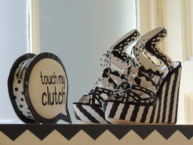
This clutch bag I spotted at LFW says it all.

What's more, you don't need to be on the front row to have that all-important eye on the world, especially in today's media-savvy age. Thanks to the slew of websites providing coverage on brands and catwalk moments, from the big hitters like Elle, The Guardian and Vogue to the indies like The Genteel, there are plenty of ways to see what's making the news and then present your own take. Even if you miss a live stream or an entire Fashion Week (because sometimes you have deadlines or perhaps a holiday to somewhere with terrible Wi-Fi), there are great quality show reports and trend reviews to catch up on. 

The crucial thing is not to retell the news exactly as it stands, because essentially you're just repeating what's already been heard, and also you could easily run into trouble for stealing people's content - something which Google, and your average hard-working journalist, certainly does not encourage. Scott believes that those who are able to 'analyze what's going on and have a point of view' will stand out amongst the rest.

The lesson to take from this? Express yourself in your blog and hone in on what you love writing about or photographing. Don't just add to the noise - bring something different.

Wednesday, 19 September 2012

LFW S/S13 - A Snippet of Street Style

London Fashion Week Street Style Men S/S13
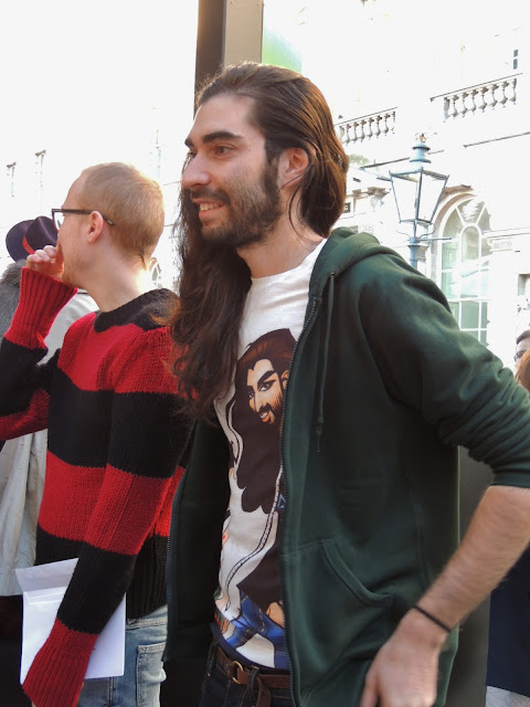
 A typically eclectic slice of menswear from the courtyard at Somerset House.
[All photos my own.]

London Fashion Week Kate Nash S/S13
 Kate Nash arrives at London Fashion Week, dressed as a space marshmallow. 

London Fashion Week Ada Zanditon S/S13
 Ada Zanditon shows her new collection, Tigress Reign, with a Kill Bill-inspired video to boot.

London Fashion Week Accessories S/S13
 The Exhibition drew me to plenty of fascinating accessories - this is just one of many. 
More photos to follow.

London Fashion Week Phannatiq S/S13
 Stylist Alexis Knox listens to the soundtrack for the Phannatiq video at the Felicities PR event.

Fyodor Golan LFW Fashion Fringe
 Last year's Fashion Fringe winners, design duo Fyodor Golan, stood next to me!

London Fashion Week Street Style S/S13
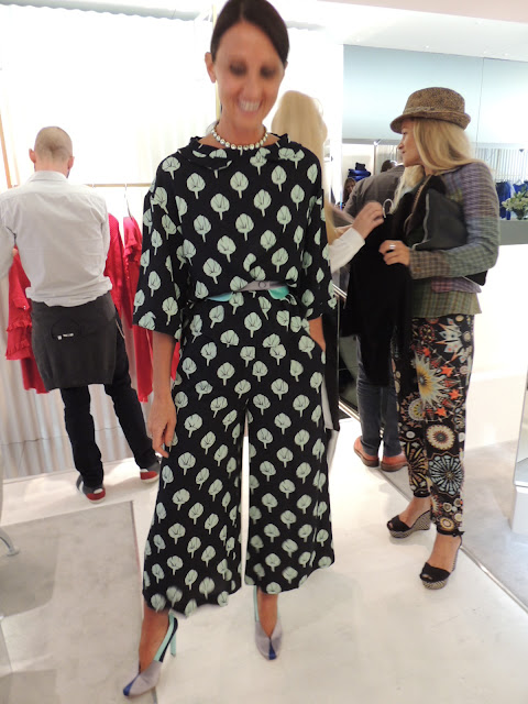
 This lady was incredibly stylish and I couldn't resist a snapshot.

Fashion Fringe 2012 Haizhen Wang
 2012 Fashion Fringe winner Haizhen Wang lifts his trophy as one of his models looks on.

Fashion Fringe 2012
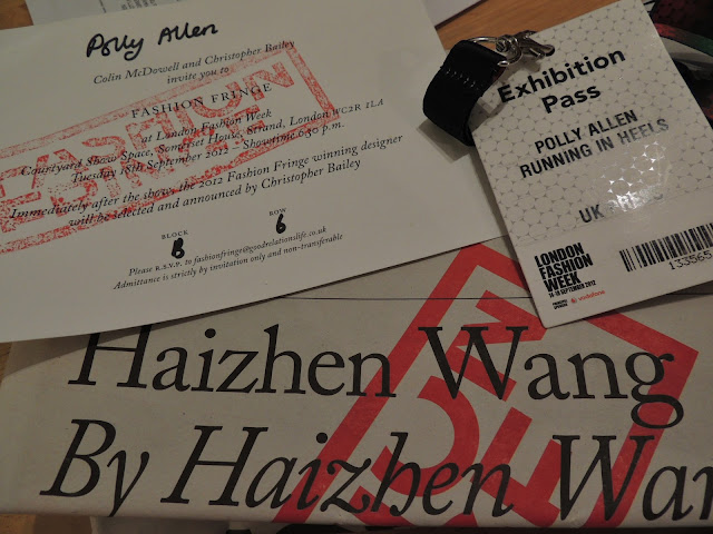
Here's a selection of what I brought home.

There are so many images still to upload onto the blog, so please do bear with me. I'll eventually put everything on Flickr as well, because there are far too many photos to include on here (yes, really!). 

Some of my catwalk shots did disappoint me, as strangely my fresh-out-the-box Nikon P510 bridge camera wasn't as effective as my Canon SX210IS, where I can always manage to rely on the fail-safe 'Kids and Pets' mode if it all goes tits-up in terms of bright lights and fast moving models. Instead I've ended up with lots of ghostly white outlines of the clothing and the camera has paid too much attention to what the crowds were doing, which is a shame (and doubtless my own fault) but is something I will be rectifying by illustrating what I saw instead. If all else fails, turn to pen and paper. 

Anyway, stay tuned for more LFW images throughout the next few days, and some doodles too.

Sunday, 16 September 2012

LFW: Topshop Unique S/S13 Gets Graphic

Topshop Unique S/S13
 Topshop Unique goes for angles and monochrome.
[All images taken from the live streaming on Topshop.com].

S/S 2012 was defined for this label by that Cleopatra print, but the forthcoming collection from Topshop Unique suggests that there's now a more grown-up directive heading our way for next summer. There was still playfulness in the Matisse-like mesh dress seen here in black (and later in white), but it was about stripping back colour and experimenting with texture and print in a more reserved style than the counterparts of the previous year.

Topshop Unique S/S13
 The live-stream was accompanied by a social sharing experiment

I enjoyed the use of intersecting lines, cut-outs and oversize shapes to form the bulk of the collection, and the odd flash of colour such as that yellow jacket and also a yellow and black abstract print which added interest to an off-white silk dress. It all felt fairly ageless and just as likely to suit a fifty-something woman as it would her daughter.

Throughout the show you could take static photos of the live stream thanks to Topshop's collaboration with Facebook, allowing the subsequent shots to be shared on your newsfeed, however I decided not to bombard my old school friends with news from the catwalk, based on their predilection for Lolcats and Farmville rather than Fashion Week (sorry, Facebook). 

I can't be the only one who felt that this would have worked better if it was a partnership with Twitter or Twitpic, which is naturally suited to brief updates about what people and brands are up to and can cope with something more aspirational (personally, my Twitter feed is about 80% fashion and nobody has an ultrasound scan as a profile picture or announces that their relationship status is 'complicated'). However, gripes aside, it was nice to see the brand reaching out to its huge social following and seeking to promote the show in new ways.

Topshop Unique S/S13
That great cut-and-paste feel comes to the catwalk.

That Matisse dress came back in white (I can't decide which version I prefer) and was joined by an excellent puff-sleeve batwing jumper with chopped sections - almost like a mullet at the back - and an elegant chiffon evening shirt dress with a fairly hypnotic pattern in what appears to be velvet. I also enjoyed the odd sprinkle of silver, especially the silver trousers which I never thought I'd find myself coveting but can't get out of my head. 

I doubt I'll be able to stretch my budget to any of these pieces but they're definitely worth considering if you can afford a bit of luxury. When pared down and brought back to design basics, the team have created a desirable collection that will have twenty to sixty-somethings dancing in the aisles.

Friday, 14 September 2012

London Fashion Week S/S13 Day 1 - Uniqueness Pop-Up Shop

Uniqueness Pop-Up Shop Alessandra Facchinetti
 Designer Alessandra Facchinetti, looking amazing in her own collection at the pop-up shop in South Molton Street to celebrate Uniqueness' new lines. 
[All images my own].

Uniqueness Pop-Up Shop Alessandra Facchinetti
 Now that's one huge tablet on display. Alessandra shows the girls how to use it to flick through her online mood board for the season.

Uniqueness Pop-Up Shop London Fashion Week
 Uniqueness brings the collection to you with the lightning speed of today's technology. 
Goodbye six month wait (as Ready To Wear incurs, making it not-so-ready after all) - you can buy these clothes now.

Uniqueness Pop-Up Shop London Fashion Week
A close-up of the beautiful art deco jewellery.

This is a sneak peek of what I saw at the Uniqueness pop-up shop. Facchinetti chose London for "its energy," she told me.

I won't go into the collection at length because I have been writing about it for Running in Heels, but suffice to say that it strikes the balance between classic pieces and covetable quirkiness.

Wednesday, 12 September 2012

NYFW S/S13: Victoria Beckham Strikes Again

Victoria Beckham S/S13 New York
 Whoever underestimated VB must be kicking themselves by now.
[Images via Style.com].

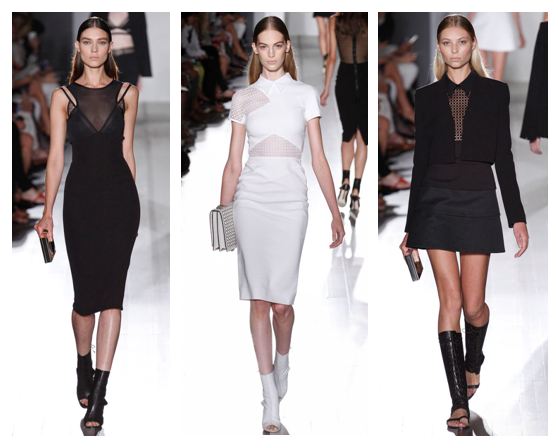
Time and time again. Victoria Beckham's design skills prove that she knows what women want regarding power dressing without the shoulder pads. This collection, like those before it, showed how you can dress like you mean business without compromising on style. 

I particularly enjoyed the nods to geometric patterns and the overlaying of sheer panels, especially in the central image where you see that those panels are actually on one side of the shoulders and add an unexpected quirk to the design. 

Victoria Beckham S/S13 New York
 Angular panels of fabric (and some equally angular brogues) were juxtaposed with softer pieces like those nude sandals in the central image and the bright orange draped jacket on the right.

There's so much wearability in these pieces and it does seem a shame that they carry such high price tags, so I would like to see Mrs. Beckham creating a more affordable diffusion range in the future - I know she has her second line, Victoria by Victoria Beckham, but it still doesn't stoop to the levels of my humble purse. If it did, I'd combine the black cut-out jacket on the left with dresses from COS and vintage boots.

Victoria Beckham S/S13 New York Fashion Week
 This was my favourite look of the show: really simple but wearable and in trusty black.

All in all, the collection was as polished as ever but showed serious potential for inspiring the high street. She's created looks that are desirable without being gimmicky, and I can't wait to see what comes next.

Tuesday, 11 September 2012

Google Does Fashion: Diane von Furstenberg puts Google Glass on the Catwalk

 Diane suddenly realised she should've gone to Specsavers...
[All images via WWD, credited to Giovanni Giannoni].

I might have added comedy captions here (sorry, DVF) but I'm more than a little intrigued about Google's Glass technology being brought to the fashion world. The search engine giant already dominates the fashion industry in plenty of hidden ways - all those bloggers who want to rise to the top are at the mercy of Google's algorithm and the power of SEO overlord Matt Cutts, whilst new brands that need to be found online or department stores that need to be visible for key search terms above all of their competitors are also affected. This, in a way, is just a more blatant form of the big G's dominance, putting founder Sergey Brin on the front row and getting all of the models wearing his technology. I was half expecting someone from Bing to be shaking their fist angrily in the background and brandishing a pair of 3D specs, but somehow it didn't get that far.

The aim of Google Glass is to bring you connectivity without taking you away from real life, so you can record imagery and video or send messages but you're not staring at an intrusive screen throughout. To show how large companies and creatives can use it, von Furstenberg has been recording with Glass and will show how it's captured her work in a short video to be released, naturally, on Google +. Fashionistas were a little surprised at the design of the gadget but, as this is all in production stages, we can assume some modifications will be made before it hits the shops.

Aye aye, Google sets its sights on the NYFW runway. Parrot just out of shot.

Ok, pirate and optician jokes well and truly done, it's time to look at the practicalities of this thing. To be honest, I can see a lot of advantages to Glass, especially as I've often daydreamed about having a way of recording images and video in all of those places where you're not allowed to take your camera - art galleries that have crap postcard selections and demand you pay £60 for a print of a nice painting; times when you'd like to record a shop assistant being incredibly rude to you and send it to the smug CEO of the company after uploading it onto YouTube... ah, so many possibilities. Obviously with the introduction of Google Glass then those savvy shop assistants and gallery attendants will just tell you to take off your bloody tech device, but that's beside the point of the daydream, right? 

In simple terms, Glass is going to be about a personal view of the world for style mavens, whether that's used for promoting your fashion label or capturing every moment of a fabric buying trip to India. It'll keep you connected as you go, allowing you to filter ideas in something resembling a stream of consciousness. I think that, as long as they improve its slightly off-putting appearance, this will be a useful tool for everyone from designers to bloggers. Personally I can't wait to watch DVF's film and feel like I'm seeing through her eyes, if only through this new technology.

Monday, 10 September 2012

Theyskens' Theory S/S13: Boy Meets World

 Grunge for Spring/Summer? Hell yeah.
[All images via Style.com].

I am a little bit in love with Olivier Theyskens, even though he used to make demi-couture gowns that cost more than my combined university fees. There's something about his clothing that puts up two fingers to the doubters and makes you feel powerful (I assume - it's not like I have a secret stash of Theyskens' Theory in my room, though it would be a nice thought). Unlike the try-hard grunge look that seems distinctly pre-fabricated, this is genuine insouciance and you can tell that he's enjoyed crafting each piece, regardless of its reception. 

The top and trousers in the centre remind me mostly of grass stains, as if the wearer had spent long enough rolling down hills and scuffing her clothes to inadvertently create a look. Meanwhile the sheath dress on the right could have been sewn from a satin nightdress with a black voile thrown over the top in a last-ditch attempt to look presentable after a night on the tiles. Turning to the evening gown on the left, you can see it's made for putting your hands on your hips and into those pockets - not for being a wallflower.


 For those times when you feel a little bit different and don't want to chuck on jeans.

There was definitely an element of second glances in this collection, most notably in the ever-so-sheer demure-looking dress that flashes bright white underwear beneath this season's peplum. Similarly, but with less potential to offend the elderly, the blue house coat in the centre seems quite girly with its A-line shape, yet a closer look reveals that it's actually more like an oilskin men's jacket, but given an unusual cut, then thrown over a leather dress to give a mash-up of textures. Lastly, the beautifully sculptural maxi dress on the right is toughened up by embellishment and that stern pout from the model - you get the feeling she might have a knuckleduster on.

 Don't just go for the 'boyfriend' look as a phase - take that old jumper or suit jacket and wear it to death.

Boyish went for more of a grandad edge with chunky charcoal jumpers, elegantly cut jackets that verged on the masculine, and some deep v-necks that revealed gaping chests rather than ample cleavage. Those shiny black trousers on the left are perhaps a hard act to follow on the high street, with potential echoes of MC Hammer, but you can bet that fashion industry insiders will be clamouring to be shot in them by the likes of Scott Schuman and Tommy Ton.

As a parting note, everything gets bleached as the grunge kids draw back the curtains.

I wanted to end with more of the pure white Theyskens' Theory pieces, as they're so dazzling and might initially seem to go against the grungy aesthetic of the rest. Again, on a double take they seem a little less innocent. That white suit with those serious black boots gives a hint of A Clockwork Orange, whilst the baggy coat and silvery hair makes an otherwise simple, if short, shift dress seem like the choice of a post-gig rock star. The soft thigh-skimming jacket on the right is also fairly indecently short, but there's barely a hint of anything underneath (look away, middle America!). 

I can't get enough of this collection; there's so much fun behind the separates and they'd all add something to your wardrobe. Olivier Theyskens is a constant source of inspiration for me and I get the feeling he'll be lining the pockets of a few of our high street stores when they get creating copycat designs. Not naming any names, but you might want to head to Zara, Mango and COS to try and replicate the great man on a more budget-friendly scale...

Sunday, 9 September 2012

Black Light: Alexander Wang S/S 2013 vs. Viktor & Rolf S/S 1999

When I read about the amazing black light finale at Alexander Wang's S/S 2013 show, I couldn't help but compare it to the work of Viktor & Rolf. Wang's use of visual trickery to completely transform his collection is fantastic, but it's worth comparing it to what Viktor & Rolf created for for their own Spring/Summer collection of 1999. Let's hit the lights.

Alexander Wang

Alexander Wang SS13 Black Light
[Image via Style.com]

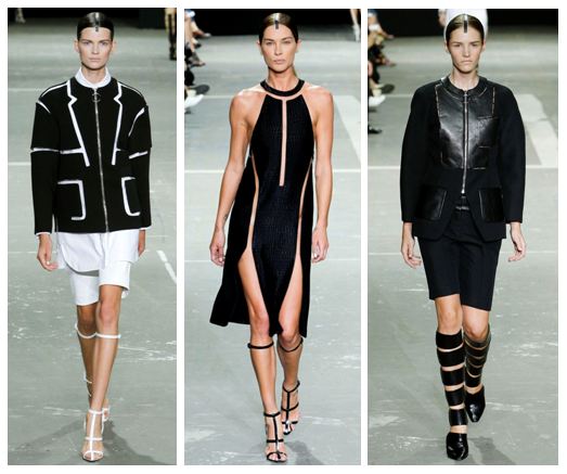
The only warning of what was to come was the announcement that flash photography was not allowed at Wang's latest show. Bewildered attendees must have wondered why, as it was only in the closing moments that the lights went down to reveal an ethereal glow from the clothing. What could have ended up like a tacky disco moment was instead made into a sleek piece of artistry because of the cut-out nature of each piece, creating bold panels of white and complemented by a single line on each model's head that marked their bodies out against the darkness. Wang referenced the futuristic film Tron to put the effect into context.

So, how was the panelled effect achieved so successfully? Using fishing line. This makes each part seem to be suspended in thin air, which adds to the artistry of the whole collection, right down to the simplistic white stilettos with thin straps that divided the legs into neat sections. Essentially the black light helped us to see each look in its own right, without distractions.

Viktor & Rolf

Viktor & Rolf SS99 Black Light

[Image via Google Books]. 

It's such an early moment for the design duo that V&R's Black Light doesn't even feature on Style.com (my Bible for quality catwalk images that don't look like they've been taken by someone nine rows from the front row using a dodgy Blackberry). Instead I turned to Fashion at the Edge: Spectacle, Modernity and Deathliness by Caroline Evans, to find what the author described as 'their last spectral collection before they launched themselves into the real world of embodied fashion and commerce'. The designs were firstly shown in black light, then in normal conditions, to show the transformation.

What I gleaned from the images was that Viktor & Rolf were already establishing themselves as not being easy to categorise: the designers who couldn't be neatly put into a box. This was about having original ideas and wanting to put on a show, making the wearer feel like a gallery piece rather than a sex object or a dowdy housewife. It was part-freak and part-opulent, yet somehow the aesthetic worked, down to the skeletal lines on a trouser suit.

Comparing the Two

Wang's use of lighting might seem like an afterthought compared to V&R's theatrical staging, but I think we have to remember that Wang is able to take fewer risks as the creator of a highly commercial brand. What he has produced is just enough quirk to raise the stakes of Fashion Week, without alienating buyers and your middle-of-the-road fashion lover. Keeping trendsetters and trend followers equally happy is not an easy task, but he seems to have pulled it off without totally plagiarising his black light trailblazers.

Saturday, 8 September 2012

MBFW S/S13: Alexander Wang and Cushnie et Ochs

So, New York Fashion Week is upon us (known as Mercedes Benz Fashion Week, corporate lovers). Here's what has grabbed my attention from Alexander Wang and Cushnie et Ochs for next season:

Alexander Wang

Alexander Wang SS2013
[All images from Style.com].

Wang brought us separates that worked together to create a blank canvas for the wearer to either personalise or use as a barrier to the world. The stark minimalism was tempered with an edge of cut-and-paste as layers of leather and cotton shirts built up to reveal a stunning monochromatic look overall. I can definitely see those thin-strapped stilettos being fed down to the high street.

Alexander Wang SS2013

The body was either elongated with metal zips, enlarged with wide jackets or sectioned horizontally with multiple-strap black boots that diced up the legs with a precision that reminded me strangely of the anatomist Gunther von Hagens (if you've ever seen his Bodyworlds exhibition, you might recall the body sliced into thin lines). Anyway, enough of the gore - this collection was about pure minimalism and playing with proportions using graphic lines. The finale, using black light to make the white pieces glow, proved that Wang wants you to make an impact in these clothes.


Cushnie et Ochs

Cushnie et Ochs SS2013

Another show full of clean lines came from Cushnie et Ochs, a design duo whose main palette was black and white, with splashes of aqua and cobalt blue. Though the footwear was less inspiring than Wang's, it continued the trend of stripped-back shapes (and also reminded me of 90s heels, which was a little scary). Where the designers excelled was in the necklines, shoulders and decolletage, adding points of interest that made their creations suddenly stand out. That meant embroidery on what appeared to be voile, an amazing heavy shoulder addition on the aqua dress in the centre, and wave-like cut-outs on the right.

Cushnie et Ochs SS2013

Here are some more neck and shoulder details that definitely inspired me. Each one looks so crisp, like it's been cut out with crimping scissors or a scalpel, and it entirely removes the need for necklaces or earrings. Perhaps there's a risk that these dresses could end up wearing you, rather than the other way around, but I'd be willing to give it a try and find out. I'd team one of these necklines with nude lips and cobalt blue angular eyeliner, then I'd add sculptural wedges a la Alexander McQueen.

I didn't just pair these two designer reports because they seemed vaguely similar; they both have their own take on minimalism and have added memorable traits that can translate into sales. I'm looking forward to seeing creative necklines and oversize zipped shirts in the shops.

Friday, 7 September 2012

Photo Essay: Fashion's Night Out, London 2012

Fashion's Night Out Street Style
 One early-bird shopper waiting for friends.
I liked his style...

H&M Shop Windows London
 H&M's window became a live photo studio

Fashion's Night Out H&M London 2012 - a Makeover
 I'm really pleased with how this photo turned out - 
a girl having a make-over in H&M. 
Her headscarf is amazing.

H&M Photo Booth FNO
 We made a bid for styling the newest drop of H&M clothing... with military hats

Fashion's Night Out Topshop London 2012
 There was a huge crowd to see Delilah perform in Topshop

Delilah Performing in Topshop at FNO
 The woman herself, performing to her fans

Topshop FNO - Delilah
 There's nothing like having your name in lights

FNO Bershka
 Bershka's balloons and 20% off stock

Chanel Covent Garden
 Get thee to Chanel!

Vogue FNO Miss Selfridge - Customising Class
 One of the customising workshops in Miss Selfridge

Miss Selfridge Customising Studs Workshop
 Let's get studded

Miss Selfridge Stud Customising Workshop
 Studs up close

Fashion's Night Out 2012 Street Style London
A shopper in Topshop - loved her nose ring

Vogue Fashion's Night Out: London 2012 Street Style
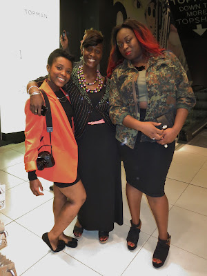
These ladies in Topshop were so stylish - I loved how they put their outfits together.
That red dip-dye is definitely on my wishlist too!

I also visited COS, Banana Republic and several other shops, but found myself grabbing a cocktail rather than my camera (sorry...). Basically, at some point you have to put down the camera and actually get into the action! However I loved putting together this photo essay and I couldn't believe how stylish the shoppers were - walking past AllSaints was like stepping into a lookbook. 

If you enjoyed #FNO then share the love! I can't wait for 2013's events. I'm off to a Vivienne Westwood warehouse sale tomorrow, so expect another shopping report from that trip...

[All photos my own. Please ask before reproducing.]
Related Posts Plugin for WordPress, Blogger...