Wednesday, 29 August 2012

Photo Essay: W. Armstrong Vintage Shop, Edinburgh

W Armstrong & Son Vintage Edinburgh

Let's make one thing clear: I love a good mannequin, even just their heads. 
This shop had me at hello. 
And no, I didn't put that magic wand there.

This was at the first branch of W. Armstrong & Son that I came across, close to the Fringe Festival's Udderbelly at Bristo Square. The manager of the shop was beyond accommodating, letting me take photos and basically have free reign of the place, before drawing a map to show me where other vintage stores were located around the city. She then gave me a discount on my purchases, which were already competitively priced! I couldn't have asked for better service.

W Armstrong & Son Vintage Edinburgh - Shirts
 The £10 paisley shirt I should have bought...

W Armstrong & Son Vintage Edinburgh - Menswear
 Some of the amazing menswear section - look at those coats. I think I've spotted a Barbour or two, but I'm drawn to the blue woolen hooded duffel on the far right. Very Submarine.

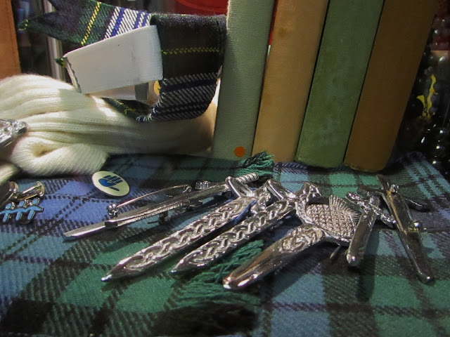
W Armstrong & Son Vintage Edinburgh - Tartan
 Staying true to its Scottish roots, here are some Celtic brooches against tartan.

W Armstrong & Son Vintage Edinburgh - Comics
 In which I get so excited at finding the changing rooms have old comic pages on the walls...

W Armstrong & Son Vintage Edinburgh Sarcophagus
 This is the larger branch of W. Armstrong, complete with sarcophagus. 

The second branch was bigger but leaned towards fancy dress or theatrical outfits. There were some fantastic pieces here and I enjoyed browsing, though there was less chance of finding something for everyday wear. Prices were very reasonable and there was even a Sale section. I would have liked to spend more time looking at the wedding dresses, having sorted and catalogued over 100 in two days during a stint of volunteering at my local charity shop a few years ago (yep, that's my claim to fame).

W Armstrong & Son Vintage Grassmarket
 I've tracked down some more mannequin heads and these ones are dressed for summer.
All these little quirks make it seem much more personal.

W Armstrong & Son Vintage Shop
Mannequins wearing cravats... I think I've died and gone to heaven.
The staff clearly know their visual merchandising without being too commercially obvious.

[All images my own].

There's also now a concession in the Edinburgh branch of Miss Selfridge, as the manager was telling me. I think this is an excellent way of getting local vintage into the spotlight when it can be hard to compete with the bustling trade of Princes Street. Good on W. Armstrong & Son for spotting a gap in the market. 

Branch #1:14 Teviot Place, EH1 2QZ.
Branch #2: 83 The Grassmarket, EH1 2HJ.
Branch #3 (which I didn't visit): 64-66 Clerk Street, EH8 9JB.
Or you can buy vintage online from their website.

Sunday, 26 August 2012

Warehouse's Arty Prints: David Hockney and Ansel Adams Would Approve

After spotting an amazing canyon-print dress from Warehouse in one of the Saturday papers, I couldn't resist making comparisons between its design and that of David Hockney's Grand Canyon photo collage, and even his paintings of the landmark. Logging onto the website, I then tracked down another art-inspired dress that reminded me of legendary photographer Ansel Adams. As an art graduate I'm always chuffed to find major high street brands taking their cues from artists, and I thought I'd show you just how I made those connections.

Warehouse Canyon Dress
 [Images via Warehouse and Lalouver].
 The Canyon Print Dress (£70) is sure to make an impact.

I like that Warehouse has put such a bold print on the entirety of the fabric, not cutting into it with plain sections but allowing it to dominate. The horizontal bands are much like Hockney's intense collage, following the form of the wearer like his photos follow the canyon's shape.

Warehouse Canyon Dress - Hockney
[Images via Warehouse, Artnet (photo of the artist) and the National Gallery of Australia].
I'm guessing a little bit of Hockney inspired the designer.

What strikes me is how the multi-layered rock formations  and colour bands sit on one piece of chiffon but give the illusion of several pieces sewn together. You can see in Hockney's painting, A Bigger Grand Canyon (1999), that colour divides work well and help to illustrate the way that the canyon has different facets. There's also a warmth to the painting that translates to the dress - that fiery vermillion against a snippet of cool blue. Already I have a few locations in mind for creating an outfit post with this - either a dry river bed or an abandoned building - if only I can get saving up that £70...

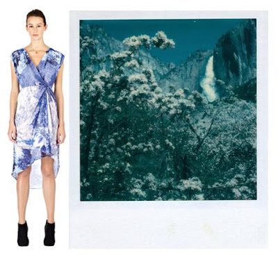
Warehouse Ansel Adams Polaroid
[Images via Warehouse and Tumblr].
Poetic and with the lightness of a Polaroid.

A different cut to this Landscape Print Dress (£55) but still a big link to artistry, with this china blue and white print that reminded me of a teal Ansel Adams Polaroid photo of Yosemite Falls (1979). If you changed Adams' work to that same royal blue, I think the comparison would be even closer. I also love the pin-tuck in the waist band that makes the fabric kick out, like a waterfall.

Warehouse Landscape Print Dress
 There's also an element of Japanese artist Hokusai, but I'm more drawn to the photographic elements of the print.

The slight mullet hem brings this bang up-to-date and also helps to emphasise curves. The whole piece is lined to the hem, so don't worry about revealing your modesty.

Ansel Adams vs. Warehouse
 [Image via Weston Gallery, and close-up Warehouse].
This is an example of Adams' straight photography and how it complements the print of the fabric.

My final comparison shows how the delicate foliage and waterfall shot by Adams in Yosemite seems similar to the print on the dress. I don't know for sure whether the designer had referenced him directly, or even looked at his work, but I feel that there is a natural link there, and it's great to see that fashion is continually looking to the art world for its eye-catching prints.

Friday, 24 August 2012

Fashion Capitals: Milan vs. Palma, Majorca

This week I'm taking on judging duties (no, not a la X Factor) for the easyJet Holidays #FashionTravel competition where three lucky bloggers can win tickets to London Fashion Week and three runners-up get an amazing goody bag, and to enter they simply blog about what outfits they'd pack to visit one of two fashionable destinations. So this is how Milan and Palma, Majorca, came to be mashed up in a delicious mix of established style credentials and new edginess.

 What would you pack? 
[Image my own].

The ticket winners get to see a Felicities PR event that features the latest collection by ethical British designer Ada Zanditon, who's been on my radar for some years, and it should be an excellent opportunity to be up close to next season's clothing. Ada's been inspired by the concept of a tigress, which makes me think that the collection is going to be pretty powerful stuff. She's recently been on a holiday to Majorca herself, soaking up its culture and getting a well-deserved rest before the crazy energy of Fashion Week, and I can totally see why the Balearic island appealed.

Palma: Majorca's Capital of Cool

Palma City isn't necessarily on the radar for fashionable holidays, but I think it should be. It has a fascinating past, containing 11th Century Arab Baths and the beautiful La Seu Cathedral amongst its architectural gems, as well as a fairytale castle - the imposing Bellver - that's surrounded by a forest. By the waterside you'll find huge yachts of the rich and famous, so already I'm thinking you could create some pretty cool editorial shoots here that would grace the fashion glossies. As for the shops, designer fans can breeze around Louis Vuitton and the more affluent streets around Avenida Jaime III, or if you're more of a high street person then you'll find recognisable favourites like Zara and H&M within easy reach, as well as El Corte Ingles (a Spanish department store that is definitely worth a look).

What I'd be itching to explore is the selection of vintage and charity shops, including Kling, which is big on designer labels, and Seattle Vintage. I'd also be compelled to head to the outskirts of the city for a visit to the artist Joan Miro's studio, which has been lovingly preserved. I'd then head back into the centre to track down the famous Ginbo bar, selling over 100 types of gin - I'm not a lover of this tipple but I've heard good things about their cocktail menu, so I'd aim to enjoy one of these as the sun went down. One thing I wouldn't do is copy my dad's example; he came to Palma on a business trip and - I kid you not - attempted to get into the VIP section of a club by pretending to be Michael Douglas (who has a home on the island). Somehow, between not looking anything like a film star and being unmistakeably English, this ruse didn't work...

Milan: The Land of the Legends

If, like my dad, you need to recover your sense of cool, a break in Milan might be just the thing. This is where the Italian greats hold court and where one of my favourite magazines, Vogue Italia, is based. Everyone worth knowing in terms of brand names is here, from Armani and Prada to Versace and Valentino, which is why it's one of the big four: the fashion week capitals that dictate our style. If you're one for your history then don't miss a visit to Galleria Vittorio Emanuele II, which is one of the world's oldest shopping centres, a.k.a a valid educational reason to go to a mall. Yes, I feel that Becky Bloomwood of the Shopaholic novels (by Sophie Kinsella) would be pretty chuffed with that.

Bargain hunters will enjoy outlet shopping, which can be found just out of town, at Serravalle, Il Salvagente, or The Place. If you're really skint then don't despair, as there's plenty to do in Milan that doesn't involve spending a fortune, and you can browse amazing bookshops or head to the Brera Gallery to see masterpieces of traditional art from Raphael and Caravaggio. The Cinema Museum is also an important pit-stop for culture lovers, or you could go and be inspired by nature at the Botanical Gardens.

So, which destination would you choose to pack your imaginary suitcase for? Make your decision known with a blog post and let's get talking #FashionTravel - you have until 31/08/2012 to enter for Week 2 of the competition. I'm looking forward to reading your entries.

Thursday, 23 August 2012

Fashion's Night Out: The Global Schedule

Serious shoppers, pay attention. Vogue's annual event, Fashion's Night Out, will be hitting our style capitals in just a couple of weeks, boosting the economy and our wardrobes along with it. This year sees all 19 countries where the magazine is published taking part. Here's your global forecast (they don't all take place on exactly the same night, sorry to upset sticklers for detail) of where to shop, with a particular focus on London.

The Official T-Shirt for London

FNO T-Shirt 2012 by Jonathan Saunders
 [Image via the official FNO page for British Vogue].

Designed by Jonathan Saunders, the t-shirt supports Refuge, which is a really great cause that helps women who are victims of domestic violence. I've written in the past about the charity's campaign with beauty blogger Lauren Luke, and it's great to see them staying high-profile with this.

06/09
New York (and across America, from Boston to Philadelphia and beyond)
Milan
Seoul
Sydney
London 
Paris
Madrid
Mexico City
Montreal, Toronto and Vancouver
Berlin
Moscow
07/09
Shanghai
Dusseldorf
Berlin
Beijing
Delhi
St. Petersburg
08/09
Taipei
Tokyo
10/09
Sao Paolo
12/09
Rio de Janeiro
13/09
Lisbon
Amsterdam
Rome
Guadalajara
Istanbul
20/09 
Thessaloniki
25/09 
Athens

Balenciaga's Exclusive Bag - Just One Example of Brand Involvement

Fashion's Night Out 2012: Balenciaga
 [Image via the Balenciaga Facebook page].

A collaboration between the amazing Nicholas Ghesquière and Vogue's Grace Coddington, this is part of the limited addition Pumpkin line of accessories, featuring sketches of Grace's cat wearing Balenciaga creations from over the years. It's whimsical and somehow it works.

Basically, FNO is the perfect excuse to either window shop or spend some hard cash. Take some friends along and make a night of it!

Top Tips for London's FNO
  1. Check out the map on the website to help you get your bearings in terms of who is involved. Brands are listed along with a description of what they're offering, whether it's a discount or in-store make-overs.
  2. Expect the unexpected. In 2010's event we were treated to an incredible flash mob of dancers in River Island.
  3. Make sure you remember to eat - you'll be trudging the shops for hours if you attend the entire thing, so don't miss out on getting a decent dinner. The main areas participating are Oxford Street and Regent Street, with plenty of restaurants nearby, from chains to independent ventures.
  4. Keep an eye on the hashtag #FNO on Twitter for more ideas of where to go.
  5. Take your camera or be prepared to use your camera phone, because there will be some photo-worthy moments.
  6. If you buy too much, remember to tell everyone you were just caught up in helping us out of the economic deficit...
If you're heading to Fashion's Night Out anywhere around the world, I'd love to hear from you.

Saturday, 18 August 2012

How To Get London Fashion Week Tickets

Unlike some Fashion Weeks that make you pay for access, London has always been a bit more democratic when it comes to granting you a seat in the hallowed rooms of Somerset House. With no charge for tickets, there's no financial barrier to attending, however you can't just be any old Joe Bloggs (or should that be Joe Blogs, for the modern blogerati?) and expect to be lavished with invitations. In order to be considered for a pass that lets you wander around the exhibition area and the beautiful buildings within the Courtyard, you need to officially register as a blogger on the LFW website and have generated a serious amount of traffic on your blog, backed up by Google Analytics stats. So what about those of us who don't have a cult following? Where do we stand if we're not household names in the blogosphere?

London Fashion Week - Somerset House
Attendees at LFW, waiting in the Courtyard at Somerset House.

The answer is that you have to be savvy and look out for opportunities, either by impressing a PR company with your self-starter attitude and getting them to send you tickets directly (which, let's face it, is not going to be easy) or you can get entering competitions and be in with a chance of winning your way to rub shoulders with fashionistas. Last year I did just that and was sitting on the front row at Holly Fulton, thanks to Grazia Magazine

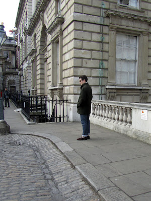
How to get London Fashion Week tickets
 One of the style-conscious men waiting in the Courtyard.

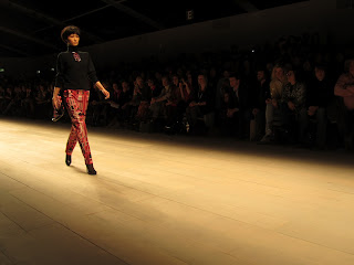
Holly Fulton AW12 - London Fashion Week
Holly Fulton AW12 - it was amazing to see in person.

 This time around I'm pleased to announce that I will be personally helping bloggers to win their way to Somerset House, thanks to renowned ethical designer Ada Zanditon who has teamed up with easyJet Holidays to shoot her forthcoming Spring/Summer 2013 collection in Cyprus. To celebrate this partnership, a blogger challenge has been set, showing how fashion and travel are closely intertwined. All you need to do is pick one of two fashionable destinations over the course of three weeks (you can enter for one, two or three of the weeks, so you can fit it around a busy schedule!) and tell them what outfits you'd pack to visit your chosen holiday spot. 

I'll be judging Week 2, which kicks off on Friday 24th August and pits traditional fashion favourite Milan against cool newcomer Palma, Majorca. After the competition has closed at the end of Week 3, there will be three lucky winners announced who will bag tickets to a London Fashion Week event (17th September 2012) with Felicities PR to see Ada Zanditon and other designers showcasing their new creations. They'll also gain access to the amazing Exhibition area, which I've worked at before and can honestly say is a hotbed of stylish new brands. Three runners-up will get goody bags from the event, getting a taste of the Fashion Week atmosphere. 

If you'd like to find out more and check out the Terms and Conditions of entry then visit the fashionable holidays page. Stay tuned for my judge's blog post where I'll be deciding for myself between the two fashion destinations and picking a favourite.

I'm really excited about seeing the entries and finding out what you lot would put in your suitcases for a fashionable break. Good luck!

[All photos my own - please ask before reproducing].

Wednesday, 15 August 2012

Vogue US Hits 916 Pages With September Issue

Vogue US September Issue
Lady Gaga works it on the cover. 
[Images via Fashion Gone Rogue, one of my favourite sites].

Vogue US is considered by many slaves to fashion as the Bible, and it'll be even harder to shake that reputation with their ground-breaking September issue, totaling a massive 916 pages. I can't speak for the content because it's not out here in the UK yet, but by the sounds of the cover descriptions then it's going to be going for all-out style worship, creating a retrospective. 
Who better, then, to grace the front page than Lady Gaga? Arguably she knows about going stratospheric, considering her legions of fans and the uber-cool Haus of Gaga at her disposal to create outfits. Here she's styled by the legend that is Grace Coddington and photographed by Mert & Marcus, inside the shoot.
 
Vogue US September Issue Gaga
 
I can't say that I actually buy Vogue US that regularly (maybe once a year, if that, as it isn't half as good as its Italian counterpart, though I always skim through it and look out for any shoots featured on Fashion Gone Rogue) but I'm definitely set to buy this issue. If a magazine can churn out that many pages then I'll be keen to see top quality interviews with top designers, editors and creatives, as well as working out whether the advert-to-content ratio is worth their 'biggest ever' page claim. 
 
Another interesting proposition is 'Fall Fashion for All' - I'll have my politically correct radar going off for that one, as it'll be worth seeing just how diverse this gets. Will we see tokenism or actual genuine inclusion of women outside the 'white, size 0, very young' category? I really hope that 'for all' means what it says.

As for the 'Hair is the New Make-Up' feature? That's surely one for the Neophiliacs column in Private Eye magazine...

Thursday, 9 August 2012

Photo Essay: Hotel Missoni's Bar, Edinburgh

Hotel Missoni, Edinburgh
 The view of the bar at Hotel Missoni: sleek design.

We didn't stay at Missoni's Edinburgh hide-away (sadly our budget didn't stretch that far) but my mum and I managed to pop in for a drink and a rare sit down on our Edinburgh mini-break. The welcoming staff outside the hotel were really genuine and didn't discriminate against non-guests such as ourselves, even though we were blatantly gawping at the decor and weren't set to have a full meal here. We never felt looked down upon, which is one of the most important considerations for me when visiting somewhere that's beyond my budget. I'd been wanting to come here ever since I read about Missoni opening the hotel and I'm so glad it lived up to expectations.

Bar at Hotel Missoni, Edinburgh
 My mum, mid-conversation, at our table.

Hotel Missoni, Edinburgh
 Looking at the decor. Those glossy red tables were like lacquered nails.

Hotel Missoni, Edinburgh
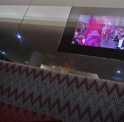
 Screens showed the catwalk to bring home Missoni's design legacy.

Hot Chocolate at Hotel Missoni, Edinburgh
About to tuck into the signature hot chocolate (£3.95 but worth it).

Hotel Missoni, Edinburgh
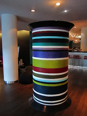
 What I presume is a giant cotton reel showing some of the brand's typical colour clash prints.

Hotel Missoni, Edinburgh
A larger-than-life vase is given an edgy geometric look.

If you're in the neighbourhood and wondering whether or not to step inside the foyer, definitely take the leap. You'll be able to enjoy top-notch design and a little oasis of calm in the heart of the city at this five star hotel.

1 George IV Bridge
Edinburgh
Lothian
EH1 1AD

Sunday, 5 August 2012

I'm Off to the Edinburgh Fringe Festival (Again!)

Edinburgh Fringe Festival: Royal Mile Performer

This week there may be less blogging as I'm off to Edinburgh for the yearly trip to see the Fringe in action, along with my partner in crime: my mum. I'll be keeping Twitter updated with our exploits (which look set to include a mixture of comedy, theatre and curry - not necessarily in that order) but I can't guarantee I'll be able to physically blog as the laptop is not part of the meagre luggage allowance. Hopefully when I get back then I'll have a bit of Edinburgh street style to show you, as well as an extensive collection of leaflets from the lovely (if very over-enthusiastic) leafleteers on the Royal Mile.

This year I won't be climbing the Monument with its claustrophobic staircase straight out of Hitchcock's Vertigo, but we do have plans to climb Arthur's Seat, the massive hill overlooking the city, where a man who changed his name by deed poll to Lionel Ritchie is said to hang out. It should be interesting to say the least.

[Photograph my own. Please ask before reproducing.]

Sketchbook Magazine Goes Online: Interview with the Editor

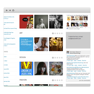
Sketchbook Magazine Online
When I read recently that the iconic Sketchbook Magazine (staunch supporter of illustrators, fashion bloggers and creative types) was being re-launched, I was intrigued to see what the new look publication would be like. As a self-confessed magazine junkie who'd readily spend my weekly food shopping money on creative glossies, it's fair to say that anticipating the re-launch was a bit like counting down to Christmas. And the best bit? It's moved totally online, giving you unrivalled access to the best up-and-coming design talents from the creative industries - artists, fashion designers, photographers and graphic visionaries. I caught up with Editor-in-Chief Wafa AlObaidat to find out what Sketchbook 2.0 is all about, learn what the Sketchbook Design Society will do, and to seek advice for any budding illustrators out there who want to submit their portfolio. Say hello to your new favourite bookmarked website...

"We want to tap into a bigger audience, but also we have too much to share and our previous blog layout didn't do the site justice at all," explains Wafa. Fully aware of the importance of digital platforms in magazine publishing, she continues, "We also wanted to compete with other online magazines of an international standard and, in order to do so, our online presence has to be strong." 

I completely agree; working with online content on a daily basis in my full-time job, I can see how easy it is for blogs and websites to reach people and create a permanent resource for them that is indexed by Google, whereas print versions don't have the same longevity. But will there ever be a printed edition again? "Ideally we want to get Sketchbook in print and online and we are ready for that transition but it was time to upgrade the site and allow for more of a regular platform for contribution."

One of the magazine's strengths is its collaborative style: the idea that you could add your own work to the living, breathing showcase that is the website seems incredibly tempting: "We want to get them to collaborate with other creatives within our network," she says. They receive over 50 portfolios a day and "pagefuls of invites to events" which are then distributed to correspondents around the world. Obviously the beauty of taking things online means that these events will now be reported as they happen, with daily updates and a fast turnover of editorial content. Alongside all of this is the brand new initiative that Wafa is championing, known as the Sketchbook Design Society, found as a tab on the website:

"It's a member-based organization of design professionals, educators, administrators, students and associates in communications, marketing, media and design-related fields. Our goal is to raise the general standard of design in Bahrain [where she's based] and the Middle East, and we hope to inspire local designers and engage the public."

It all sounds promising, but I can't help wondering if there's any time left for pop-up projects - something the publication became famous for with its 3 week series of live events in London's Carnaby Street back in 2010, which included Issue 1 cover star Susie Bubble as a speaker. "Once we establish a society of creatives, we may then continue to pop up and do spontaneous events,"Wafa reassures me. 

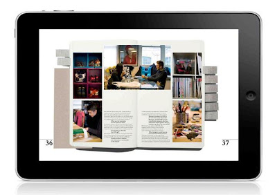
Sketchbook Magazine Tablet


So what do you need to know if you're looking to submit something to the site, either as a feature or a creative contribution? If you're fresh out of uni then don't panic - "A big slice of our audience are emerging and young creative designers and illustrators and recent graduates of art school." Here are Wafa's top tips for getting involved with the site and on launching your career:

  • Get your CV done in a creative way and check out the fan mail section on our site for inspiration. Creatives who email us with interactive portfolios are the ones that get a call back. 
  • Get as much PR coverage as possible, and also continue to contribute to get your name out there, and build your name in the industry. This will allow clients to email you for services.
  • Define who you target audience is and start emailing them requesting to work with them. 
  • Be active online, social media wise, and do as much work as you can!  
Basically, if you're sitting at home wondering whether to submit something, then the world's your oyster as far as I can see. The new look website is a springboard for you to carve out a name for yourself and it's a great way to see what your peers are producing as well. Even if you're an observer rather than a creator, it's just as fascinating to see what graduates are coming up with and find out about industry news.

When asked for three words to describe the all-new Sketchbook, Wafa has a think and then picks five: "Clean, modern, minimal, user friendly, smooth." Just another example of how the publication goes beyond expectations. 

To join the Sketchbook Design Society, head to the dedicated tab (next to the Magazine tab) on the homepage.

[All images courtesy of Sketchbook]. 

Saturday, 4 August 2012

Lakme Fashion Week: India's Take on A/W 2012

Felix Bendish for Lakme Fashion Week AW12
Felix Bendish knows how to open at Lakme Fashion Week.

Far from there just being four style capitals of the world, Fashion Week takes over in many nations twice a year and brings the new season to buyers and press. You might not get to read as much about them unless you specifically look for designers or round-ups, but it's worth keeping an eye on what the catwalk has to offer when it's not based in London, Paris, Milan or New York. 

Today I'm turning my attention to India, where Lakme Fashion Week is a huge event. I watched the Bollywood film Fashion a few years ago and have been admiring the country's creative output ever since. Here are the designers who you should be watching, if autumn/winter 2012 is anything to go by...

Aarti Vijay Gupta LFW AW12
 Aarti Vijay Gupta produced a really intelligent and graphic collection.

Mixing quirky sketches and precise colour wheels and educational charts, this was Aarti Vijay Gupta's exercise in how to add a touch of the cerebral to your clothes. The glasses worn by the models might have taken the geek motif a bit too literally but otherwise this was a really well-produced range that wouldn't look out of place in a British boutique. I definitely want the last dress in the image above - the anatomical print is just too good to miss.

Dolly J LFW AW12
 Dolly J's take on autumn/winter reminded me a lot of Ralph Lauren.

I could see a lot of Ralph Lauren's extravagant evening gowns and autumnal colour palette in Dolly J's range, but she gave it an injection of personality that added Bollywood flavour with the embellished top seen on the left and the layers of different fabrics and finishes on the chest of the dress on the right. And, whereas Lauren kept things severe with Downton Abbey decorum, Dolly's outfits were a lot more free-spirited.

LFW AW12 Kiran Meghna, Gaurav Gupta, Tahera Peeran
 One of the coolest trends I spotted was 'half and half':
cutting vertically into the design with a different colour or style.
L-R: Kiran &; Meghna; Gaurav Gupta; Tahera Peeran.

I love the cut-and-paste style of panelled clothing (apart from horrendous 90s patchwork denim - yes, it still makes me shudder) and when it's done as well as these three examples then it shows how much fun you can have when you divert from the norm. My favourite is Gaurav Gupta's pink dress with half a sleeved jacket, which takes a leaf out of Vivienne Westwood's book with an Anglomania feel.

LFW AW12 Drashta Sarvaiya, Nupur Kanoi, Mrinalini
 Some designs gave a strong nod to Western fashion. 
L-R: Drashta Sarvaiya; Nupur Kanoi (looking very Balmain); Mrinalini.

LFW AW12 Gaurav Gupta, Virtues, Pankaj & Nidhi
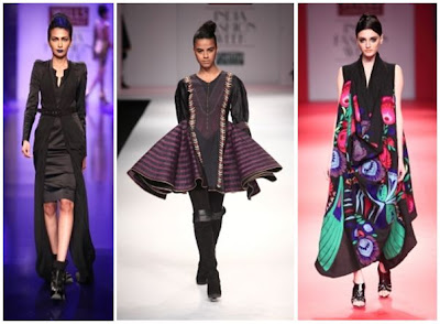
 A trio of eye-catching shapes on the catwalk that caught my attention. 
L-R: Gaurav Gupta; Virtues; Pankaj & Nidhi. 

Lakme Fashion Week: Virtues AW12
Virtues went for a sculptural edge with a distinct Gothic-meets-folklore feel.

Another unmissable collection that I was drawn to was the folkloric Virtues, with heavy boots and bold trims contrasting with flowing fabrics. What's more, most of it was distinctly wearable and wouldn't look out of place on the red carpet or in the pages of Western fashion magazines. I definitely think that more fashion editors should look to Indian designers for inspiration and photo shoot material, as there's a wealth of talent out there.

[All images taken from Vogue India and the official Lakme Fashion Week website].
Related Posts Plugin for WordPress, Blogger...