In previous years, these windows have featured a psychedelic frog and glamorous tableaux of mannequins, but 2013 called for simplicity, a smattering of sequins and starbursts.
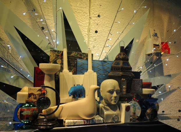
Each star contained products based on a particular theme or customer - this one definitely covered travel, with a distinctive wooden sculpture and some beautifully covered maps.
More travel, anyone? The phrenology head sat alongside a globe and a Moroccan lantern.
A little Statue of Liberty snowglobe or paperweight added a pun on the shop's name.
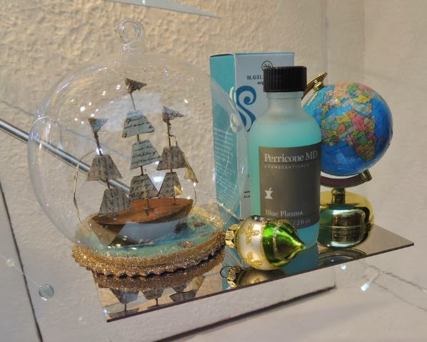
Fancy setting sail with these gifts?
A flamingo ticked the kitsch box.
A solitary mannequin in this window showed just how uncluttered the displays were in comparison with previous years, when it was hard to see everything crammed in.
Rockstud pumps by Valentino got my attention.
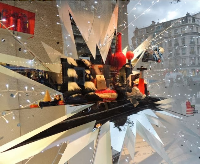
Fur trimmed boots were placed with stylish homeware pieces.
I couldn't resist a peek inside, either. These mannequins and their present hats stopped me in my tracks.
One of the building's rare open spaces, overlooking the scarf hall, was dedicated to the West End musical, Matilda, complete with letter panels and a paint-splattered satchel.
Considering Liberty's Christmas shop alone attracts 250,000 visitors every year, it's fair to say that the visual merchandising on the outside plays an important part in drawing potential customers through the doors.
Obviously going minimalist can be a risk for a place so readily associated with opulence and floors piled with goods, but I think it will help Liberty to stand out from the crowd. I would have liked to see a bit more colour in the windows, but otherwise the content is still going to grab people as they walk past.
Do you think going minimalist at Christmas is a good idea for the store, or would you have preferred something crazier? Tweet me - @misspallen - or leave a comment below.


No comments:
Post a Comment