Monday, 30 September 2013

Saint Laurent S/S14: The waif chic look has gone too far

There's a point at which the banality of seeing size 0 models on the catwalk goes too far; when it stops being banal and starts being a cry for help. For me, that point came when flicking through the images of the Spring/Summer 2014 Saint Laurent (the brand formerly known as YSL) collection by Hedi Slimane.

Slimane, it's fair to say, loves the waif chic look through and through; he champions Pete Doherty, grunge and the faux-punk rebellion of the over-hyped Cara Delevingne, and he's previously created a book of rock photographs in his spare time. However, whilst I'm willing to accept the flannel shirts and rock 'n' roll attitude he brings to the brand, I am not at all comfortable with the aesthetic that his models are simultaneously bringing to the table. 

Hedi Slimane's SS14 womenswear with rock n roll aesthetic
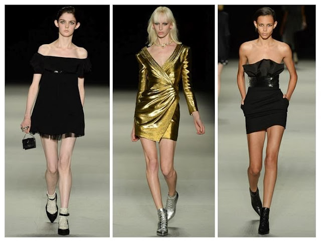
[Images via Style.com]. The Saint Laurent look for next season: worryingly thin.

The skeletal figures are not only upsetting, but they're also distracting, to the point where I can barely see the clothes because all I can picture are the jutting collarbones, alarming thigh gaps and paper-thin arms. I know that these models have walked other shows this season, that they look like hundreds of others on the circuit, but I've never seen their shape - or lack of shape - emerge quite so disturbingly from the catwalk before. This is not femininity or girl power; it is plain and simple deprivation.

Perhaps it's the slimline aesthetic of Hedi Slimane's designs, with the deliberately skinny ties and the asymmetric tops and dresses designed to highlight the shoulder and the collarbone? Whatever it is, it's not making me feel good about fashion or the health of these poor girls. Yes, they lead pressured lives and may 'accidentally forget to eat' sometimes or 'have a really fast metabolism', but at some point shouldn't the people around them intervene for the sake of their wellbeing?

Saint Laurent Spring/Summer 14 dresses in black and gold
Somebody please take these girls aside and give them a hug.

Besides the lack of professional concern for the models' physical and mental health, what concerns me is that these girls will be seen by the fashion world, and everyone interested in it, as perfectly normal, right down to the pre-teens who idolise them. Surely there is something wrong with the message being sent out here.

Considering the legacy of fashion shows past, I guess it shouldn't even be shocking to see such emaciated figures strutting down the runway, as the size 0 phenomenon has stayed with us since the 90s and shows depressingly little sign of disappearing. Maybe I was naive to hope that we'd get a bit more diversity in modelling in the 21st Century, with the healthier figures used by Mark Fast and, most recently, championed in the form of step dancers at Rick Owens' S/S14 show. But change is what we need, before we really do get stuck in a rut of terrifying proportions for the next generation of women seeking beauty validation from the catwalk.

Whatever Slimane might think, I do not believe that these girls should be modelling and I do not believe they should be part of his look. I really hope this show isn't the shape of things to come.

Sunday, 22 September 2013

Photo Essay: Exploring Czech Labels & Friends

A little while ago I was lucky enough to step over the threshold of one of the coolest shops in Prague, during a city break there, and suddenly I was thrown into the achingly cool world of home-grown design talent from Czech Labels & Friends. Just moments from the Old Town Square, this boutique is a breath of fresh air.

 With accessories as good as these, it's hard to narrow down your selection!

The shop's window display was hard to ignore, with a cute replica of the tower on Prague's Petrin Hill being used to great effect. I was also tempted by the range of Melissa shoes in the window - the Brazilian shoe company is the only non-Czech designer stocked here, and her minimalist footwear really compliments the clothing on offer.

 Melissa shoes on display in the window.

 My changing room choices - there's nothing like a bit of cobalt blue.

 The gold detailing on this dress makes it even more memorable.
It's by Libor Komosny, from his m.ona collection.

 Whether you want humbug stripes and florals or bold orange fabric, there's something colourful here.

 This terracotta skirt is irresistible.

 What grabs your eye?

 An asymmetric silhouette and wooden jewellery: I love the combinations at work.

 Clean lines and evergreen basics like these will always be popular.

 Another peek at the windows.

This is the dress I bought, in just one of its many forms; it can be worn in several different ways (even more than what the designer's website suggests - Katarina, who works here, showed me six options).
Not only that, it's by an eco-friendly designer, Odivi.

If you're ever in Prague, I'd urge you to set aside some time to visit this shop, where the team - Katarina and Martina - are really knowledgeable and have a passion for style.

Czech Labels & Friends

Zelezna 12, 11000 Prague.

Thursday, 19 September 2013

London's on Fire for S/S14: Meadham Kirchhoff, Giles and Vivienne Westwood Red Label

The catwalk was set ablaze this season by three great designers in London, each with their own slightly different fan-base. Meadham Kirchhoff is the brainchild of two talented young upstarts with a suitably edgy following, Giles has his endless celebrity endorsements and  mainstream fans from his brilliant New Look diffusion line, and Vivienne Westwood's Red Label boasting its incredible price tags and customer elite sitting not-quite-comfortably alongside her protestations that we all cut down on the number of clothes we buy. Ahem.

Controversial comments aside, these three shows had a lot in common; they all showed models looking empowered and fiery, whether channeling the Lolita look or going for something significantly more dishevelled. 

 L-R: Meadham Kirchhoff, Giles and Vivienne Westwood Red Label showed expressive styles with fiery traits - lace bras, bat-like headpieces and fierce make-up coordinated with a masterclass in layering that shouldn't work but somehow totally does. [All images via Style.com].

Both Meadham Kirchhoff and Giles chose to braid the hair of their models, whilst at Westwood it was all left to hang out in glorious waves, as though just undone from its plaits. The colours may not have been glowing at all times, in fact they could be pretty muted occasionally, but the prints and draping created lashings of drama to help things along.

 The boys  at Meadham Kirchhoff brought us a gold-tinged vision of summer with the prospect of raiding the dressing-up box for those accessories. 

Red satin princess-style gloves: check. Edwardian jacket fresh out of Downton: check. Gold jacket from that 80s fancy dress night: check. Finish it all off with strappy gold shoes and a piercingly bright orange wig and you're good to go.

This is what I call Lolita meets Little House on the Prairie (with a touch of Wednesday Addams). The Meadham Kirchhoff woman isn't afraid to wear her inner child on her sleeve, but that doesn't mean you should mess with her. She mixes decades and patterns better than you, and she can also drink you under the table.

 After reappropriating famous paintings and working with beautifully burned fabrics to set the mood of a smouldering country pile, Giles Deacon has finally created his own relics using these moody photographic prints by Glen Luchford.

There's a brilliant behind-the-scenes studio piece on Giles fresh on the Grazia website right now, explaining loads more about the creative process behind this collection. Amazingly, Giles spotted the photos being posted on Instagram by Luchford, many of them previously unpublished, and he was able to use them in the designs. There's an interesting cross-over with Prada here, as some of the pieces in the collection use prints from Glen's test shots for a Prada campaign back in 1997. 

What I love about the shapes of this part of the collection is that they flatter most figures and don't seek to exploit the women wearing the pieces. There's that all-important draping and forgiving volume that allows you to breathe underneath, rather than be constrained.

Westwood's combination of Pre-Raphaelite hair and distressed layers of clothing with slight Victorian and Edwardian nods (braces, muted florals, sharp masculine tailoring) was totally absorbing.

Being a Vivienne Westwood show, there were always going to be elements of punk spirit tied into all of this extravagance; the Climate Revolution t-shirts and the childish doodling of the make-up certainly added to that, along with the vertiginous multi-strap heels, but having Lily Cole steal the show in a beautifully simplistic and feminine beige dress made sure that this collection would be remembered for its balance of anger with feminine wiles. Trust Westwood to make beige look empassioned instead of bland. 

These three designers definitely lit up the catwalk for me, and they made a strong impact. I'll be watching out for the high street's interpretation of these looks.

Sunday, 15 September 2013

Hellen Van Rees' S/S14 Presentation: Fuzzlayerglossbox

And so to London Fashion Week, where I began my adventures with the presentation from innovative Dutch designer Hellen Van Rees. I've previously covered Hellen's work here on the blog, and also for Running in Heels. It was fascinating to see how she's developed since then, especially as she's been garnering praise for her eco-friendly fashion stance (hello, Humanity in Fashion Award) and taking on the challenge of holding a TED talk on the theme of sustainability. This was her first solo presentation at Vauxhall Fashion Scout's Freemasons' Hall, giving her the chance to really shine.

The 15 looks she created for the collection had been influenced by 1920s-30s dressing, Boardwalk Empire and Coco Chanel. They showed a more mature side to the ideal Van Rees woman, with floor-length dresses and delicate chiffon pieces complemented by 2D cuboid panels, replacing the 3D cubes that were so prevalent in her earlier ranges.


Model in white chiffon dress with rectangular patent panels
 A minimalist all-white top and mid-length skirt combination in look 3.

Wedge shoes with interwoven threads
 Wedge heels finished all of the outfits and really brought the looks together.

Waist belt in patent black with cuboid pattern
 The varying dimensions of this belt created drama at the waist. They also reminded me of city skylines, with the blocks like skyscrapers.

Patent white tabard-style layer with woven sleeves and underlayer
 The models' wispy backcombed hair and red lipstick was one example of the juxtapositions in this show.

Close-up of weaving technique seen in S/S14 collection
 Here you can really get a feel for the different textures as they sat alongside each other.

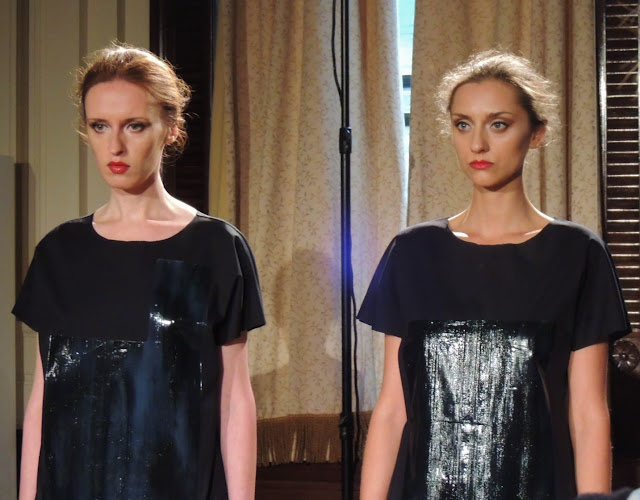
Two models in patent black dresses with chiffon
 The oil slick effect here worked really well against the chiffon.

Model in white stands in front of decadent painting at the Freemasons' Hall, London
 As you can see, the setting of the Freemasons' Hall and its dark portraits added that bit more drama.

Monochromatic dresses by Hellen Van Rees
 Multiple panels made up these dresses. The bolero jacket on the right continued the cube-shaped theme.

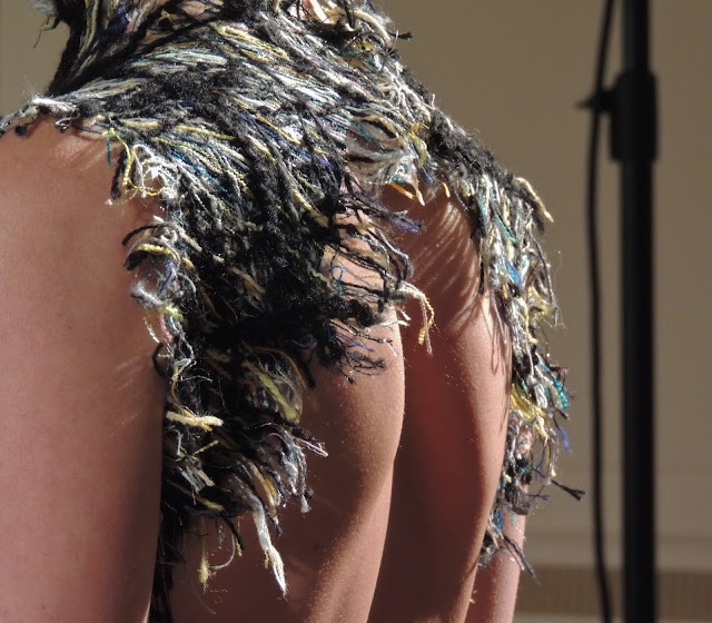
Close-up of woven dress with colourful threads
 Just look at those threads. My instant reaction was to connect the diamond pattern to the quilted panelling of a Chanel 2.55 handbag, but also the coloured threads remind me of Bridget Riley paintings.

Model wears white panelled dress with woven details
 Pure polished glamour.

Halterneck black dress with rectangular panels
 This was one of several halterneck pieces, with frayed hems.

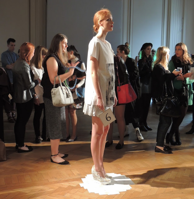
Model in white stands in front of London Fashion Week bloggers
 The presentation allowed press and bloggers to walk between the models, creating shots like this when us mere mortals were stood alongside the creations.

Blogger walks past model during Hellen Van Rees' S/S14 presentation
 Wandering around the room gave a great opportunity to see the designs from all angles and in different lights.

Polished make-up with bronze cheeks and red lipstick at Hellen Van Rees
 The white fraying looked like feathers.

Juxtaposing fabric textures at the Freemasons' Hall presentation
 Glossy white vs. multicoloured threads, and high necklines all round.

Close-up of eco-friendly weaving by Hellen Van Rees
 An open back balanced out the high neckline of this dress.

Jacquard patterns and frayed hems for spring
 Simple buns were the order of the day when it came to hair - nothing that would be too distracting.

Detail of undulating waves on a maxi-dress from the collection
More of those Bridget Riley-esque threads? Oh go on, then.

Fuzzlayerglossbox shows a definite growth in Hellen Van Rees' work and I'm sure it will be a hit with buyers as well; personally I'd love to see UK stockists introducing her to their customers, so we can show our support.

Sunday, 8 September 2013

Lakme and Wills India Fashion Week: Who to Watch for Autumn/Winter 2013

So, New York Fashion Week may have just started, but I'm still in the whirlwind of India's style options for this season. Here I'm not only focusing on the recent output from the Lakme shows in Mumbai, but also from Wills India Fashion Week, which takes place in New Delhi and is organised by the Fashion Design Council of India (FDCI); the main difference here is that WIFW showed its Autumn/Winter 2013 collections back in March, whereas LFW has only just revealed the same season's offerings. 

However, as all of the clothing is designed to be worn right now and in the coming months, it makes sense - in my head, at least - to combine a selection from the two events. 

 Soldiering onto the catwalk with Sneha Arora [All images by
Dwaipayan Mazumdar, via Vogue.in].

Sneha Arora (shown at LFW)

Arora studied at Kolkata's National Institute of Fashion Technology and has come a long way from her Gen Next status at last year's Winter/Festive shows. Last season she gave us a collection that balanced slim silhouettes and precise tailoring with billowing dresses using incredible photo prints of balloons, fluffy clouds, stormy skies and eagles, making you think of flight, independence and freedom. 

This time around it was all about restricting that freedom and turning to vintage military influences, creating 'Soldier's Story': yet again it used prints based on photos, but this time they dominated certain sections and crept into the overall outfit, rather than being prominent on first glance. You might almost assume the figures were abstract, until you look a little closer.

 Lady Gaga, eat your heart out - Nida Mahmood's eccentric adventuress rules.

Nida Mahmood (shown at WIFW)

'Steampunking away!' was the order of the day for Mahmood's fictional character, Captain Must! Qalandar, who formed the basis of her A/W13 line; to call it playful doesn't really go far enough. There's an energy and an artfulness here that places her work somewhere between Lady Gaga's Haus of Gaga and the effervescence of London's young designers like Louise Gray and Meadham Kirchhoff. Mahmood, like Arora, trained at NIFT, but she's also a self-taught artist with a passion for making wearable art.

It's often said by both industry insiders and the public that fashion takes itself too seriously, but Nida Mahmood shows that not everyone lives up to this stereotype, and with good reason.

Are you a 'fashion ninja', as Mrinalini's ladies have been called?

Mrinalini (shown at WIFW)

The 'black comic narrative' running through this collection allowed plain formal touches (the chunky shoes, the briefcase and the trilby) to clash with carefully planned injections of colour, fun and texture. 

This was a real move away from the full-on colour and cartoon-like feel of Mrinalini's S/S13 line, which seemed to have raided the paintbox, but it retained an experimental nature. I'm sure that a lot of these pieces will have commercial appeal and will be snapped up by shoppers.

The next chance to see the designers of Wills India Fashion Week will be in early October, when I'll take a look at what they've got in store for our summer wardrobes of 2014.

Related Posts Plugin for WordPress, Blogger...